
Feathered Herringbone E2E Digital Longarm Quilting Design
I have to admit, this digital pantograph is kind of showy. It's bold, it's eye-catching, it thrums with exciting texture! 
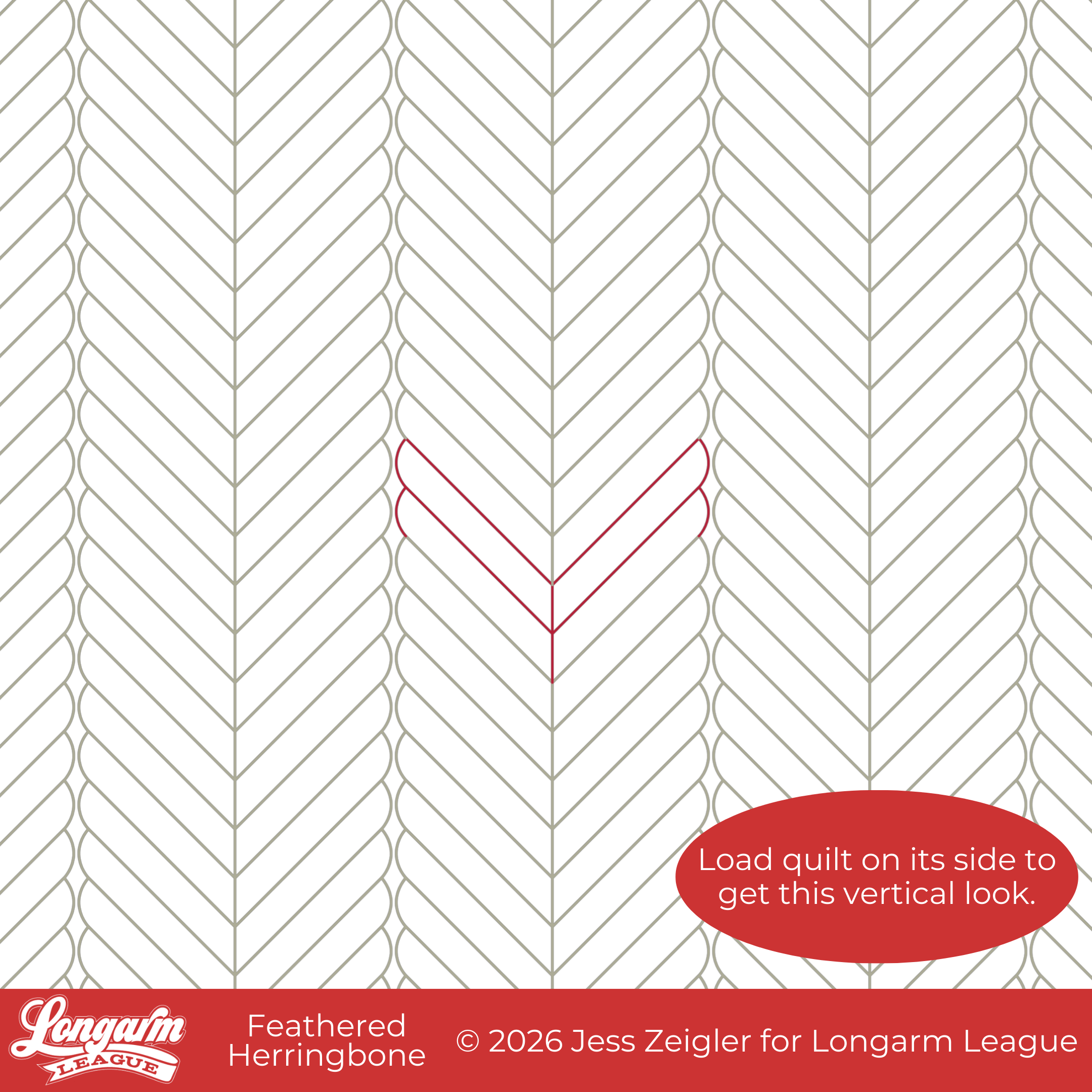
When creating this design, I began by exaggerating the length of feather plumes. I loved the concept of the feather "bump" (and therefore the backtracking) being so cute, tiny, and manageable, while the long lines of the design move the pattern forward; they are stitched in an alternating fashion without backtracking. What I ended up with looked so similar to a herringbone pattern, especially with the rows of feathers placed so close to their neighboring rows, even though they don't interlock or touch.

I wanted to keep the feather ends soft and rounded, which differentiates this design from traditional herringbone patterns. These columns (or rows, depending upon the direction the quilt is loaded) of feathers have finite ends and are "self-contained" without actually merging together. However, the eye wants to make sense of the overall texture, which reads herringbone.
The 45º angle of the feather plumes makes this edge-to-edge design complementary to patchwork using 45º angles, such as the half-square triangle.
The Quilt
Quilt Pattern

This quilt pattern is called Blueberry Trellis by Needle in a Hayes Stack. I found it here on the Connecting Threads website. I don't think I'd ever shopped for PDF patterns through Connecting Threads before; I believe I found the quilt on Pinterest first and then clicked through to get the pattern.

The pattern has a unique layout that beautifully showcases the star blocks. I thought the quilt's vertical orientation would be a good match for the Feathered Herringbone design. Playing up the 45º angles was a pleasant bonus!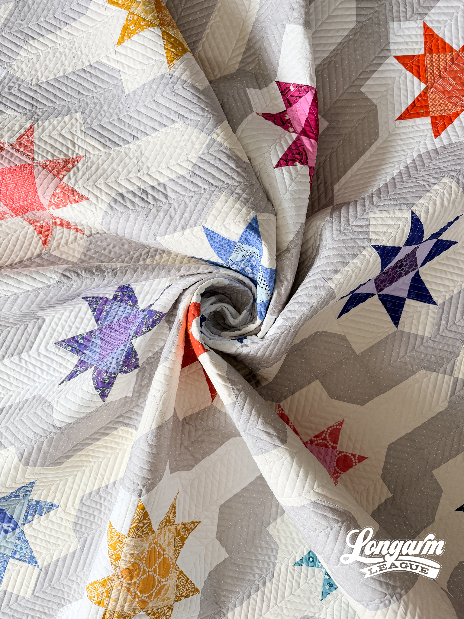
Fabrics
I continued my streak of using only the fabric I already had on my shelves. It was easy to find the colorful scraps for the star blocks. I made each block unique, with no fabric repeats. The tricky part was the medallion shapes in the background surrounding the stars. It would have been much easier to cut if I had enough yardage in a single color for the background, but I did not. I had enough cream for the background of three stars, and between a solid white and a natural fabric, I was able to cover the rest.
It was tricky to keep the background shades straight and cluster them around one star. I could easily distinguish the white from the other two fabrics, but the cream and natural looked VERY similar. I had to take notes on which star had which backgrounds as I cut them out, and I had to refer to those notes often throughout the process.
As written, the pattern used two different "trellis" fabrics. I made this a smidgen easier on myself by using only one fabric, the light gray you see on my quilt. This is the same wide-back fabric I've been using so much lately.
Backing
Yep! It's the Silver Dapple Dots by Riley Blake. On repeat. Heck, I even used this fabric for the binding of this quilt, too. So versatile. 
The Quilting Details
Difficulty Level: INTERMEDIATE
There are a few things to note about this design, so I think it should be classified as Intermediate difficulty.
If you want the feathers to travel vertically, as shown on the quilt featured in this blog post, load the quilt top on its side.
To achieve the herringbone look, the rows should be stitched close together. I didn't set up the rows to touch, but they're just a few clicks away from touching. If you have a wonky quilt top or a floppy back, it may be tough to get the spacing consistent. I liken this to quilting straight lines. Keeping lines straight with equal spacing is tougher than it looks, especially when those lines are close together.
After advancing the quilt to a new pass, I like to position my needle at the lowermost point of the last stitched row. If you lower your needle here, make sure to bring it back up. Then I engage my horizontal channel lock and move the machine head back and forth across the quilt, stopping to lower my needle at regular intervals to ensure I start the next pass straight. If the quilt isn't straight at this point, I'll use batting scraps or paper towels tucked into the take-up bar to make adjustments. There's a video linked in this blog post that shows this process with straight-line quilting.

Scale, Alternate Layouts, and Thread Path
At the scale used for this quilt, the parallel lines are just under 1/2" apart. I would consider this dense quilting.
You could also choose to keep the orientation horizontal and load the quilt top the traditional way. Here's what that would look like: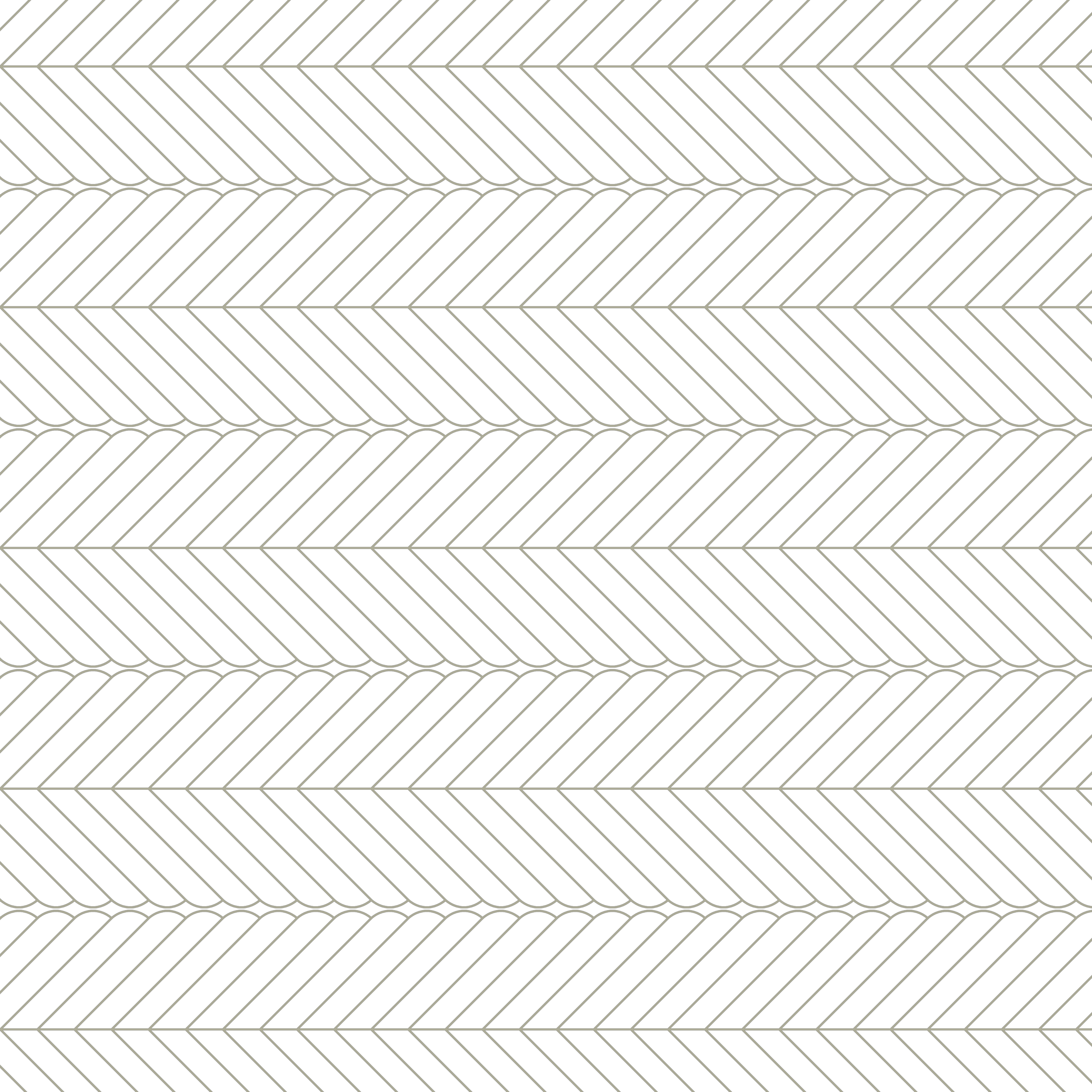
If your software has this capability, you could vertically flip every other row to get a result that emphasises the chevron look:![]()
As for the thread path, there's a short video available at the top of the blog post.
In the next photo, I'm sharing what my extreme close-up results look like on a part of the quilt with contrasting white thread on blue fabric. Even though the design in my software and on my tablet's screen shows the lines converging on the spine, my needle pivoted away before they actually touched while I was quilting. I consider this normal, minor, and passable, and it doesn't affect the overall impact of the design, but I wanted to mention it. The same goes for feathers that get backtracked; they didn't fully touch the next feather shape every time. Your results may vary depending on the equipment. I ran my machine fairly slowly for this design (IQ users: speed and details were set to 1.0; Dwell is always set to 1).

Here are the sizing specifications for how I set up this quilt using my Intelliquilter (63" x 75" quilt size):
Row height: 4"
Gap: 0.078"
Pattern height: 3.922" (measurement from top to bottom of the repeat)
Offset: none
Backtracking: minimal
Here's a look at the included PDF: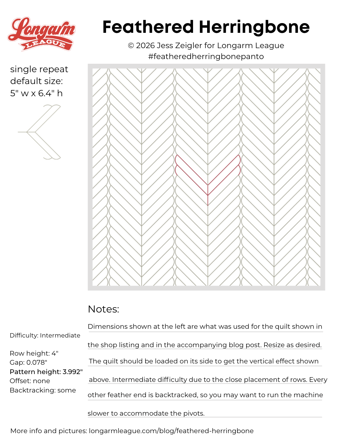

Interested in getting new digital pantograph designs like this one on the day they're released (and at a deep discount)? Sign up for our Digital Panto Club and get them delivered directly to your inbox on the first Wednesday of each new month.

Jess Zeigler
Longarm League Commish & Owner of Threaded Quilting Studio, LLC.


