
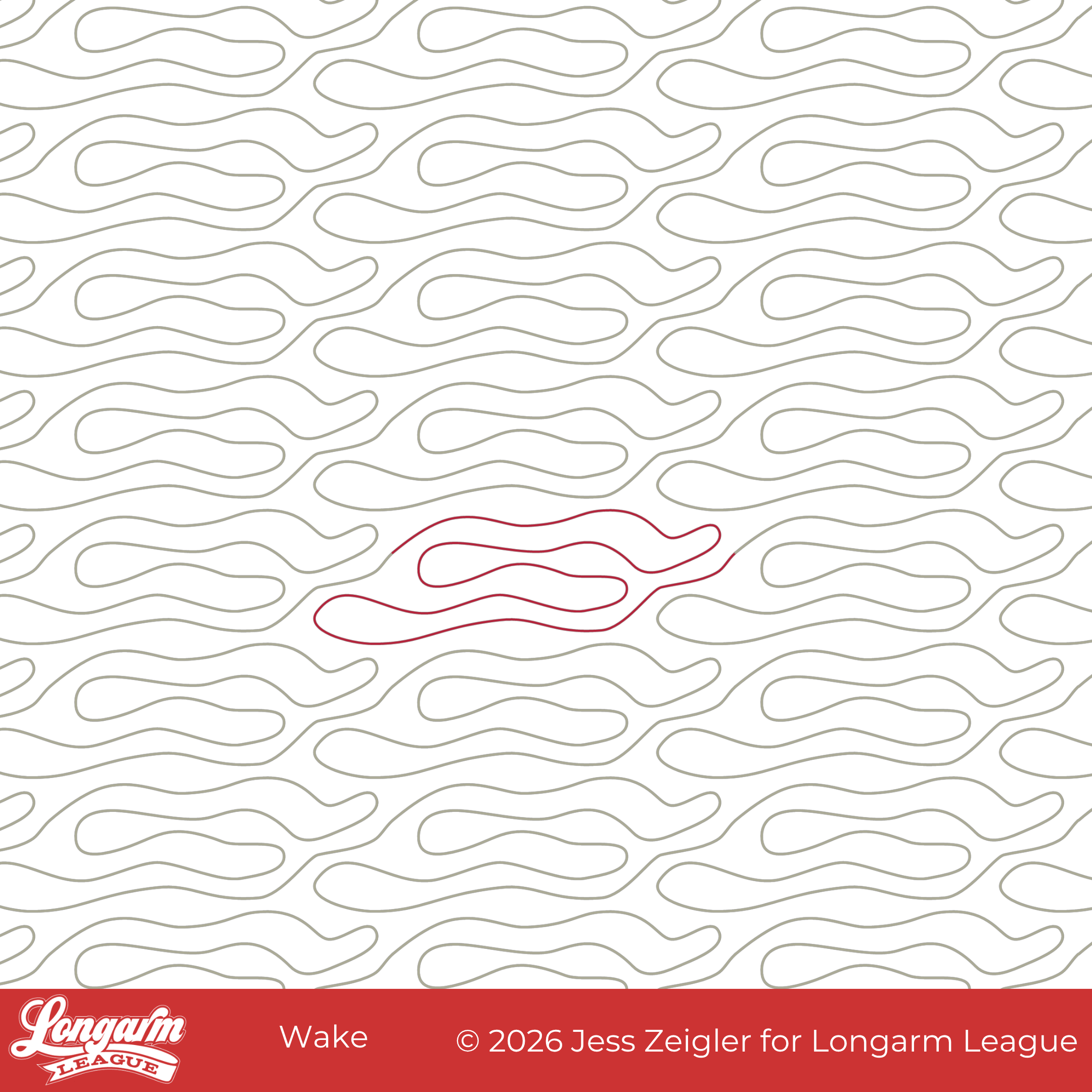
Wake Edge-to-Edge Computerized Quilting Design
I can finally put this design to bed! :) Like last month's Boho Bulbs release, this design has been in the works for several years. It started with a date night at a local sushi restaurant. I was inspired by their back wall:
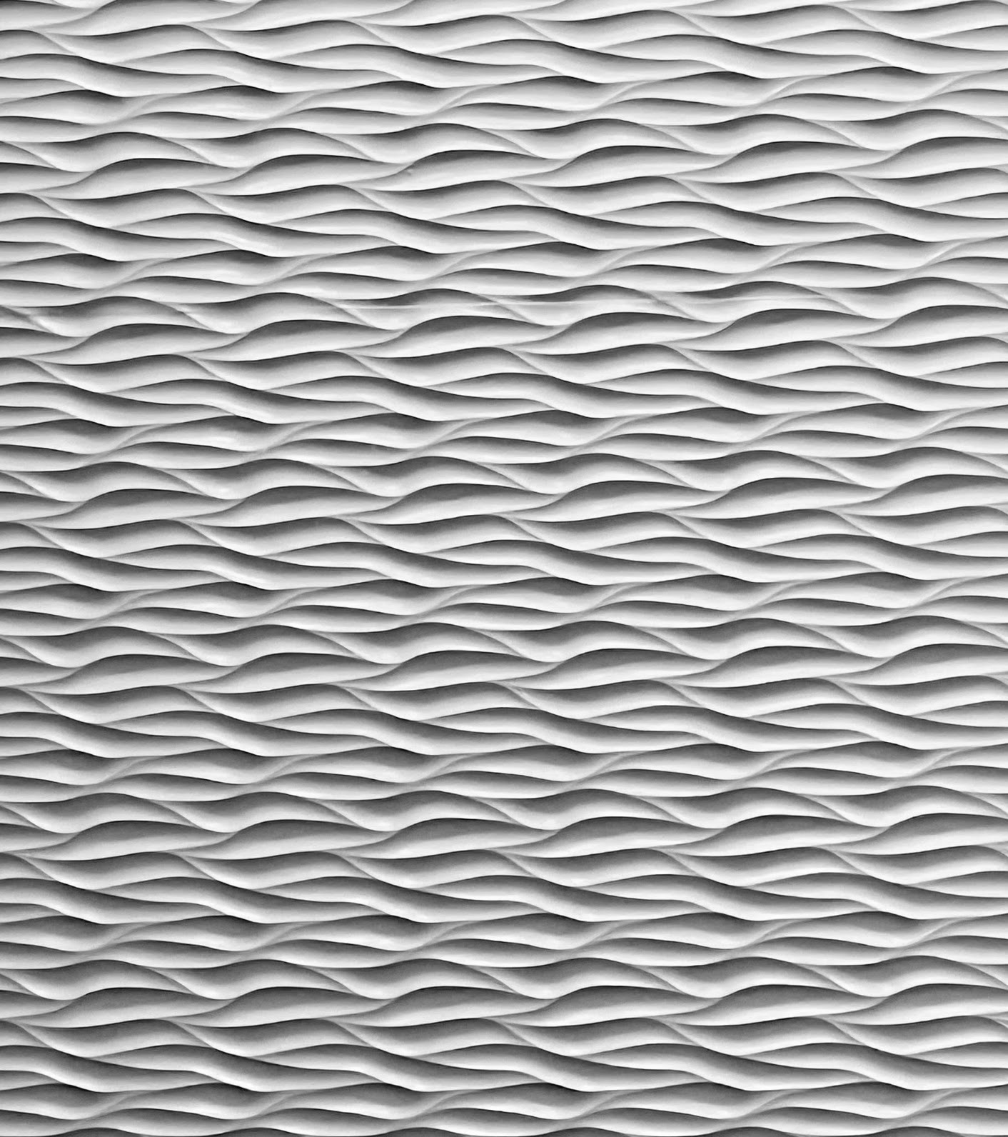
Isn't it cool?!
I loved how the lighting in the restaurant brought so much dimension and interest to the monochromatic wall. I immediately thought of quilting texture and took a picture with my phone. I started a sketch in my design software, but never fully fleshed out the design until now.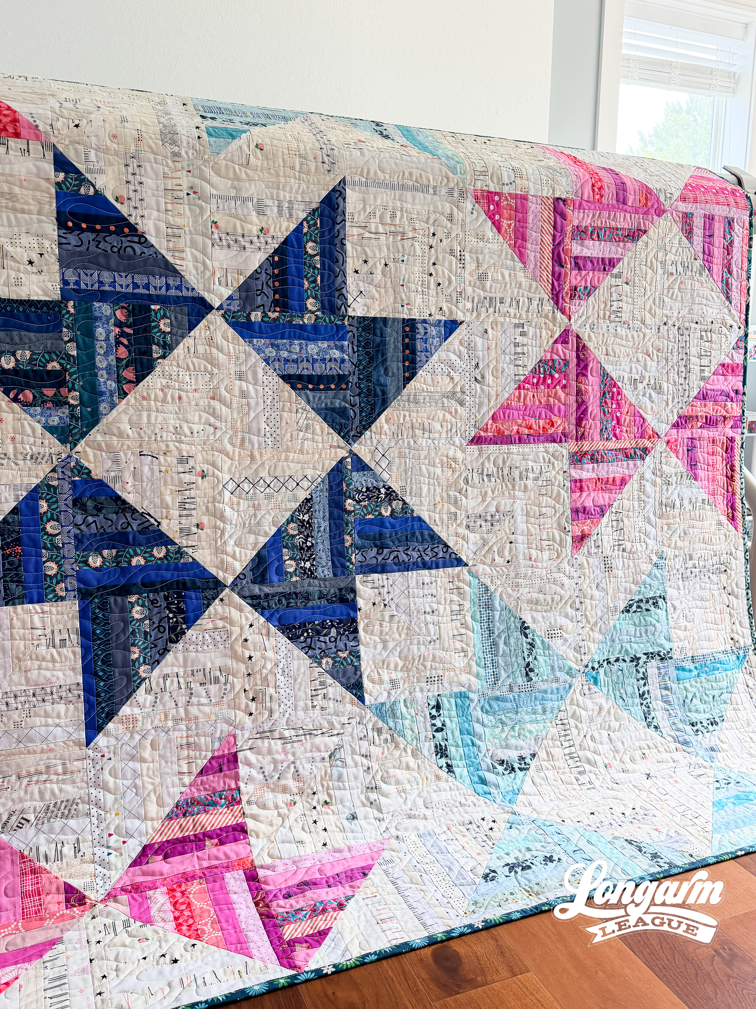
The challenge was conveying the strong horizontal orientation of the lines while coming up with a repeat that didn't have any backtracking and was easy to align/realign. 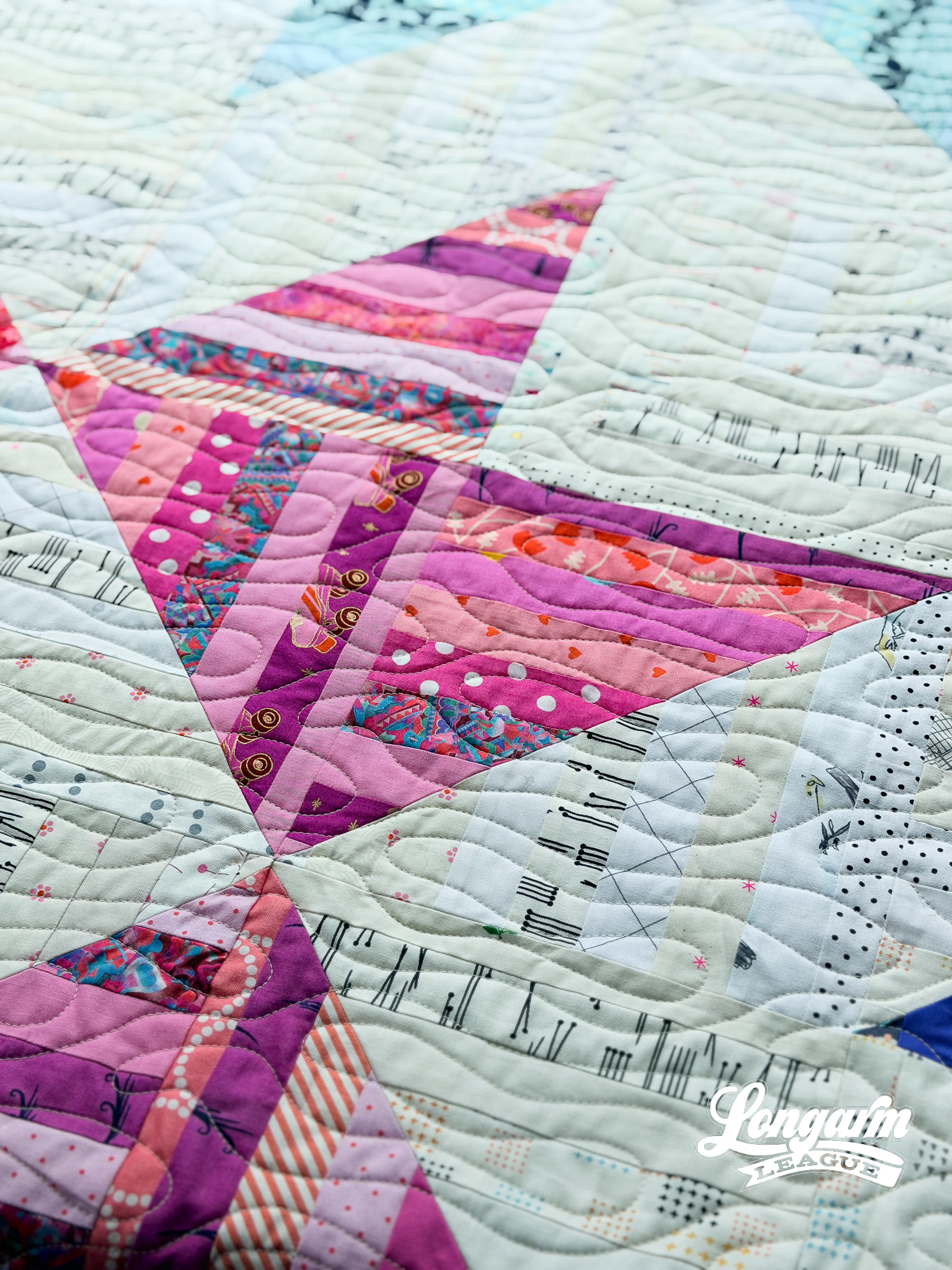
While I like the way the lines of the dimensional panels of the restaurant converge and nest together, I thought rounded ends and gaps between the long back and forth lines would be easier to stitch while still getting the horizontal flow and texture of the inspiration piece.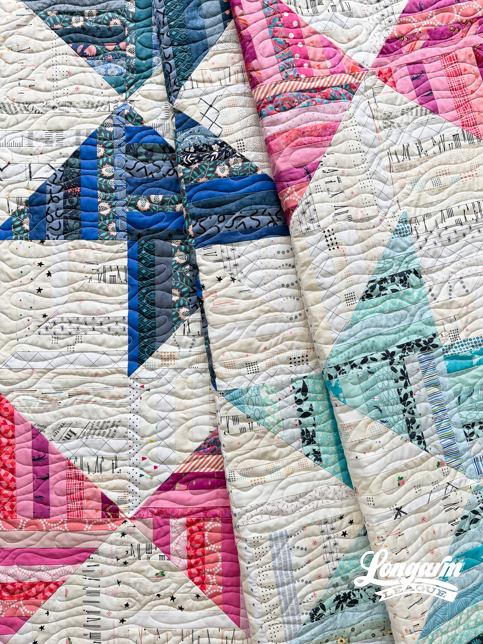
I named this design Wake...
Liquid Edge-to-Edge Digital Quilting Design
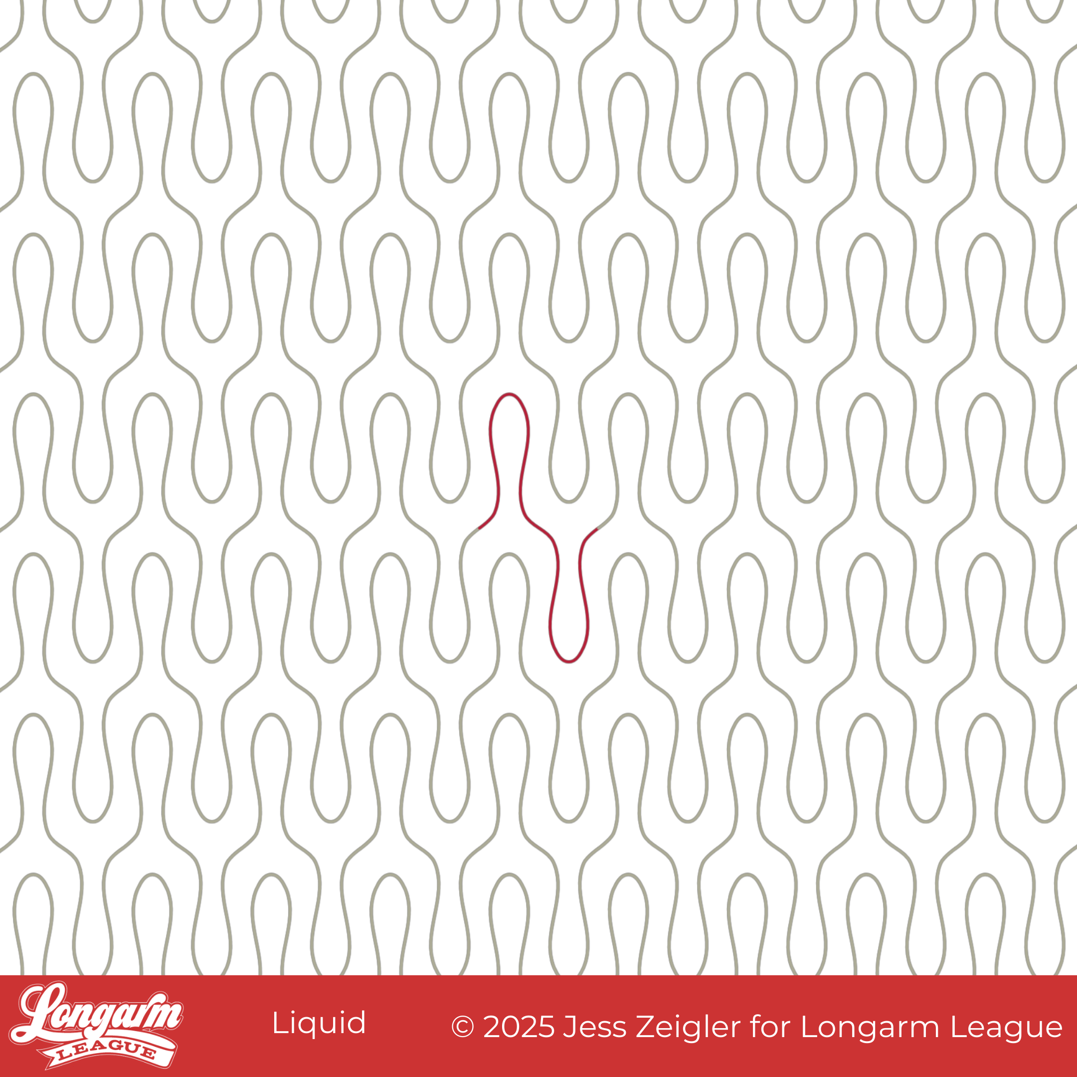
As I was working on this design, I kept thinking how similar it is to the Wishbone design. It may even look more like a wishbone than Wishbone?! My husband thought I should call it Tuning Fork, which would have also been an accurate description. I decided the one-word name 'Liquid' represented the flow and drip of the design.
This has been one of my favorite combos of quilt pattern + pantograph for quite some time! I can't help but have favorites.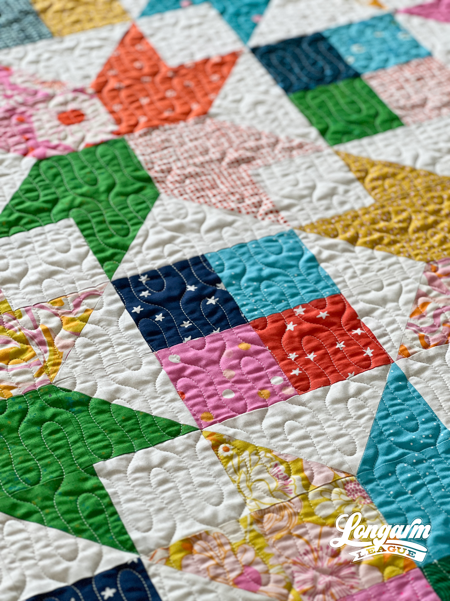
I think the simplicity of this design gives it versatility and can be used in different styles of patchwork: contemporary, modern, water-themed, you-name-it. The curvy shape gives it an element of fun and playfulness.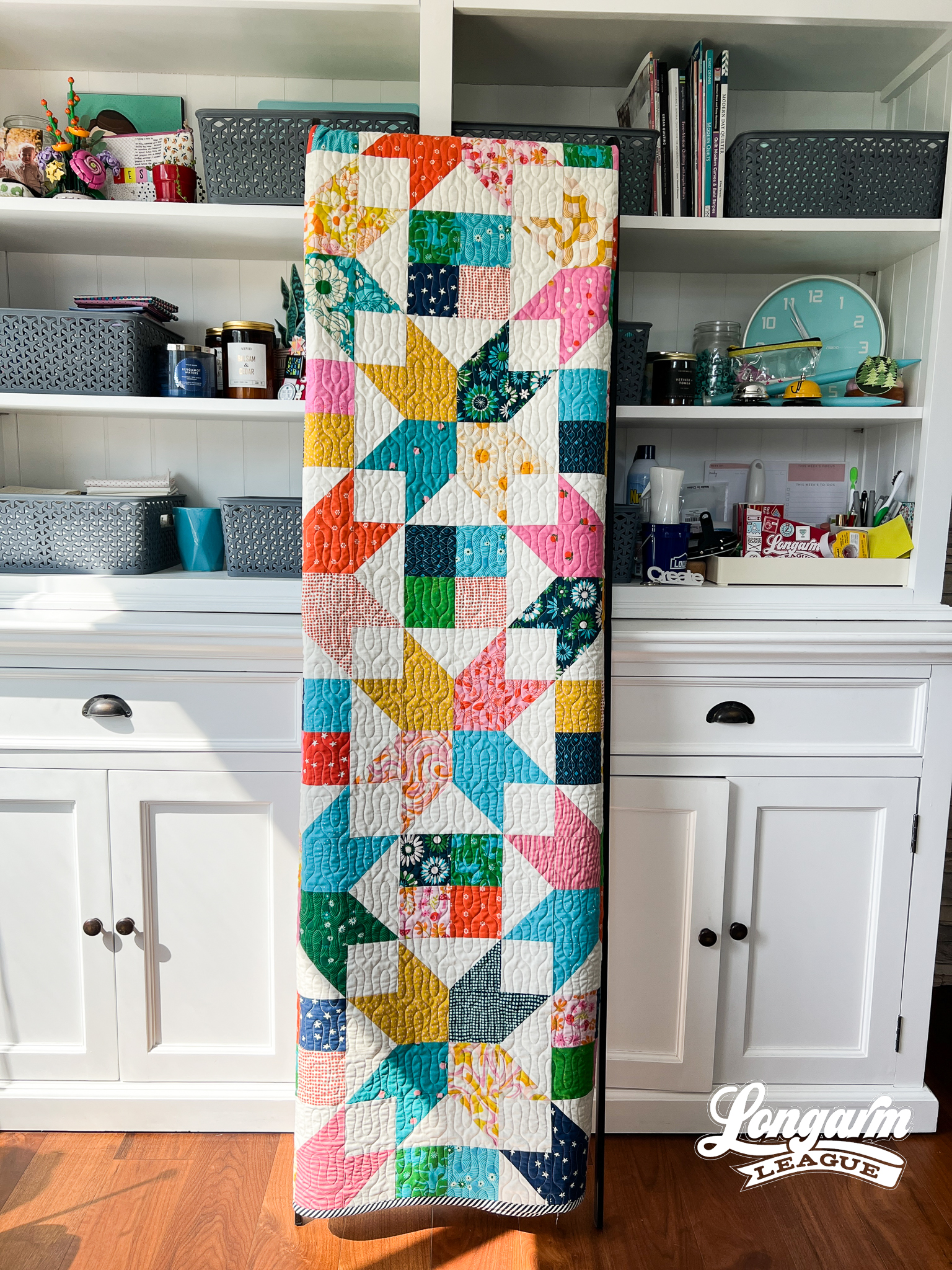
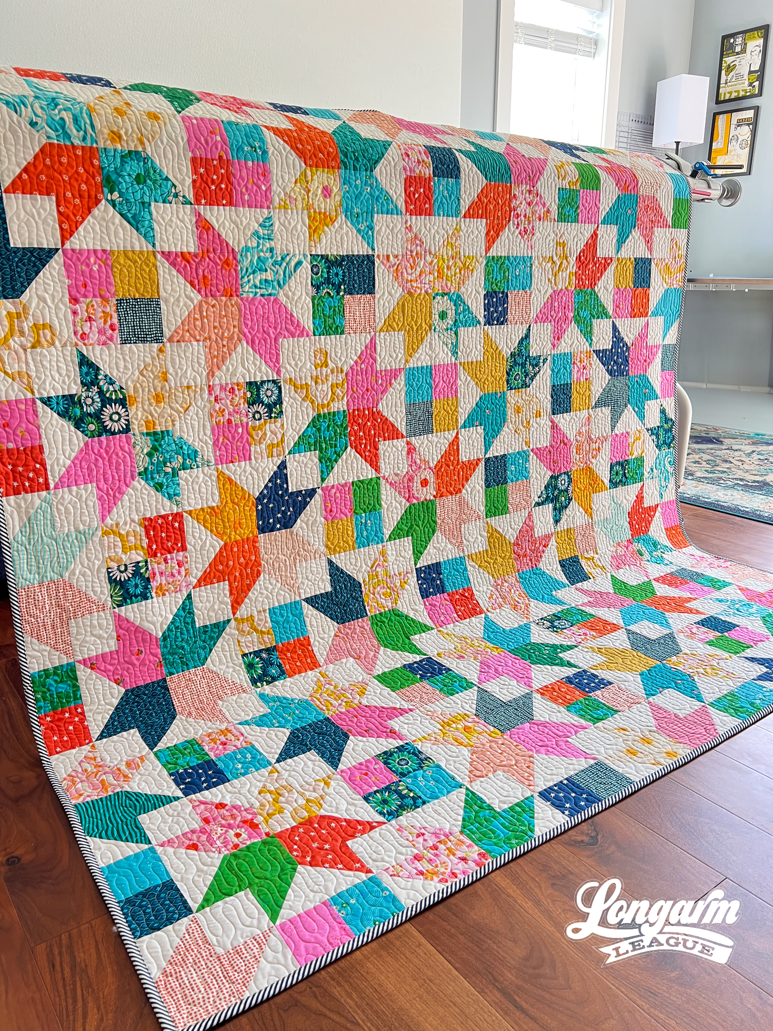
The Quilt
Quilt Pattern
The pattern I used for this quilt is called Amelia by Crystal Manning. Once again, I was prepping for a retreat and needed some ideas of quilts to make before leaving. I believe I found this pattern while browsing on Pinterest, and my star-loving heart pitter-pattered with joy!
I love ...
Cross-Stitched | Digital Quilting Design for Computerized Longarm Machines

I released a digital pantograph called Plus last summer (shown in the next image). Leading up to the release, I debated about which orientation to use for the little plusses because I was going back and forth between the up-and-down orientation of Plus and the diagonal orientation of today's release. I ended up deciding that they were different enough that instead of either/or, we could have both! The right time—or rather quilt top—came along, and I thought the diagonal version would look great on it, so here we are today.
Plus:

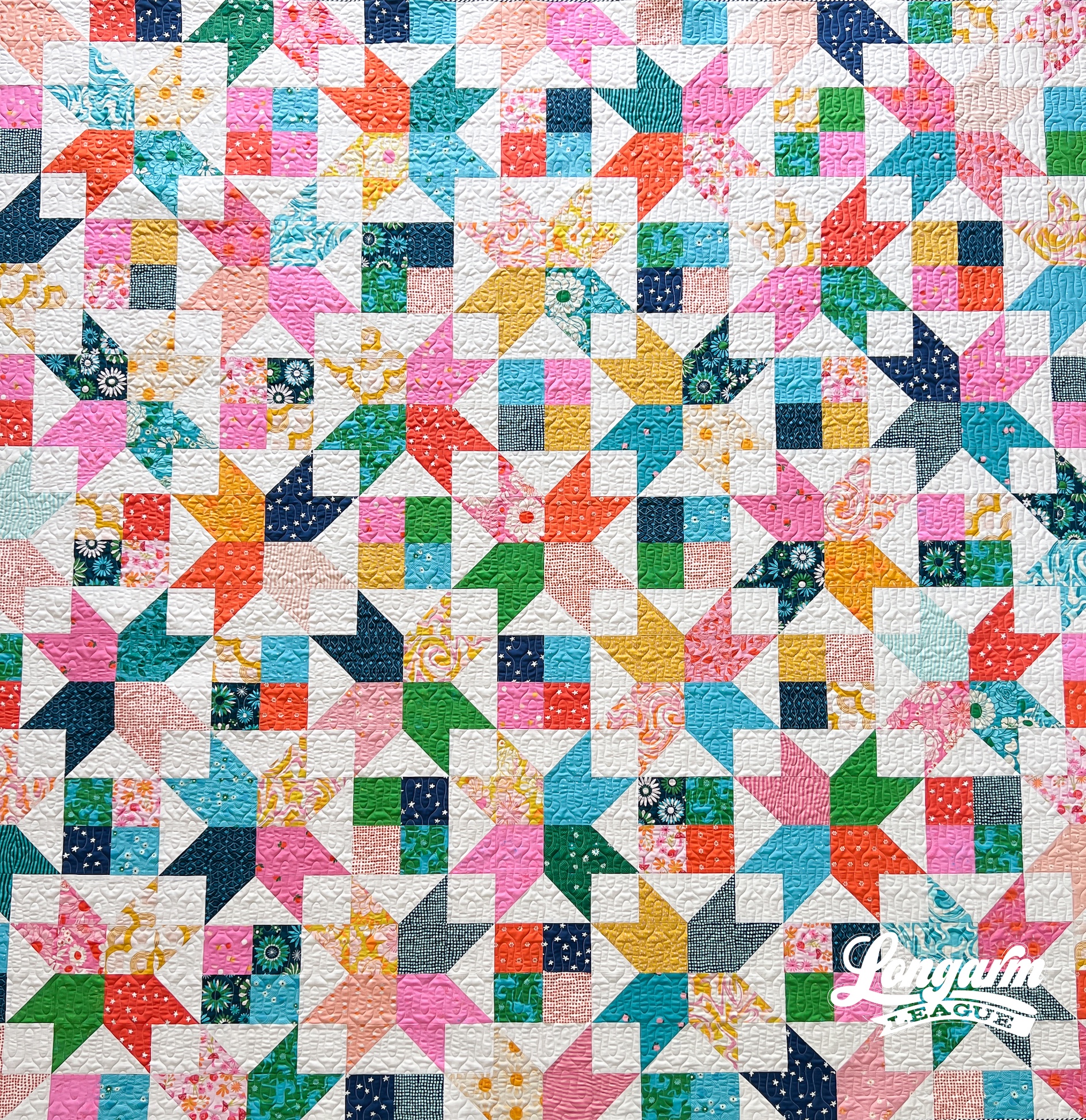
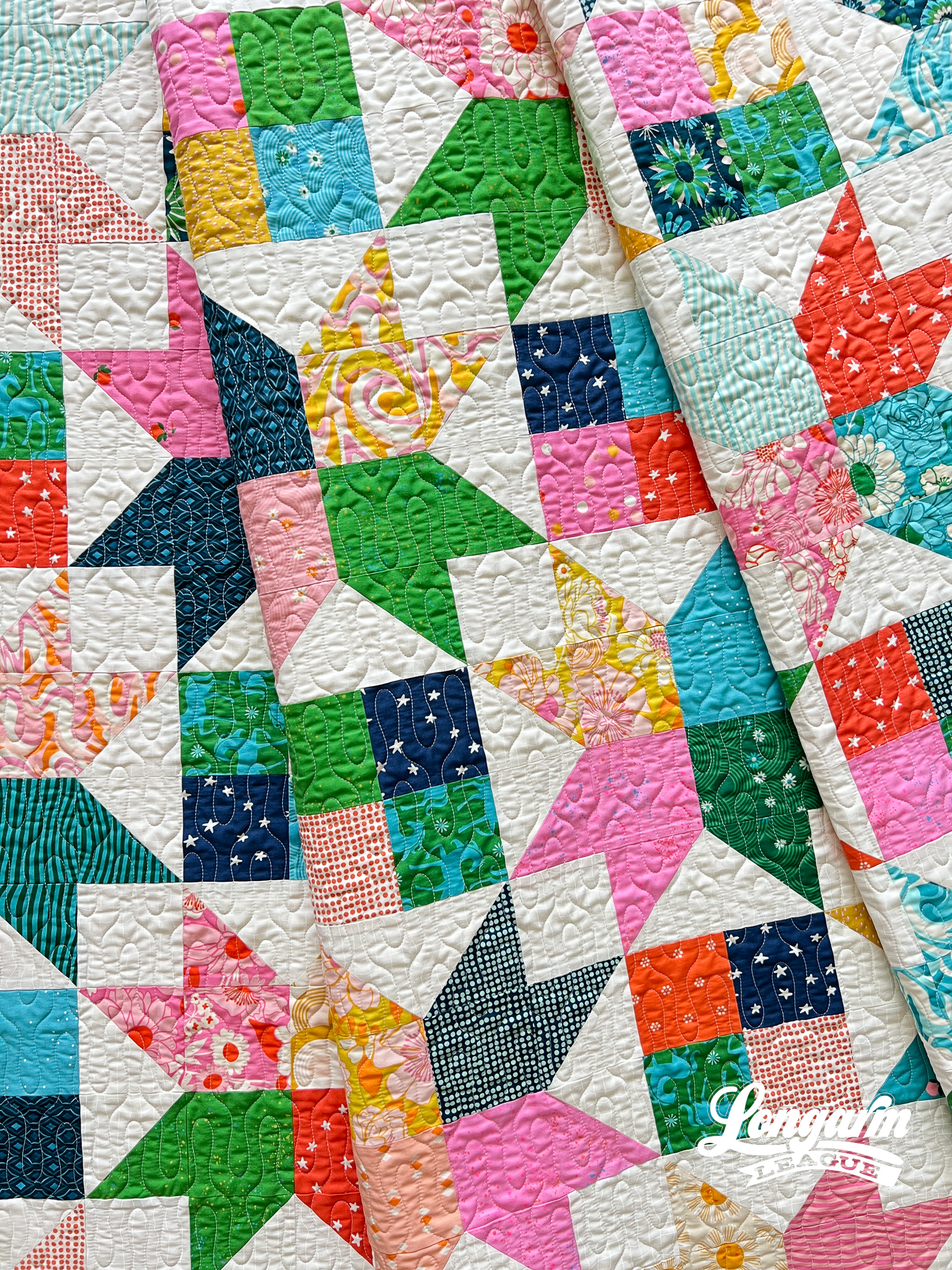
More on the quilt top in a minute, but the 45º angles of the star patchwork in this quilt was what made me think Cross-Stitched would be a good fit for the quilting.

The small-scale of the pantograph design lends itself well to creating a texture-rich backdrop. There have been a number of times when I look at the effect of the quilting, and my brain wants to think that circles are part of the design, even though they aren't. I also pick up subl...
Bell Tower Digital Quilting Design for Computerized Longarm Machines

This design called Bell Tower is our latest edge-to-edge digital pantograph with a modern, geometric theme.

Sometimes it's tough to pinpoint why I like or dislike a design, but I think the reason I like this one is the space between the shapes creates a "channel" that gives some visual oomph. 
If I look at this design long enough, it looks like a deconstructed orange peel, just don't ask me to explain how or why!
I chose to quilt this design on this quilt top because of the vertical orientation of both. I like how the soft curves of the panto add interest, as well.
The Quilt
It's a star quilt; what's not to love?
The pattern I used is called The Helen Quilt from Kitchen Table Quilting. You can find the PDF for sale here. I love the orientation of the stars and how they alternate between large and small. It was a great way to use the fat quarter bundle of Lazy Afternoon, a fabric line by Zen Chic for Moda.

I used scrappy low-volume prints in white and cream for the star b...

Jess Zeigler
Longarm League Commish & Owner of Threaded Quilting Studio, LLC.


