Bloomlet Digital Pantograph | Computerized Edge-to-Edge Design
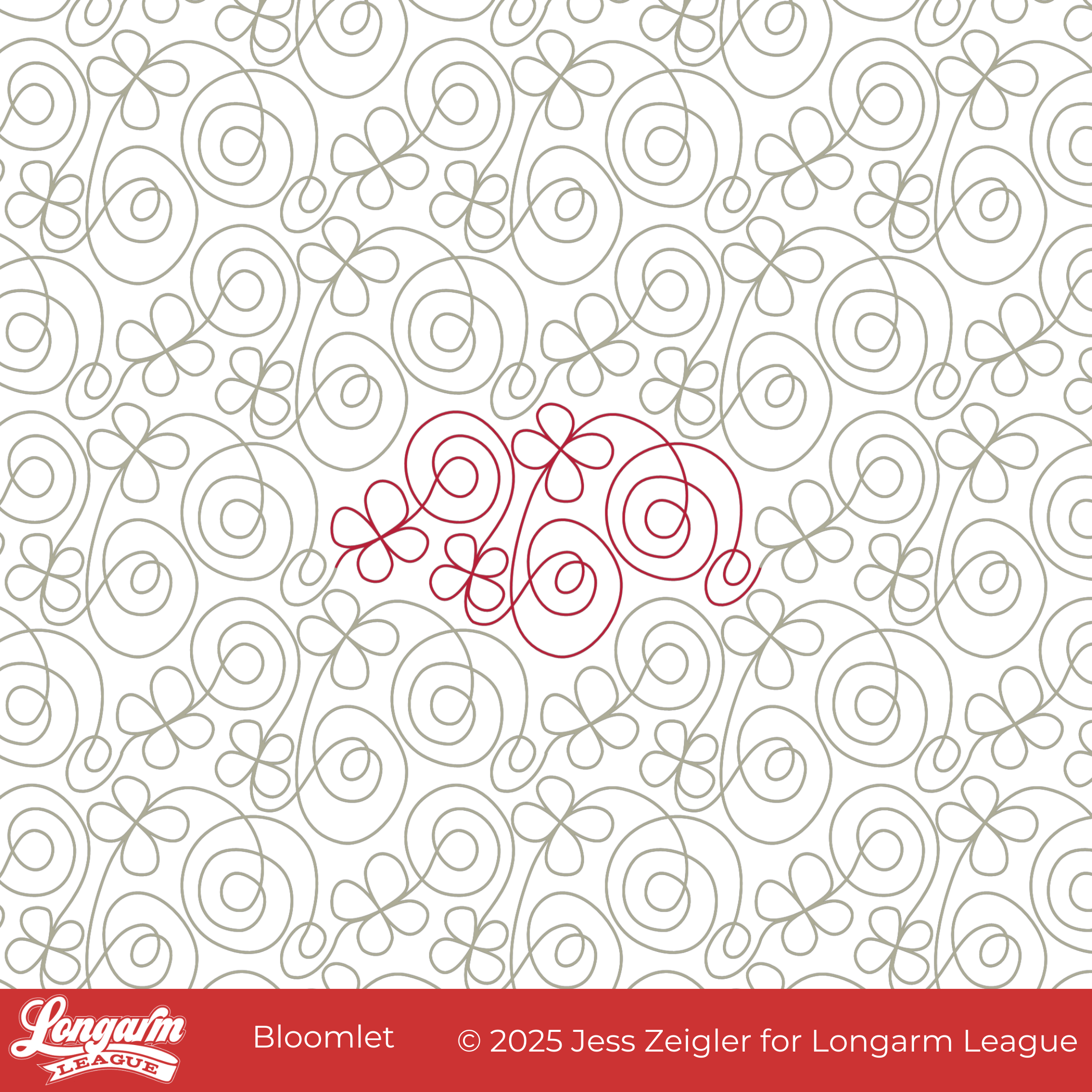
Fresh, fun, and full of charm—our newest edge-to-edge design, Bloomlet, is ready to make your quilts shine.
Bloomlet combines playful spirals with simple four-petal flowers, creating a joyful mix of curves and blooms. It has that lighthearted, whimsical feel that instantly brings a quilt to life. The design flows continuously, so while it looks sweet and detailed, it stitches efficiently from edge to edge.
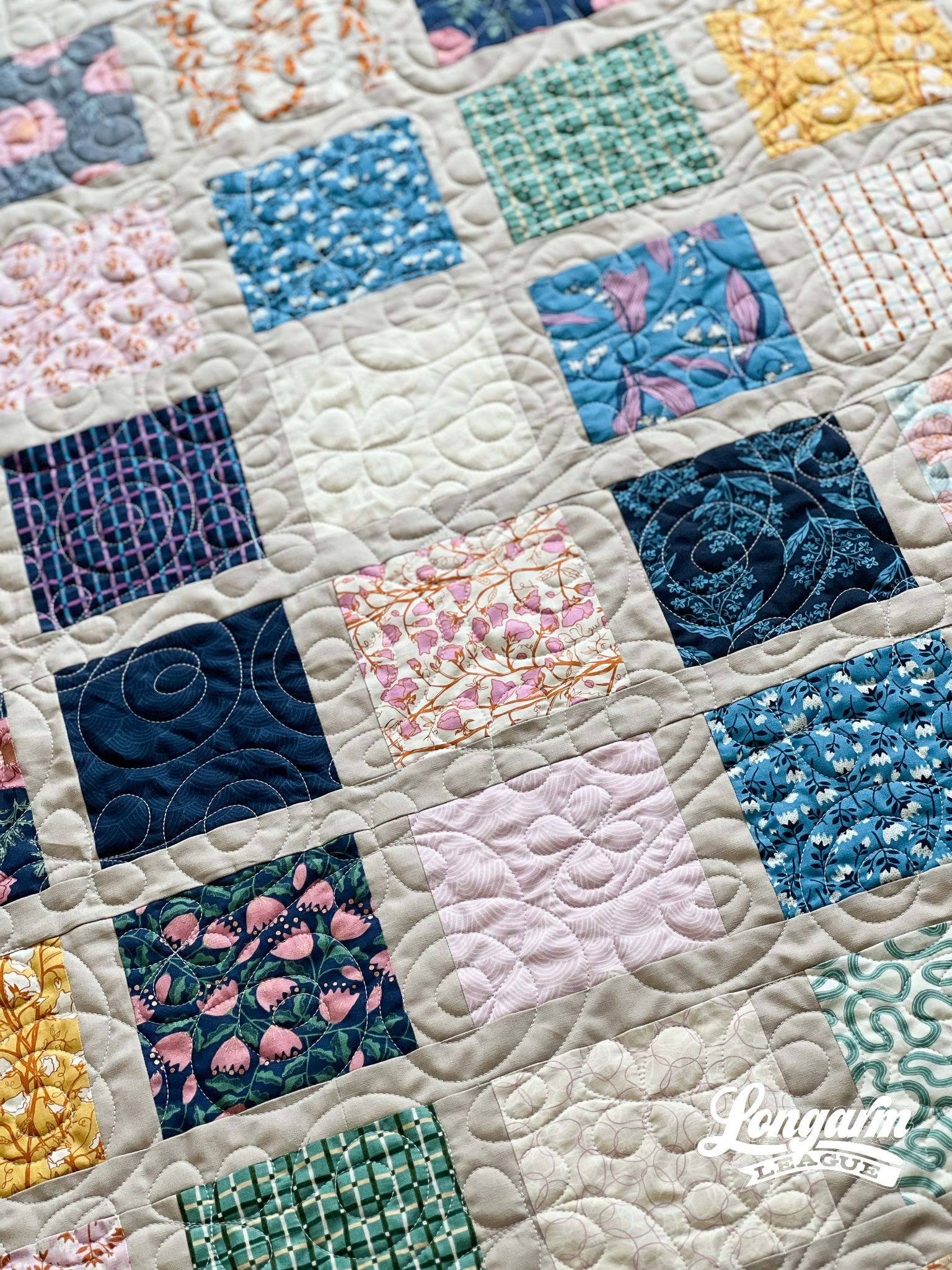
When I created Peak Blooms (four years ago—wow, time flies!), I loved the little flourish at the center of the blooms. I pulled that same shape out for this design. By enlarging and isolating the petals and then repeating them in this motif, they become a stronger feature of the overall design.
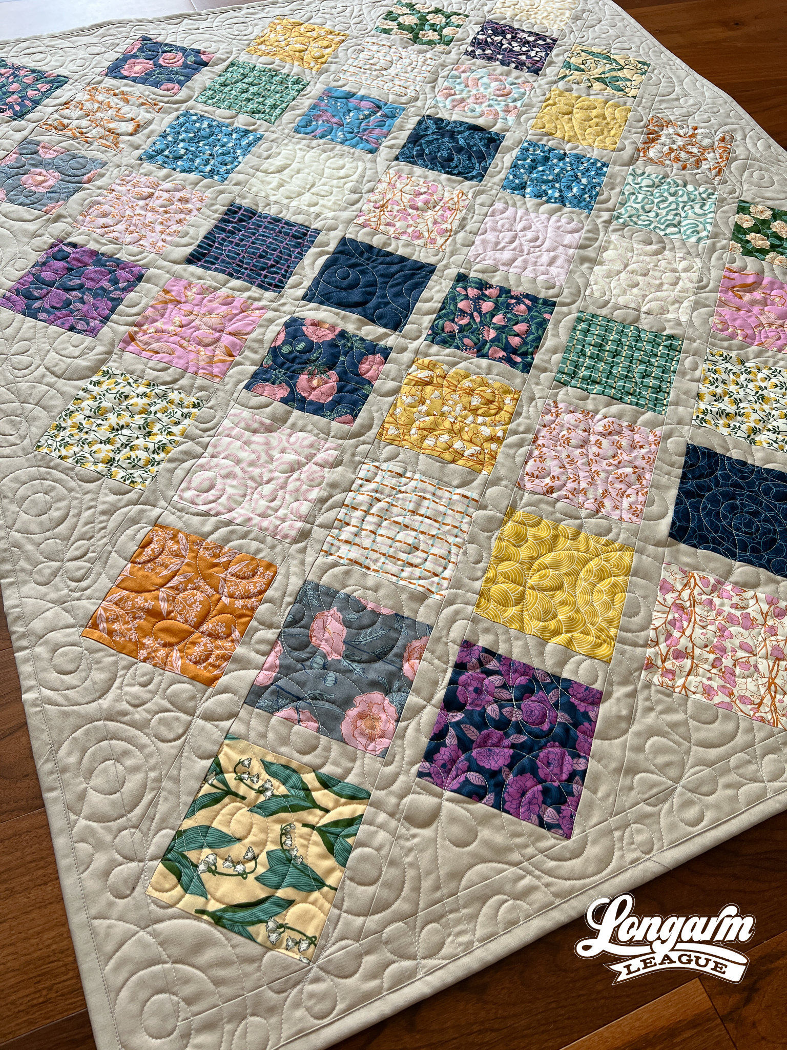
I kinda, sorta designed this pantograph for this quilt. I didn't think a strong geometric design would work well with the patchwork, and the floral prints were inviting a softer, whimsical look. The petals of Bloomlet aren't uniform, and the spirals are asymmetrical as well, m...
Demure Edge-to-Edge Digital Quilting Panto

What good is the Internet if you can't use it to jump on a trend? The first time I saw something relating to "very demure" was an Instagram Reel of a real estate agent in Des Moines, describing the city as "very demure". I thought that was an odd way to describe it, but I continued with my day. In a short amount of time, I saw "very demure, very mindful" pop up in so many other places that I had to google it. Apparently, it originated with TikTok influencer Jools Lebron as a way to describe her look and way of being. It has caught fire from there! Now "very demure, very mindful" is a phrase that is popping up everywhere, and just when I needed a name for my new design. It fits, doesn't it? 
Demure's design starts with the outer petals and ends with the medaillion-like framing around a center circle. The repeating shape is elongated. 
Every other row is staggered at 50% with this design. When arranged, the row-to-row nesting is minor and is not challenging to align when stitch...
Turnstiles Digital Quilting Design

Turnstiles is a simple design that delivers great texture! After I completed this top, I knew I wanted something cute and small scale to use for the quilting.

I struggled with what to call it, so I turned to social media for help and got many great ideas! Two years ago, the design we released was called May Flowers, so even though this is another May release that could very well look like a flower, I knew it needed to be something different.

Another popular name suggestion was Propeller. It makes so much sense, but since we have a design called Propel, I didn't want to confuse them. Whirligig was another popular option, but there are so many other Whirligig pantos out there! 
This is where I shout out Christi on Facebook for suggesting Turnstiles! Thanks, Christi—I liked it right away. It's one word (which I like), unique, and contains 'tiles' as part of the word, which calls back to some other name suggestions because the angled lines do look like tiles.
Perhaps t...
Pretty Petals Digital Quilting Design
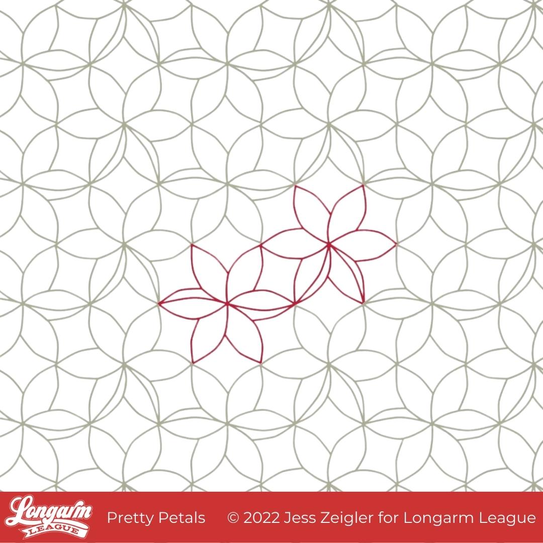
I'm glad the time has come to release Pretty Petals into the world! As a designer, I can't help but have varying levels of excitement about the designs I work on. I'm sure this is totally normal with any creative job. I can't say this is my favorite design ever, but it's up there because of the overall texture it creates! 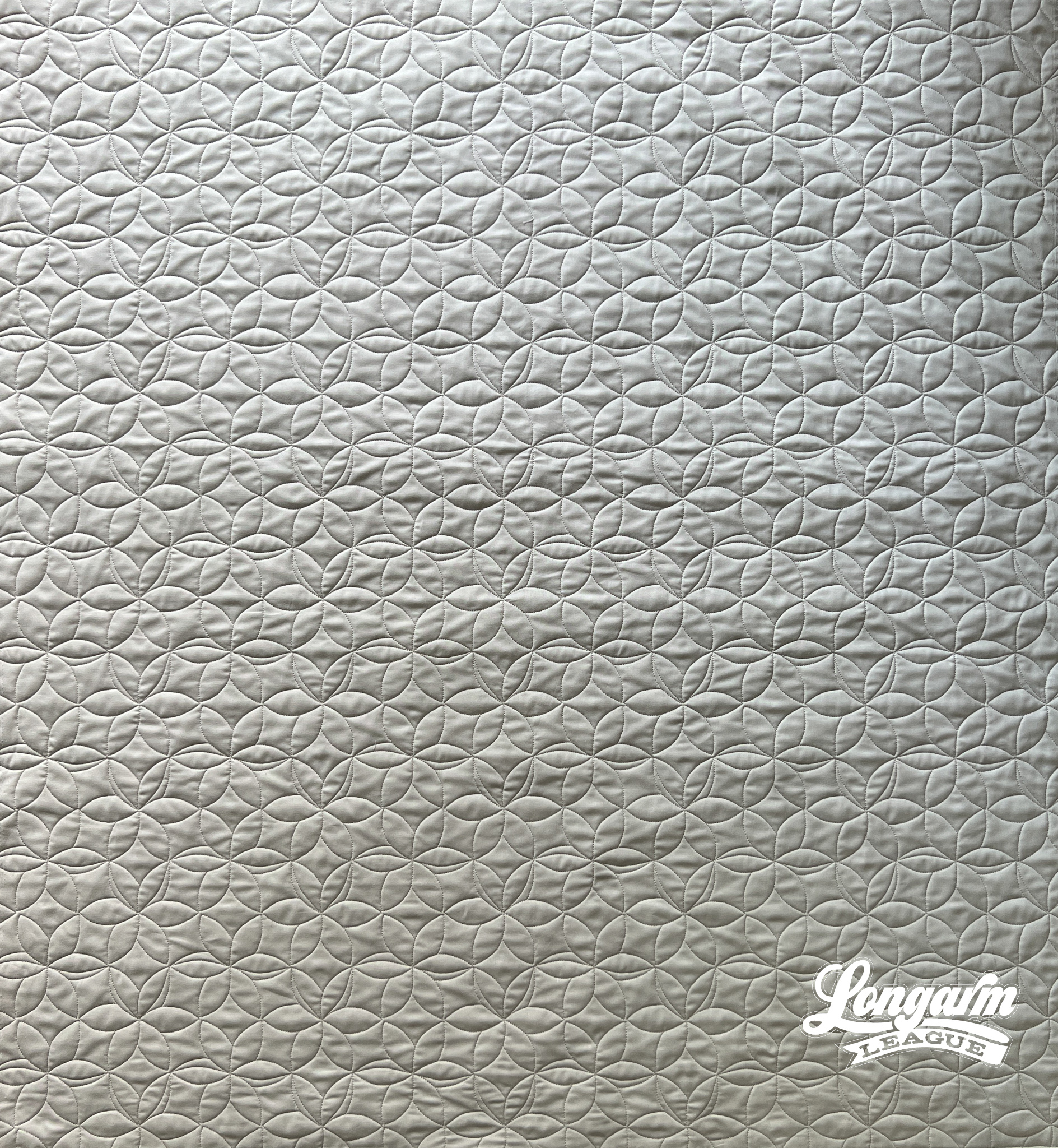
What I like about the design is the relative uniformity of the lines and spacing throughout the top. It just makes my heart happy. I like that it produces interesting texture that you don't have to think too much about. I like that it creates a background of pleasant arc-shapes that'll allow the focus to be on the piecing.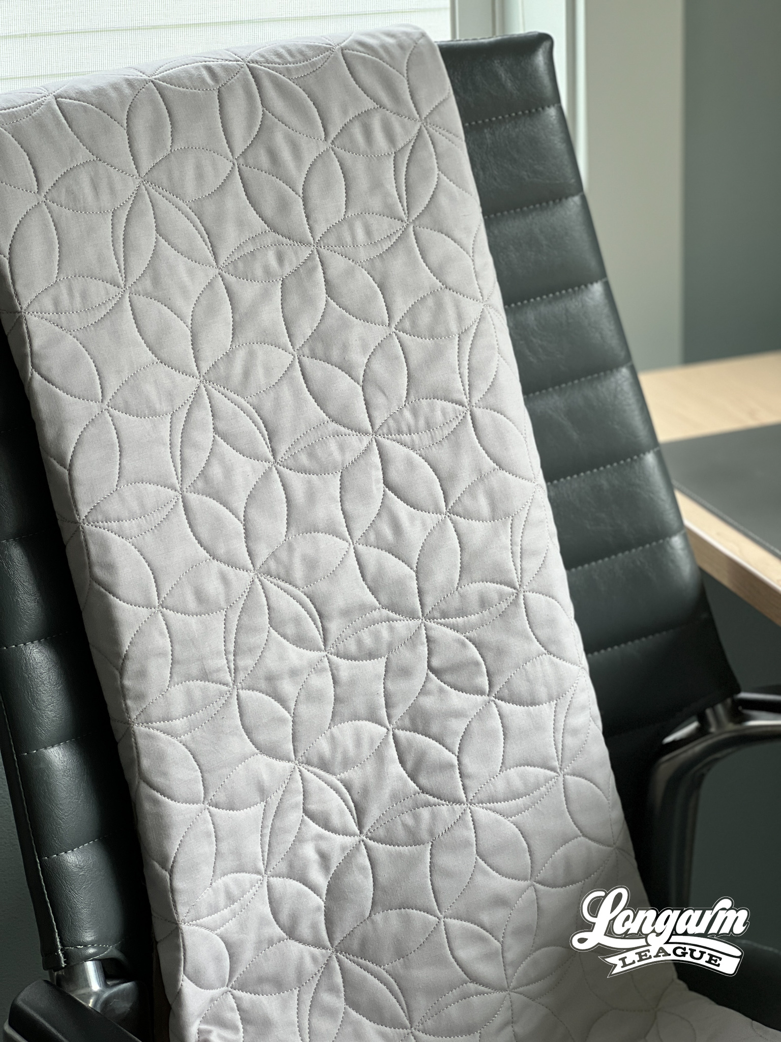
Floral themes are common in quilting in both the fabric selections available and in the quilt patterns themselves, so I like that this digital pantograph has a floral element that should compliment a floral top.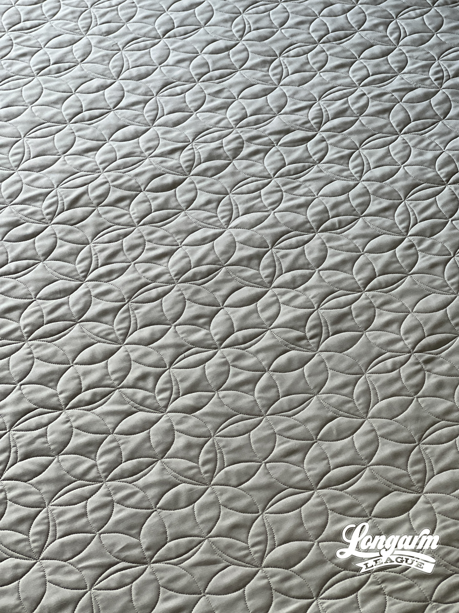
I also like that this design would pass as an interesting geometric element to enhance a quilt top that has no floral element...
Goth 2 Boss Digital E2E Quilting Design
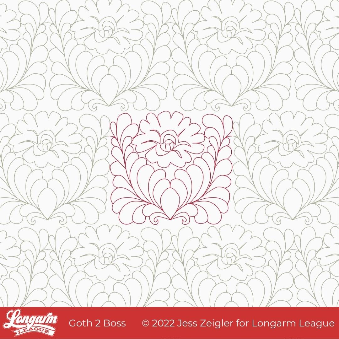
I feel like I owe you an explanation for the name of this design. That will be coming soon.
But first, I thought I'd tell you the inspiration behind it. Back in December of 2021, Josh and I were watching the series called Landscapers that had recently premiered on HBO. It is based on a crime set in the 1990s in England. The series is visually moody, drab, and dark. There's a scene in an upstairs bedroom that had deep red, ornate wallpaper and I found myself asking Josh to stop and go back to a frame that showcased the wallpaper better.
This is what caught my eye.
While it's definitely not the same, this was my first sketch from the inspirational wallpaper:

After playing around with the design a number of times on my reMarkable tablet, I slowly let the feathers get plumper and more prominent as part of the design, allowing me to fill in the space more evenly while keeping the floral center.
Here's how the design evolved as I was sketching: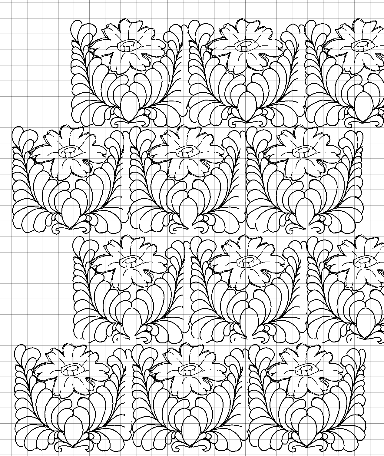
When it comes to feathers,...
May Flowers Digital Quilting Design
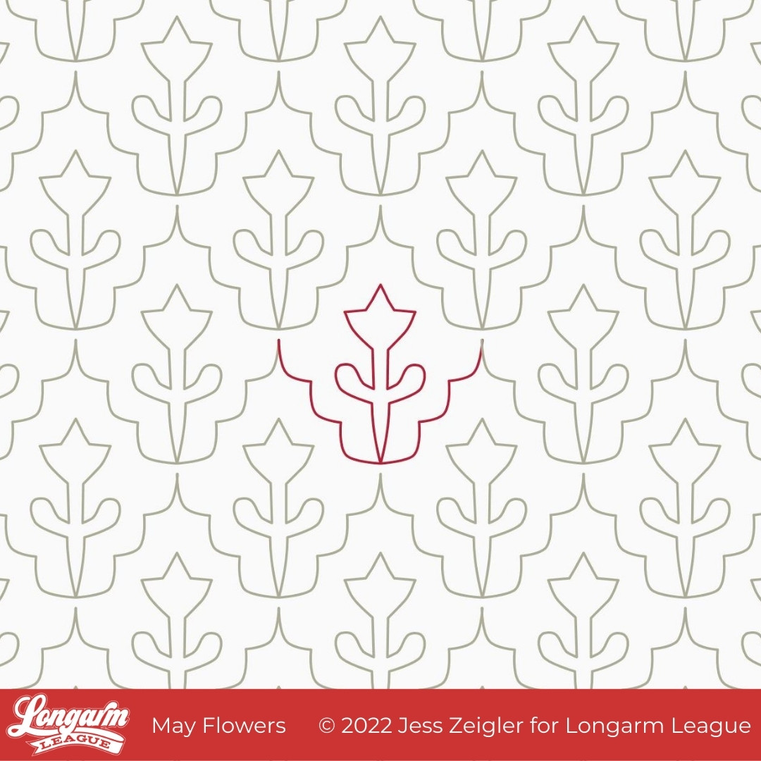
You know what they say about April showers... they bring May Flowers!
April was a dreary, wet month where I live in Central Iowa and it's actually continuing into the first few days of May. But we have hope that sunshine and flowers will appear very soon!
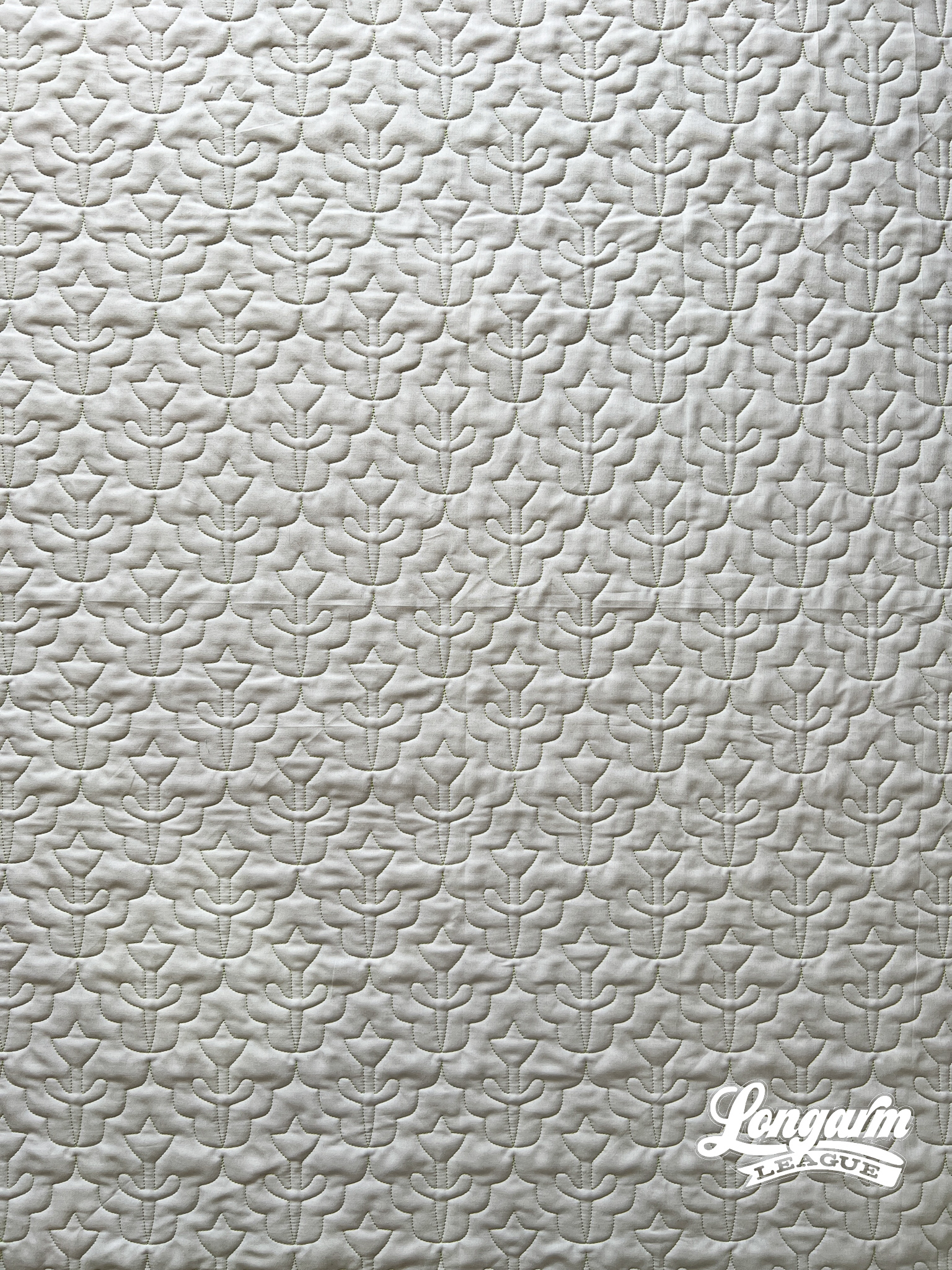
I really love Scandinavian design and I hope that comes across in this simple tulip-esque pantograph. To jazz it up just a bit, I added a scalloped edge to the repeat. It should be a great choice for the upcoming spring quilts in your queue.
May Flowers could be used both on traditional and modern quilts—the scale is adaptable, as well. I'll give you my details for this sample below.
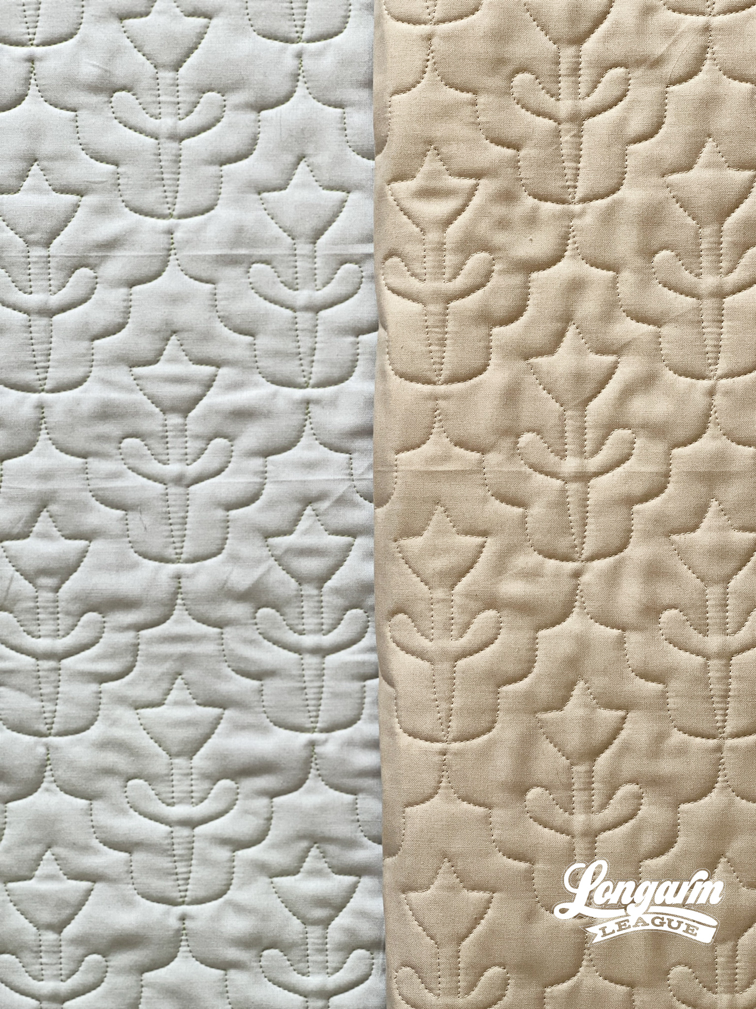
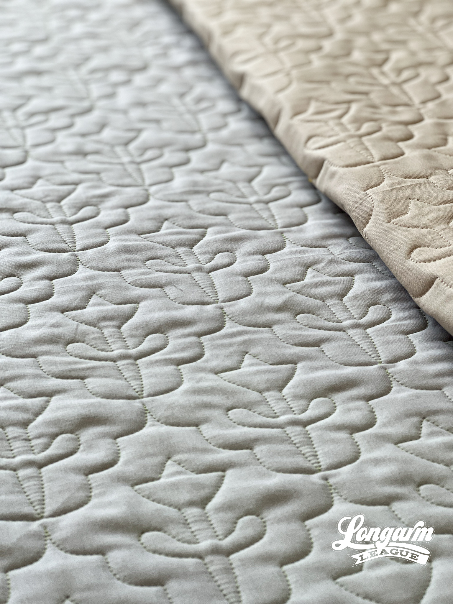
Here are my specifics using a baby-sized sample in the photos (45" x 45" quilt size):
Row height: 3"
Gap: -1"*
Pattern height: 4"
Offset: 50%
Backtracking: none
*Gap refers to the space I'm allowing between rows. I use an Intelliquilter for my computerized quilting, and because that measurement is quantifiable, I provide it here.
The row h...
Thread Garden Digital Pantograph

I'm going to be honest and let you know that this is likely the only whole garden you'll ever see me cultivate. The two "plants" I have in my house are plastic. I tell myself it's because of the naughty cats.
I know, I know! So many quilters also love to garden, so I feel like these are fighting words. But, I gotta be me!
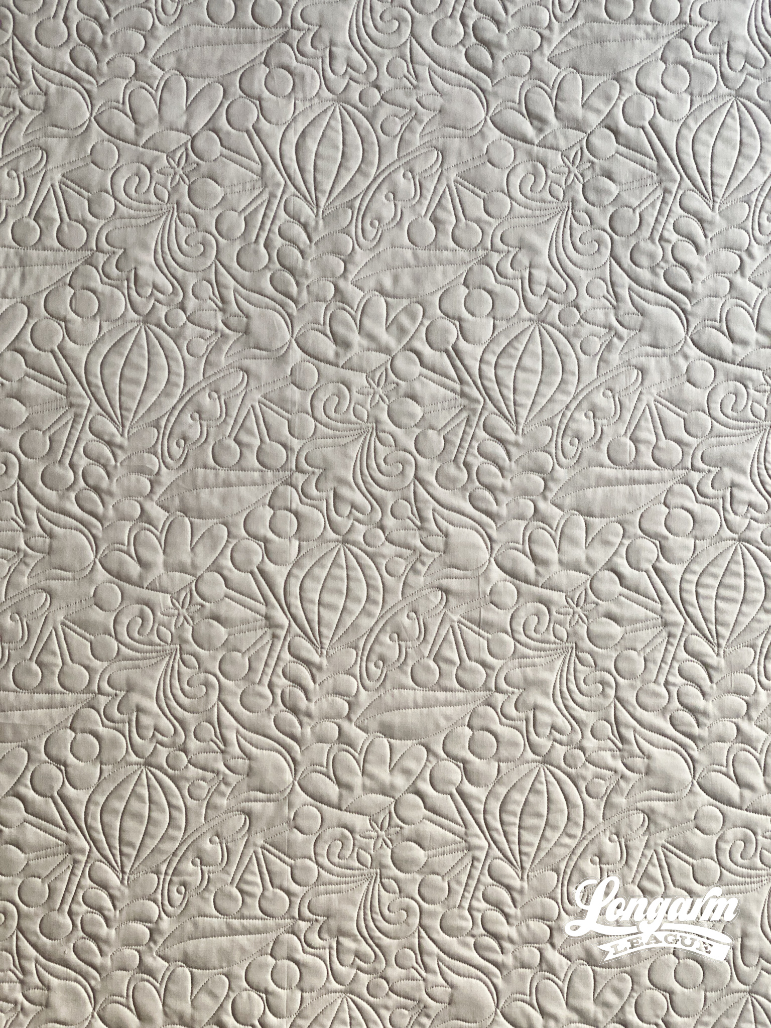
I was captivated by the idea of making fanciful floral shapes that looked "illustrated"—if you will—with no particular directionality.
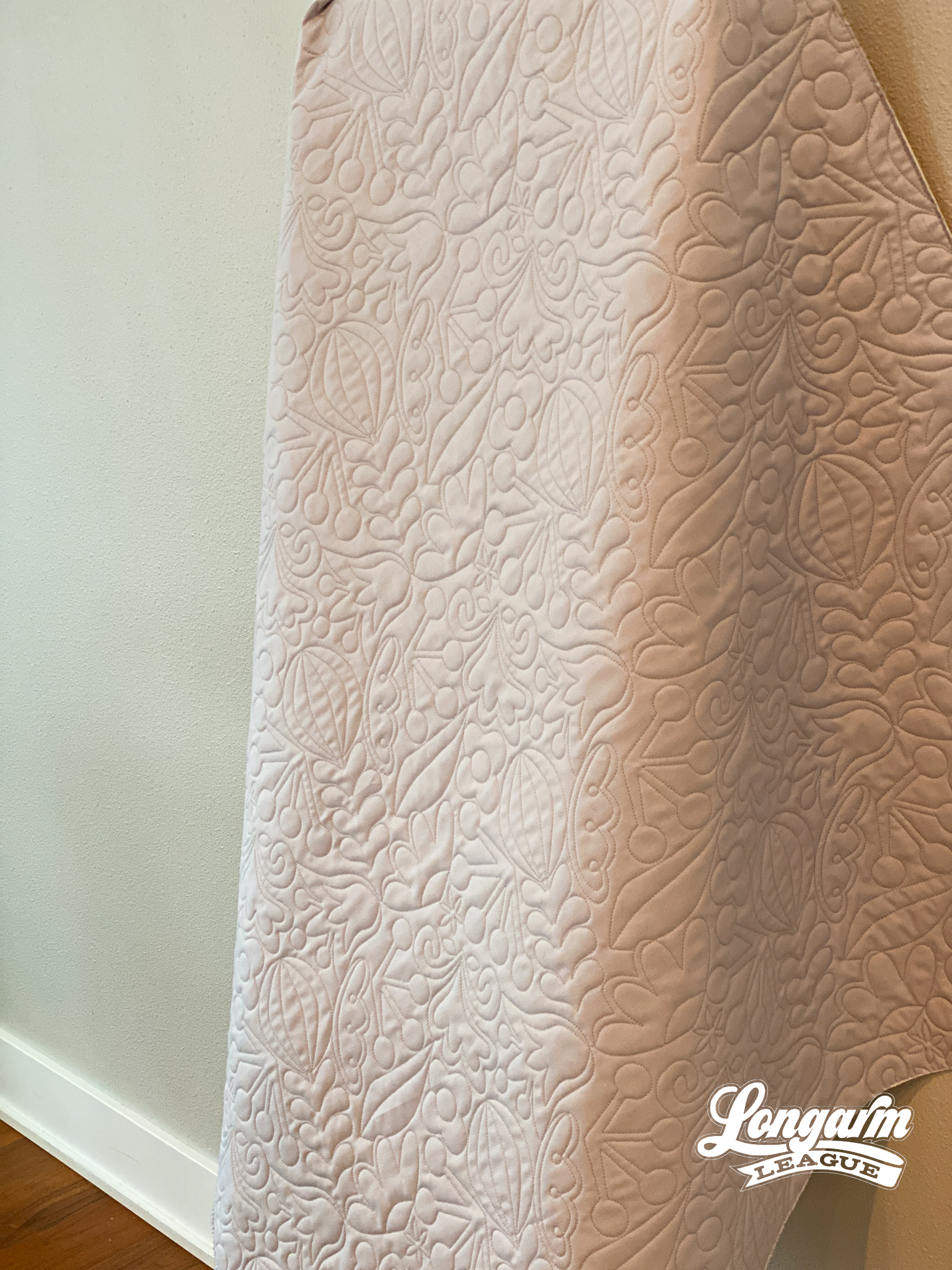
I think this design would look great on quilt tops for kids, or for modern tops, or even quilt tops with a Scandinavian theme, if you'll allow me to get super-specific about it and my influences.
I'll also state the obvious and say this digital pantograph design could also be great with floral-themed quilts! Or with quilts using a lot of solid fabrics or negative space. You know... to add some extra interest and texture.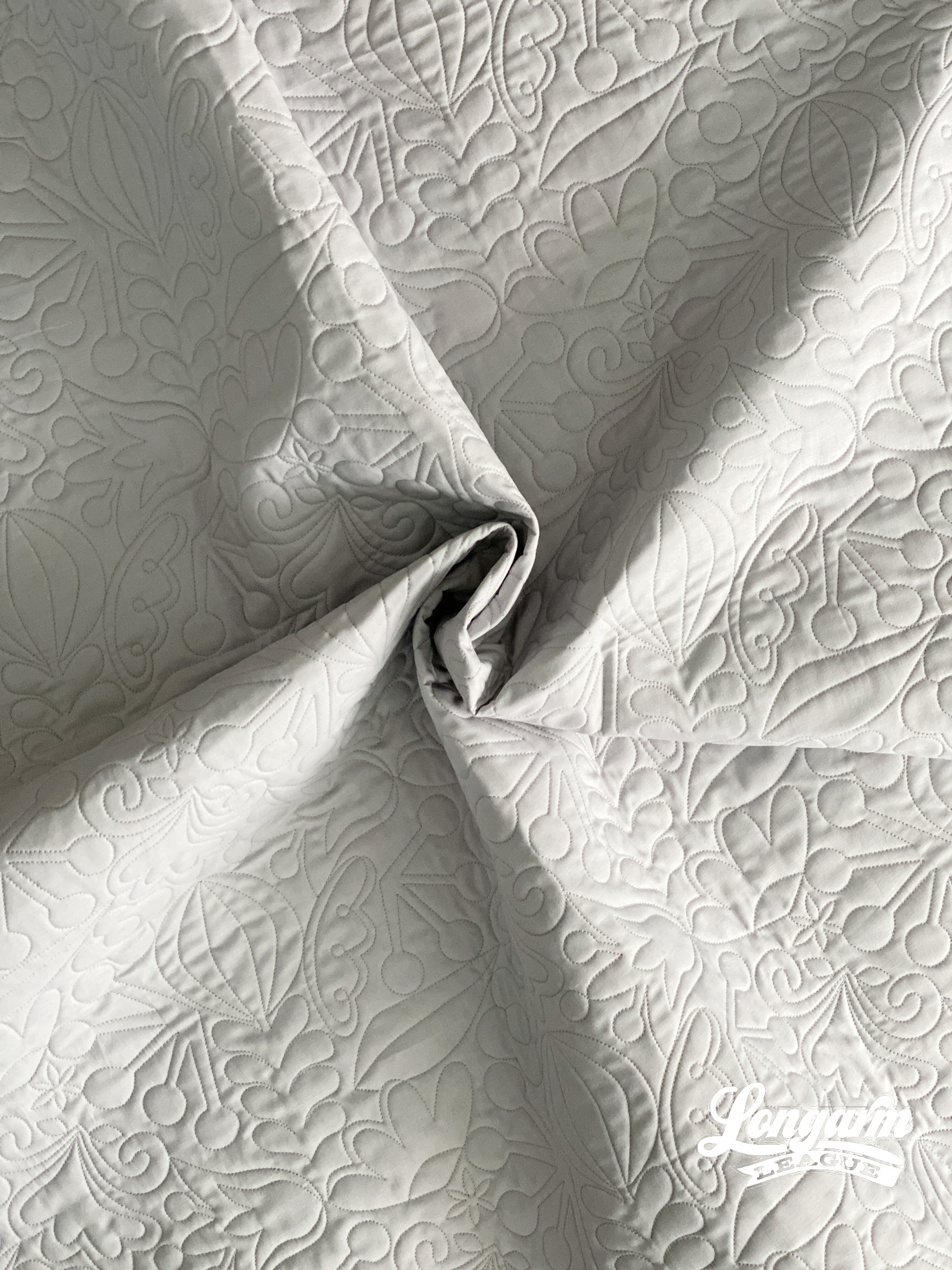
As a digital pantograph designer, I like to disguise "hard rows" whenever possible. I experimented wit...
