
Trace Digital Edge to Edge Quilting Design on a Cake Dash Quilt
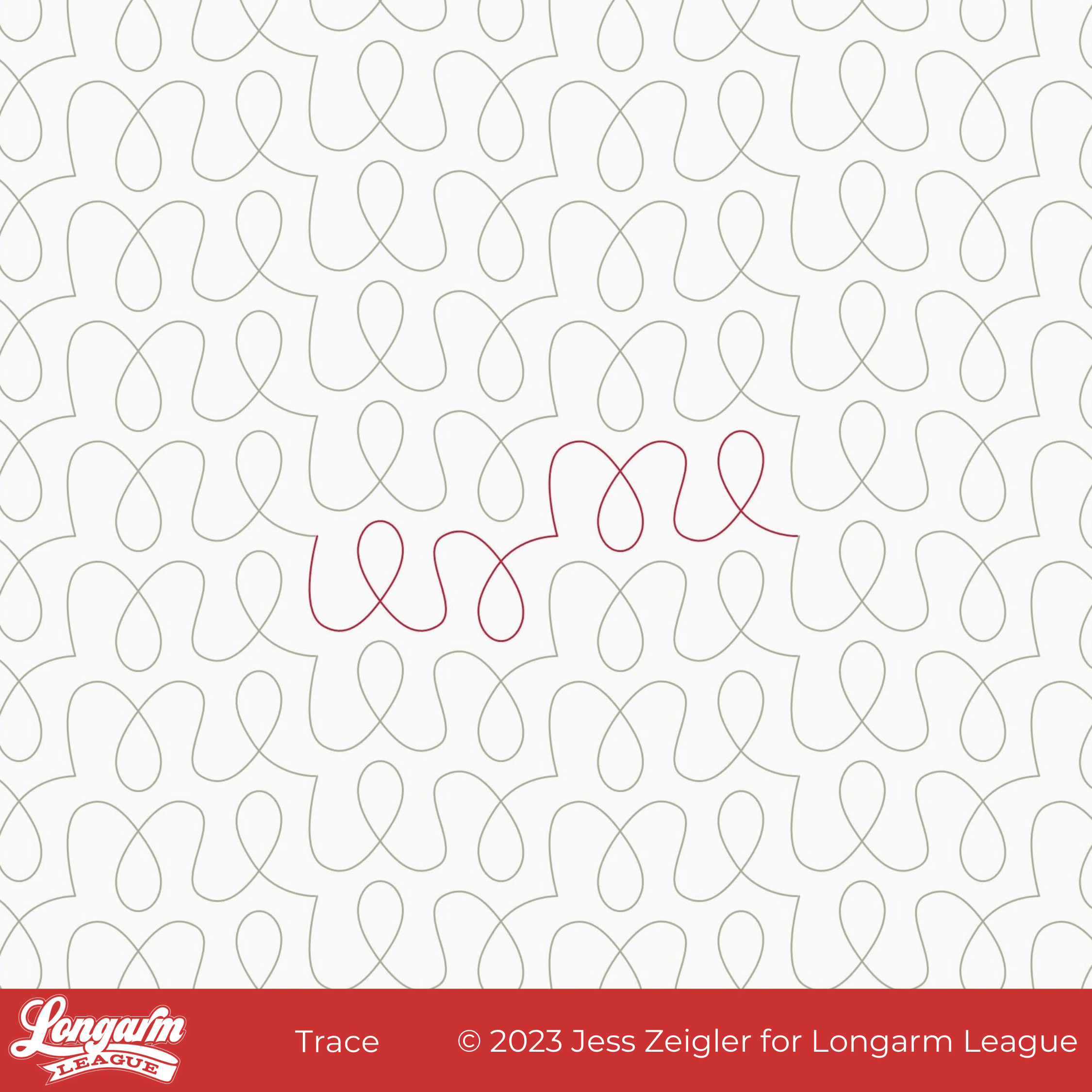
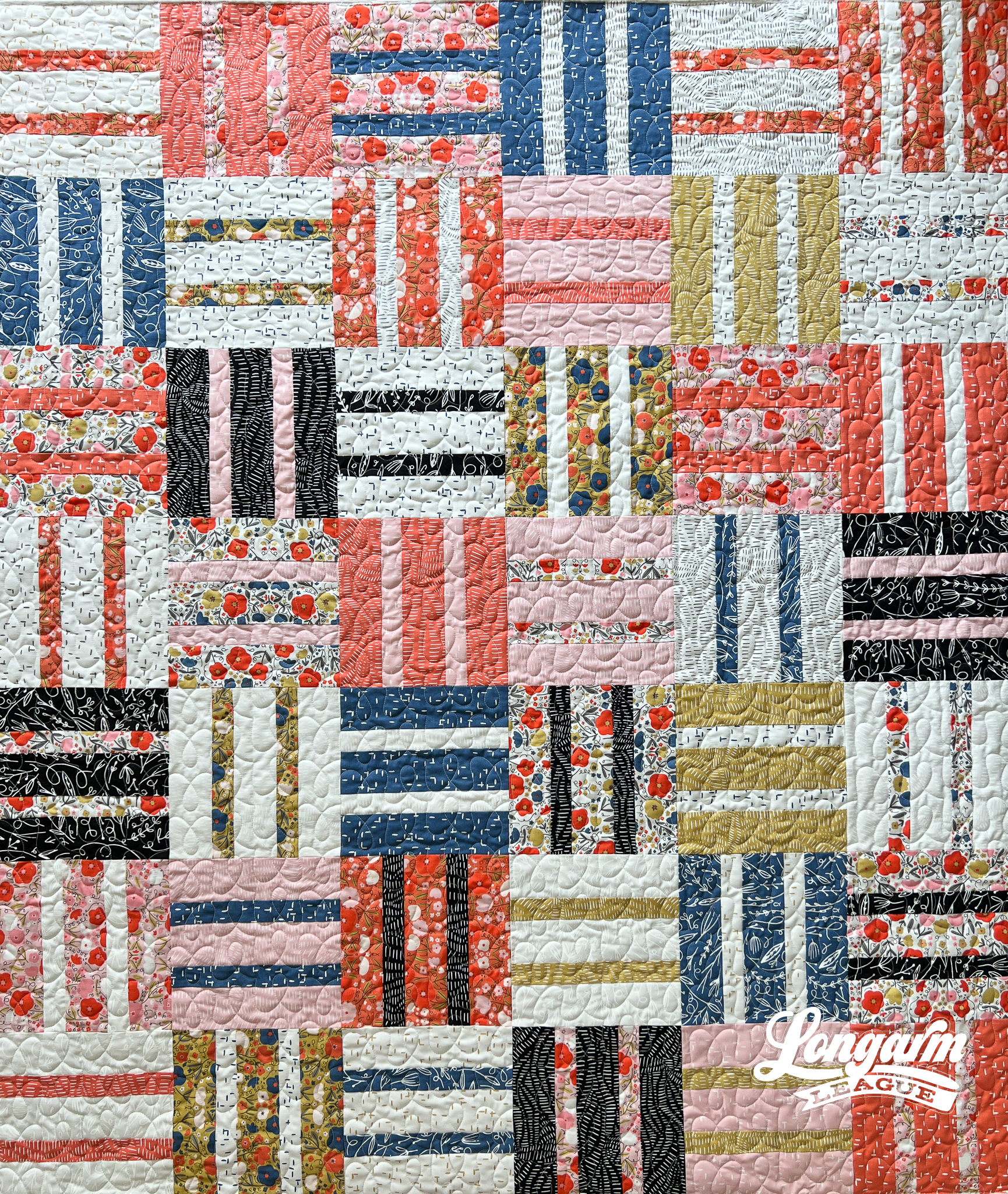
Trace is a digital quilting design that's built for speed!
Do you ever get quilts that come through your studio for quilting with fabrics that are so busy that you know any quilting you do will barely show up?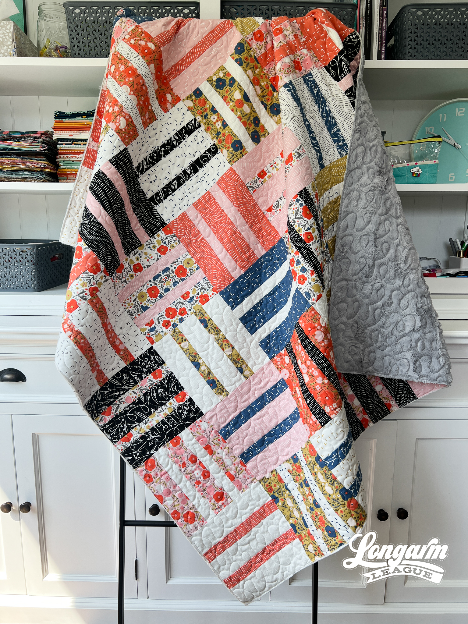
Quilts with busy fabrics would be the perfect use-case for a quick pantograph like Trace.

You'll get a sense of loops and multidirectional curves, but it's meant for providing background texture and does not need to be the star of the show.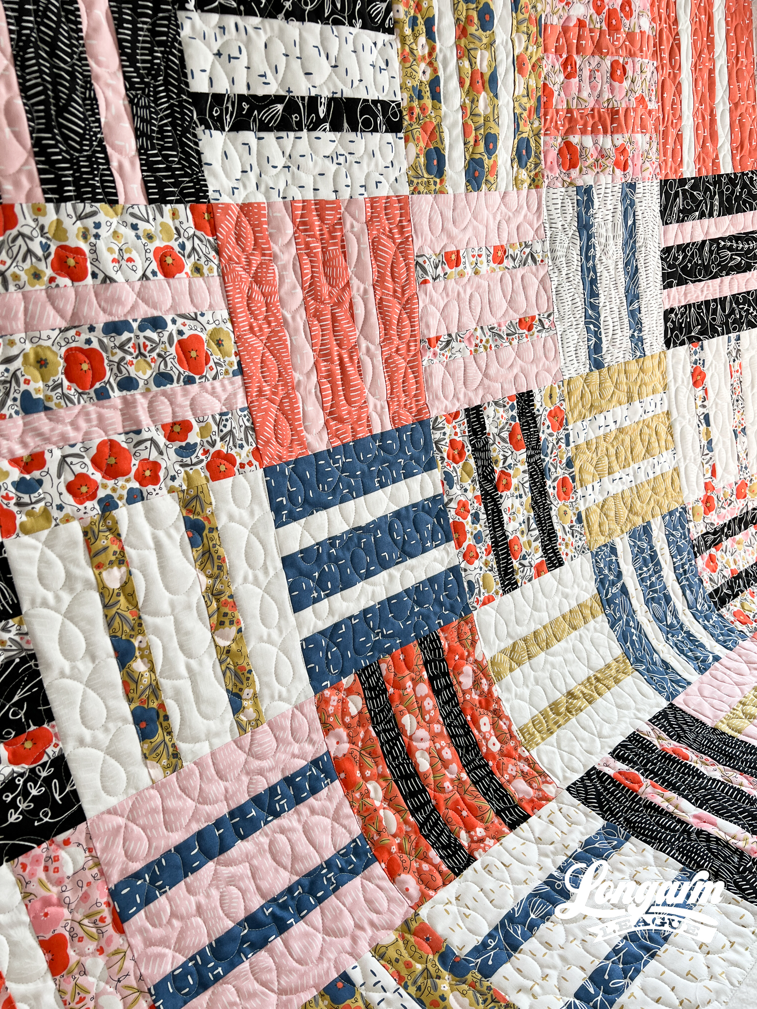
Through the design process, I thought these simple loopy shapes reminded me of practicing D'Nealion when I was in elementary school. Kids probably don't get this pleasure nowadays. ☺️

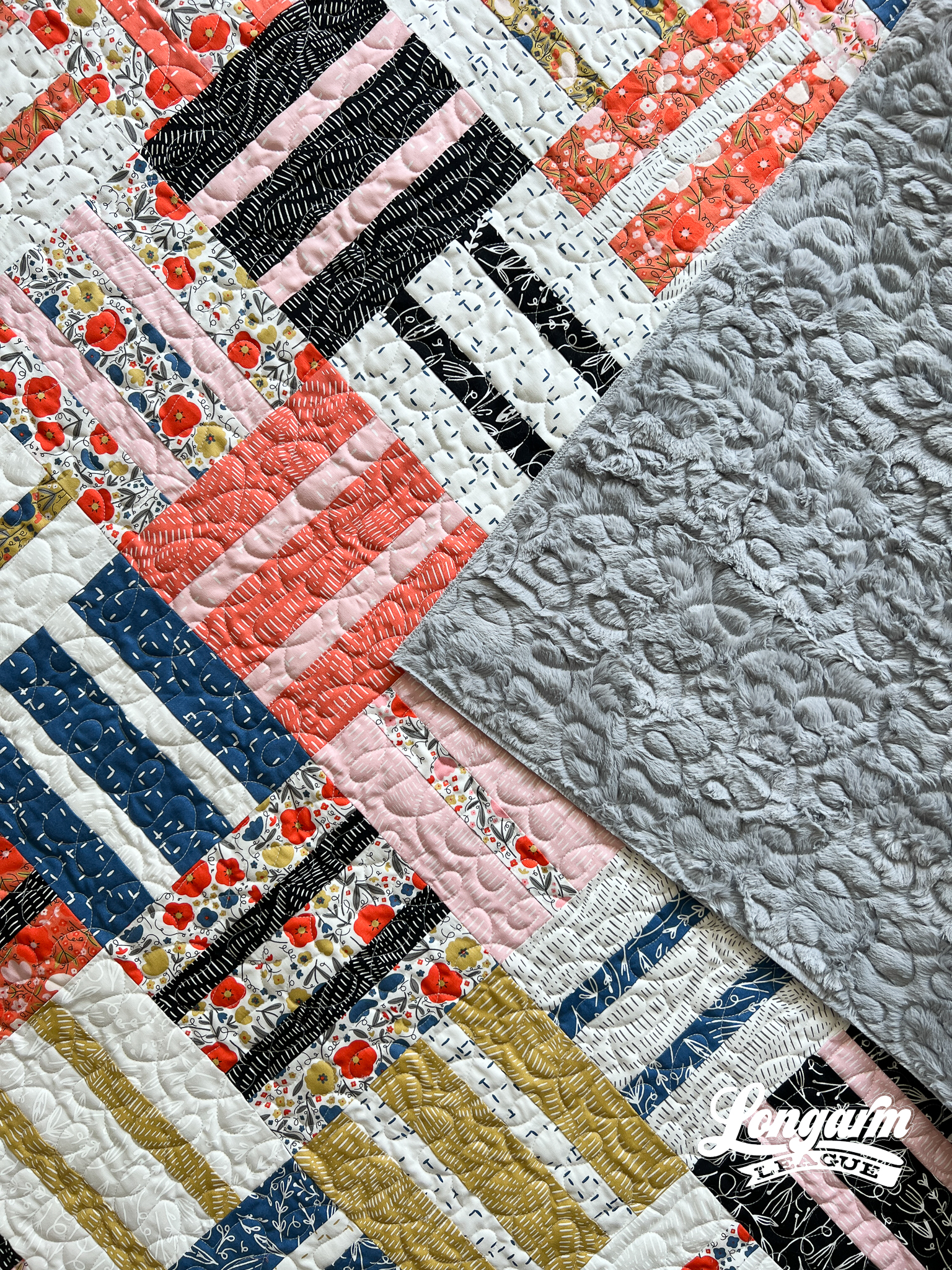
The Quilt
It's a common refrain by this point because it seems like I only finish projects while I'm at retreat! This quilt top is no different; I started and finished it while at the same retreat. It was super easy and lots of fun!
My friend Shelly of Ma Tante Quilting made a version of this same quilt pattern—Cake Dash by Emily Dennis of Qui...
Tread Lightly Modern Digital Quilting Edge to Edge Design on a Vintage Quilt

 Tread Lightly is named as such because of an embossed design I came across on Pinterest that looked like shoe tread... I don't think it was, but it very much could be, don't you think?
'Tread lightly' is also a key phrase used in a pivotal moment in the series Breaking Bad. Since we watched that series again with our teenagers recently, it was fresh in my mind. Oh boy—on the last watch-through, I really hated Walter White! But that's a topic for another day.
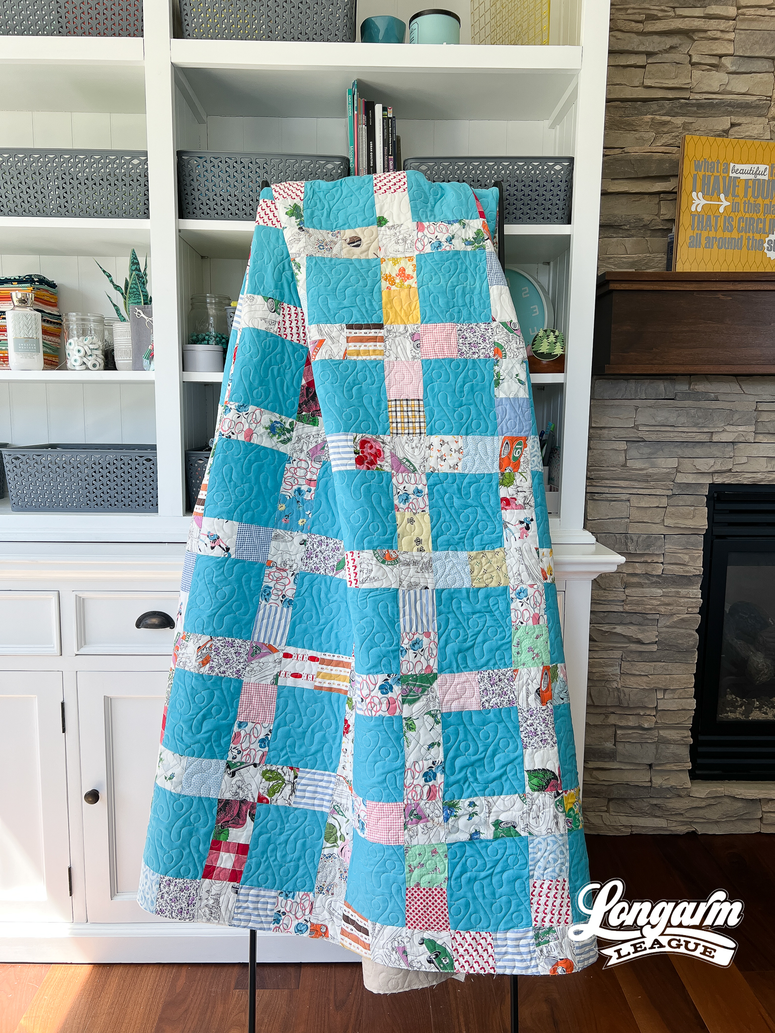
Oh yes, back to "shoe tread". This design is sort of like a simplified serpentine meander with a well-placed circle within each shape. The alternating blob directions—pointing up and then down—make for an interesting way to fill space and result in easy-to-nest rows.
It's always nice to have some wiggle room when realigning an edge-to-edge design.

The design is quirky and fun and would be great for kids quilts or any modern top. I was so excited to use it on this vintage top that was gifted to me—it very much fits t...
Seis Edge-to-Edge Digital Quilting Design on my Plaid-ish 2 Quilt
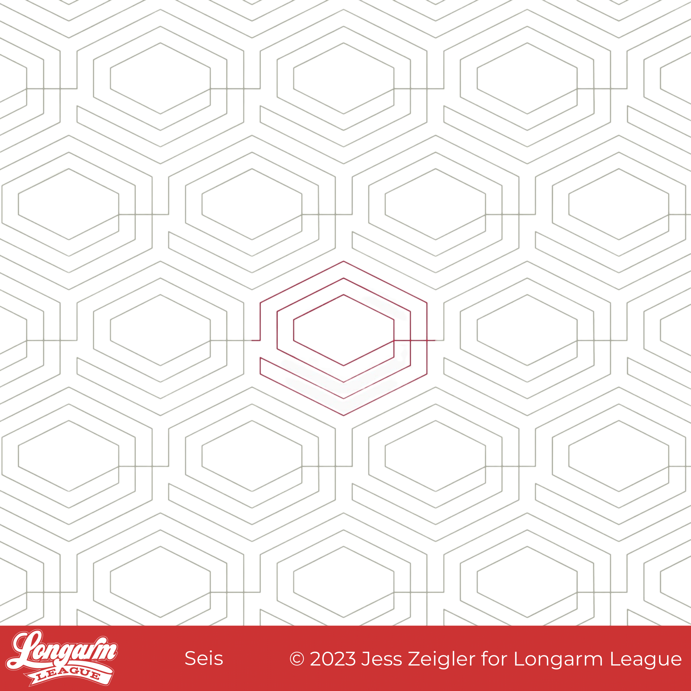
Seis is the word for the number six in Spanish. Based on this design's hexagon shape, I knew I wanted to name it something relating to the hexagon, but I haven't gotten far enough in Duolingo to know the name for hexagon en español yet, so Seis is where I landed.
Okay, Google tells me hexagon is hexágono in Spanish, but now it's too late! I've already committed to Seis.
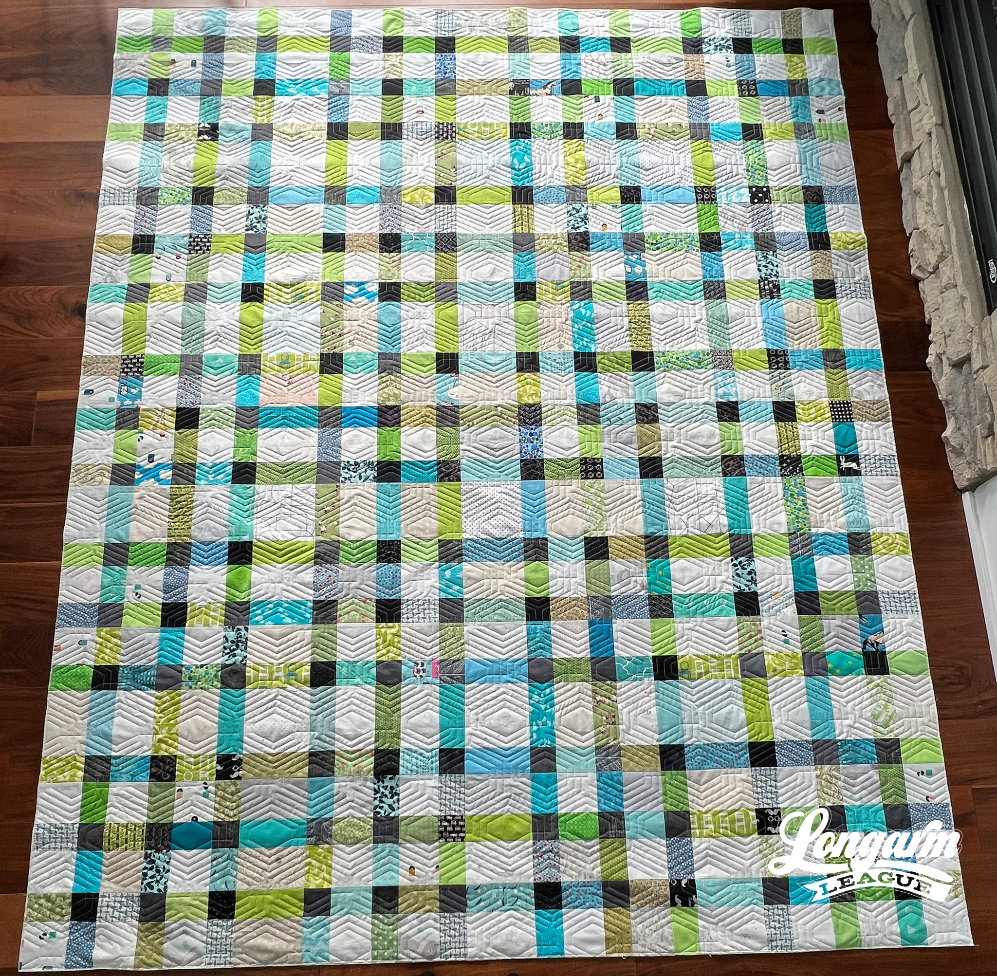
If you're on our email newsletter list, you might remember me talking about how obsessed I am with Duolingo. I am learning Spanish these days (streak of 57 days, nbd) to augment my high school Spanish education which started some 28 years ago. Ouch! It's one thing to recall the years since high school graduation, but it's another experience to count back to the time you began high school. I wasn't ready for that number!
Anyway, if you are interested in learning another language (they offer courses for 40+ languages), check out their website or download the app. They have a free tier, but I've found the paid f...
White Space Digital E2E Quilting Design
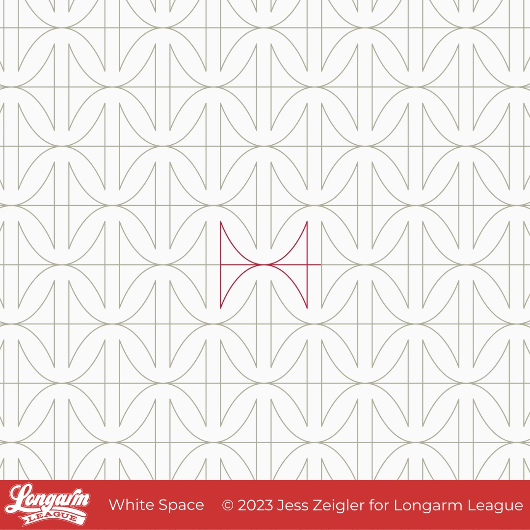
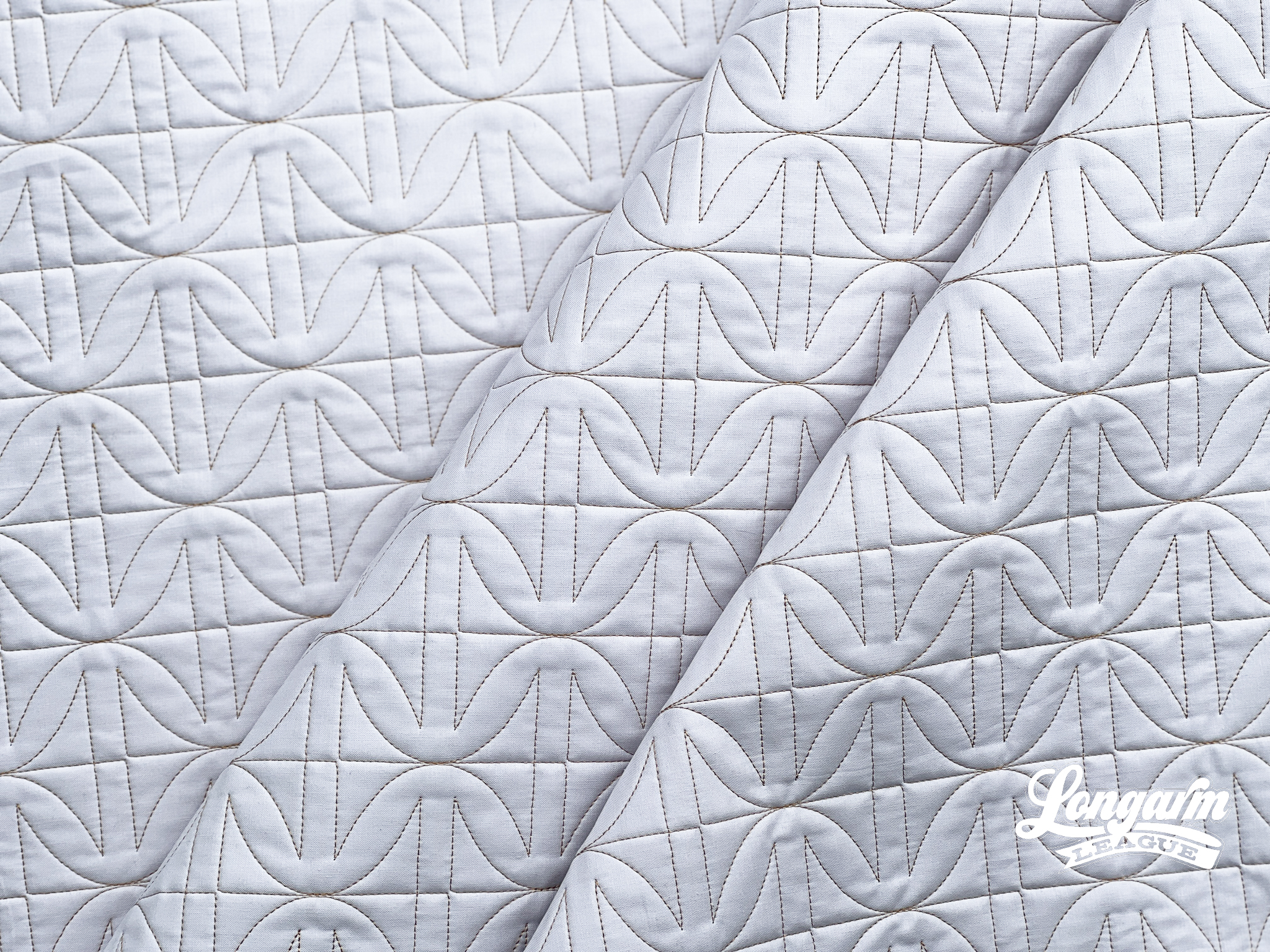
This design is all about the negative space—also known as white space—around the lines. I love how the curvy parts of the design are reminiscent of cathedral window blocks and how the straight lines create channels that provide some contrast to the curvy.

If I didn't design this and wasn't sure where the repeats were, it looks like it could be difficult to line up from row to row. That is definitely not the case! This design is very simple to stitch out. Every other row does need to be offset by 50%, but there is no exact matching necessary anywhere. 

If you stitched this design out on a quilt loaded on its side, you'd see results that play up hourglass or spool shapes. I also see asterisks and orange peel variations if I look at the pattern long enough! :) 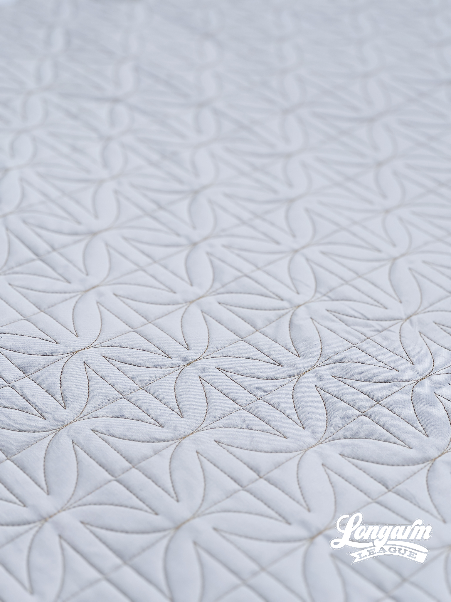

The Technical Details
A video of the stitch path appears at the top of this post. Again, it's a pretty straightforward and simple design with a fluid sequence. On the included PDF, I did indicate "minimal" over...
Wishbone Edge-to-Edge Digital Pantograph
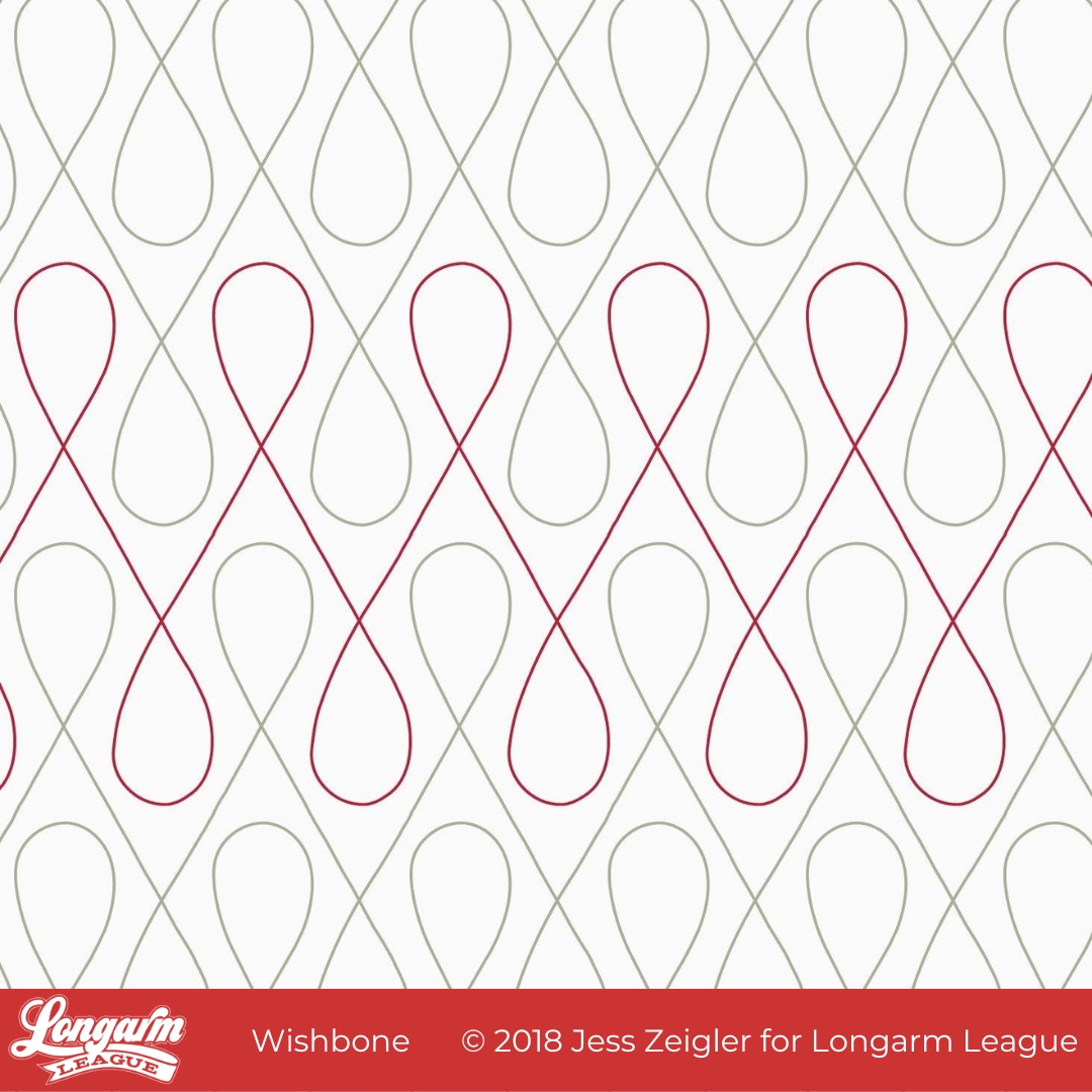
Wishbone History
Do you know how long I've been meaning to write a blog post about Wishbone? Well, I started this draft in August of 2020. The design was a few years old by that point.
Wishbone is the first design I ever released to the public in September 2019, mere weeks after the Longarm League membership started for the first time. I designed it the prior year due to the frustration of not being able to find a design simply referred to as 'Loops' by some Statler Stitcher owners I followed on Instagram.
I spent hours combing the Internet with the intent to buy the looped design, but resorted to making a version of my own when I couldn't locate it. This gave me a chance to use my Intelliquilter's editing tools to create the must-have elements that I wanted: 60º angled lines and meaty "teardrop" shapes that would nest with the rows above and below.
The resulting design lived on my tablet for a long while until I bought Art and Stitch software and was able to export it, s...
Sketch Digital Pantograph Quilting Design
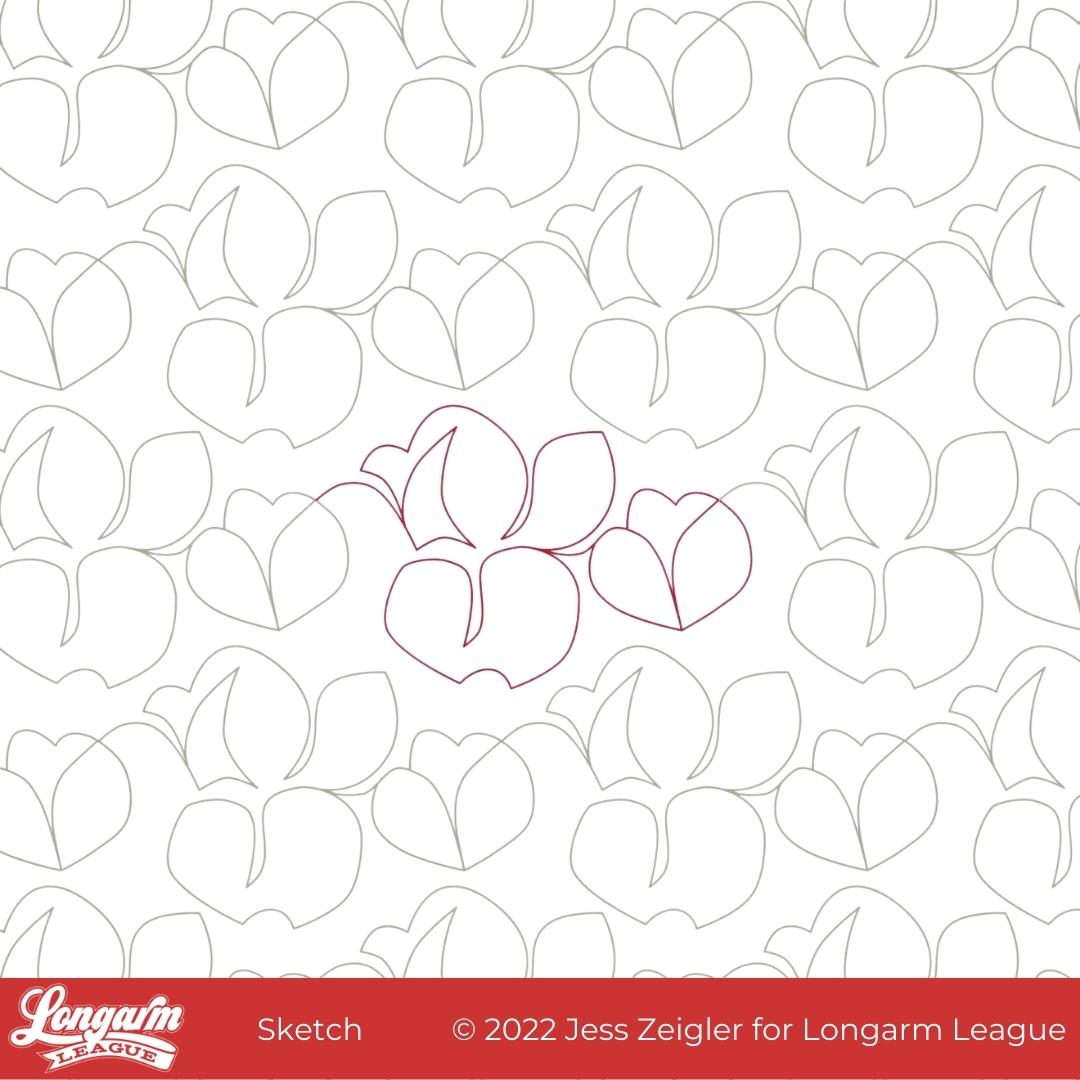
This is Sketch! Up until very recently, I'd planned to name it Cottonwood but when I discovered that's already another designer's pantograph name (with a related hashtag). I decided to go off-script and name it something unique.
The only trouble with having a really abstract design that could look like one hundred things and also nothing? Naming was hard. Why does it seem that I either have great name right away or I'm stress-listing stream of consciousness options and calling on friends and family for help? There's no in-between!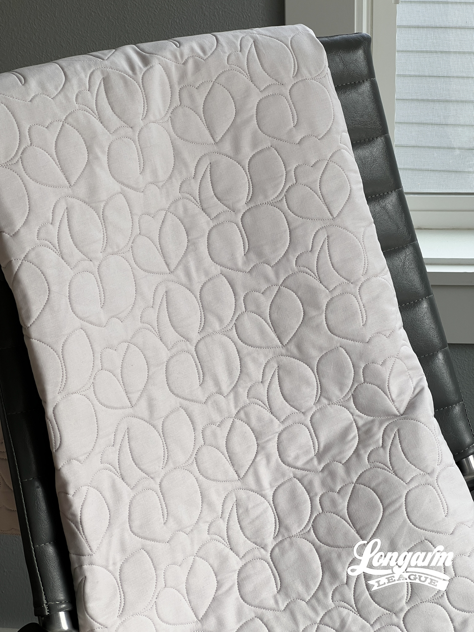
What I like about this design is that it's much more abstract and off-kilter than designs I normally create. There's a fun energy to this design—a bit folksy and quirky. I'm ordinarily not one to use negative space when it comes to pantograph designs, but I have to say that I like the organic-looking spacing of the motifs between the rows with this design. It looks more free-flowin', like a sketch!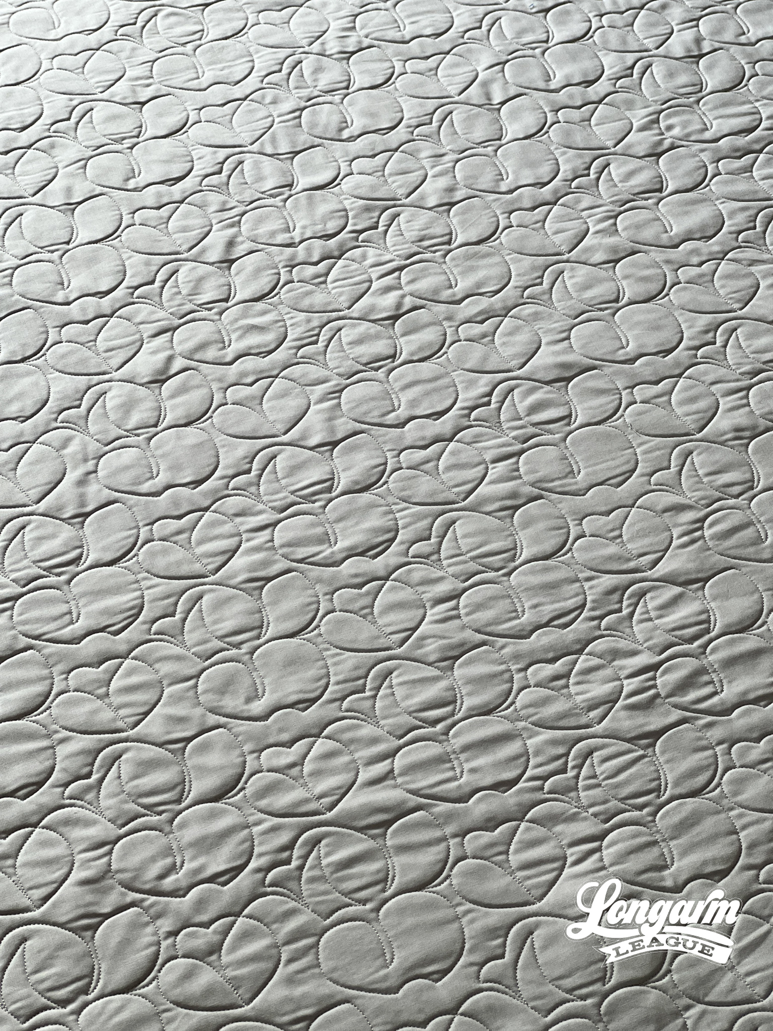
I also like that the overall texture reads as ro...
Pretty Petals Digital Quilting Design
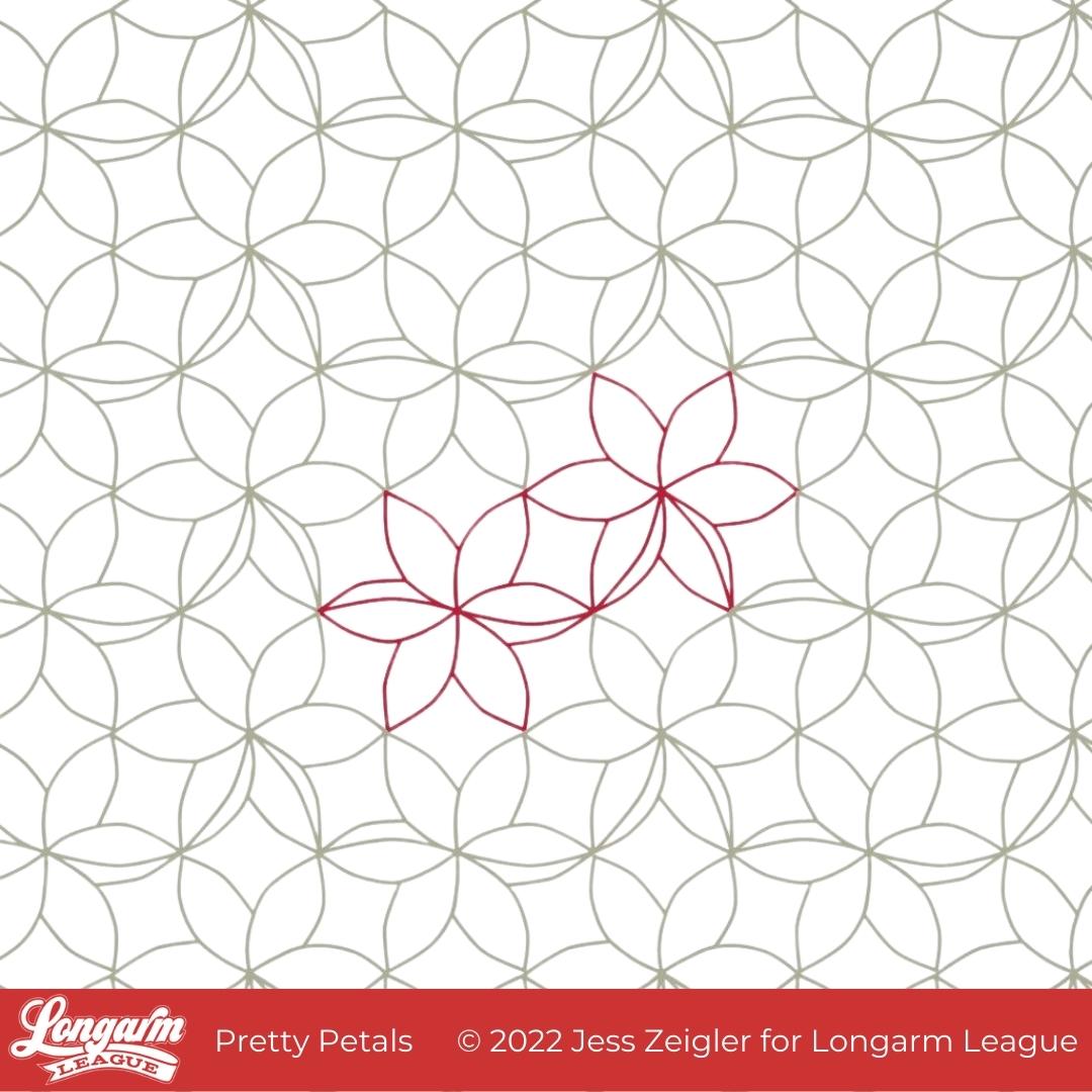
I'm glad the time has come to release Pretty Petals into the world! As a designer, I can't help but have varying levels of excitement about the designs I work on. I'm sure this is totally normal with any creative job. I can't say this is my favorite design ever, but it's up there because of the overall texture it creates! 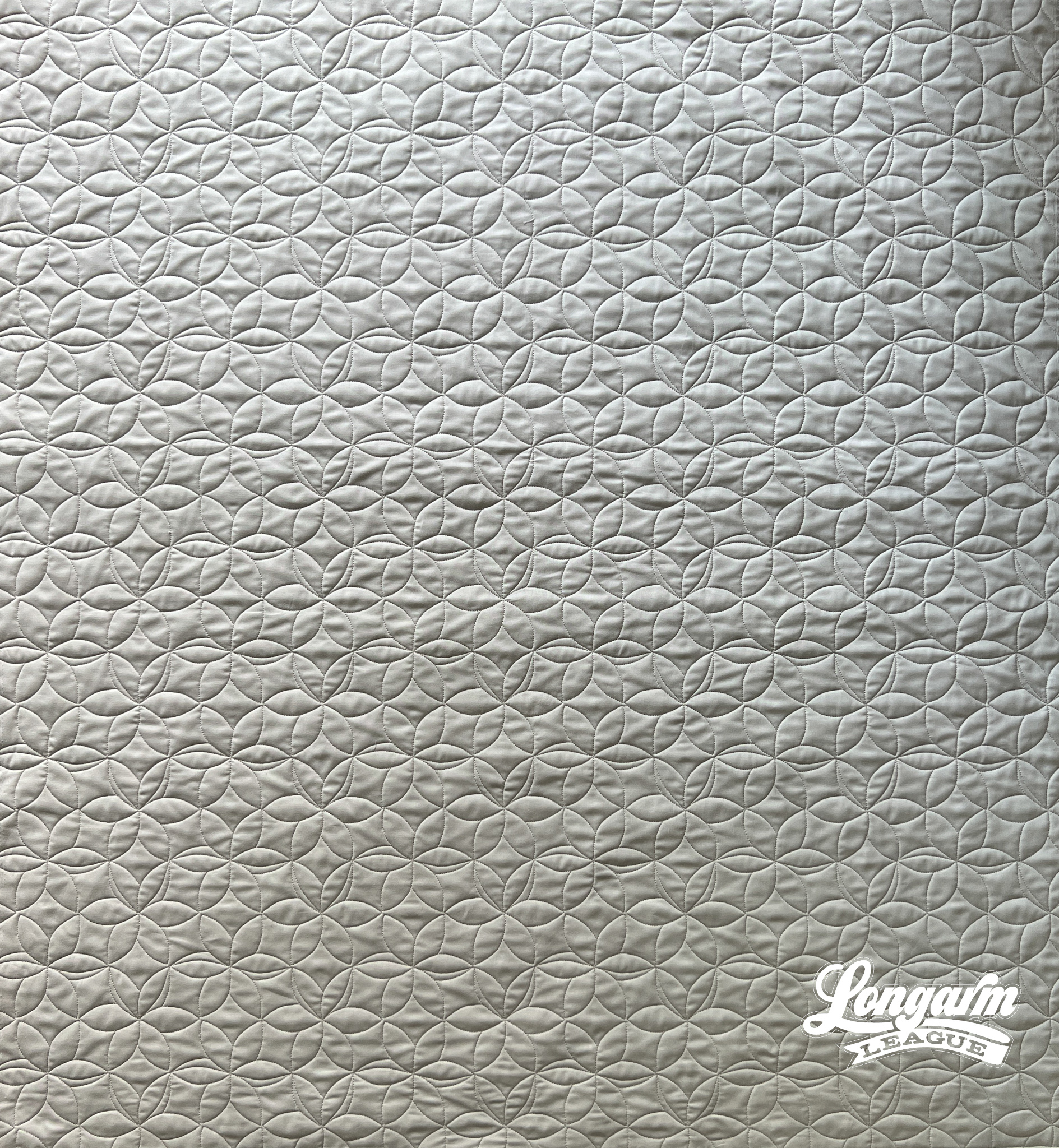
What I like about the design is the relative uniformity of the lines and spacing throughout the top. It just makes my heart happy. I like that it produces interesting texture that you don't have to think too much about. I like that it creates a background of pleasant arc-shapes that'll allow the focus to be on the piecing.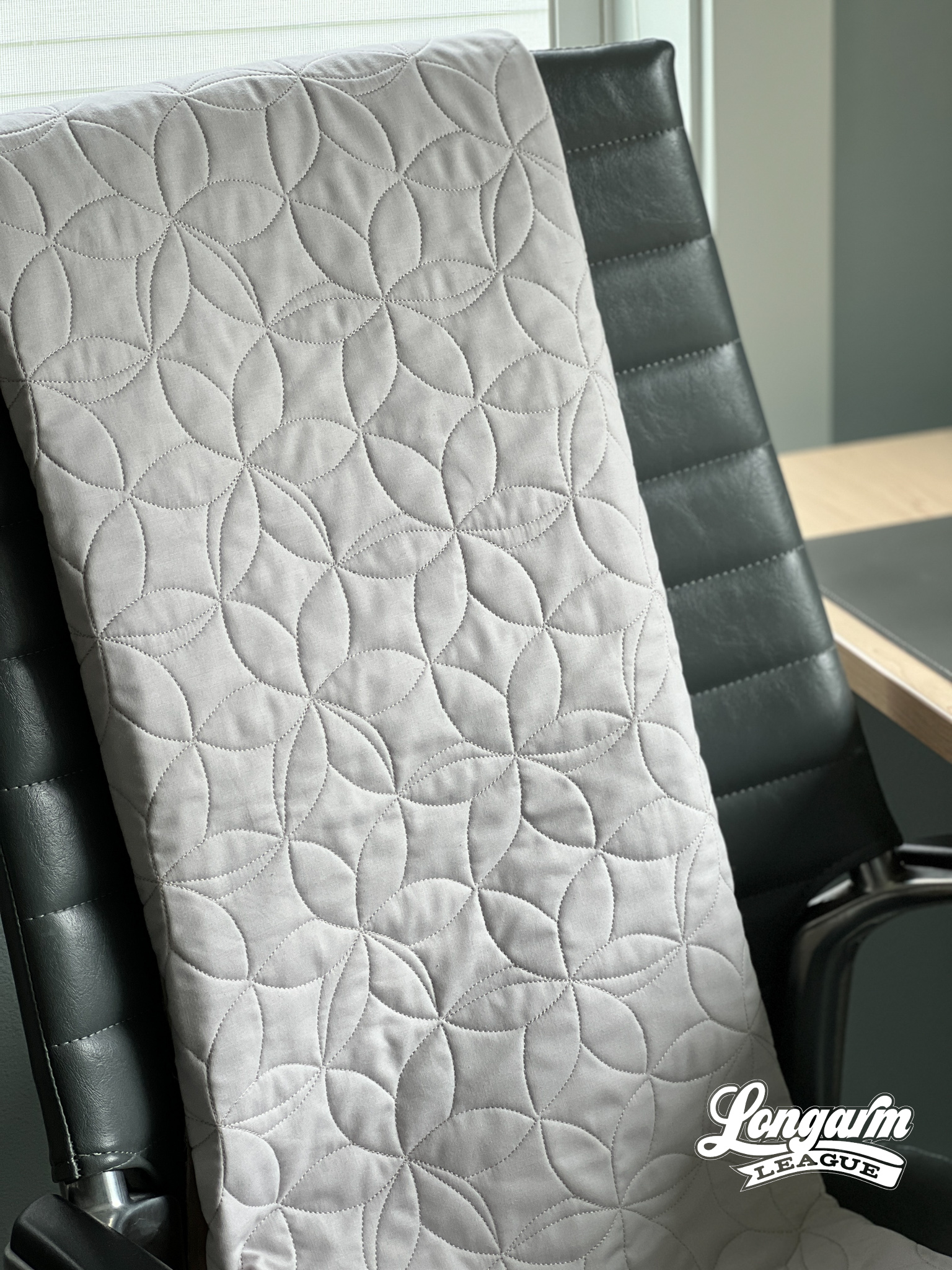
Floral themes are common in quilting in both the fabric selections available and in the quilt patterns themselves, so I like that this digital pantograph has a floral element that should compliment a floral top.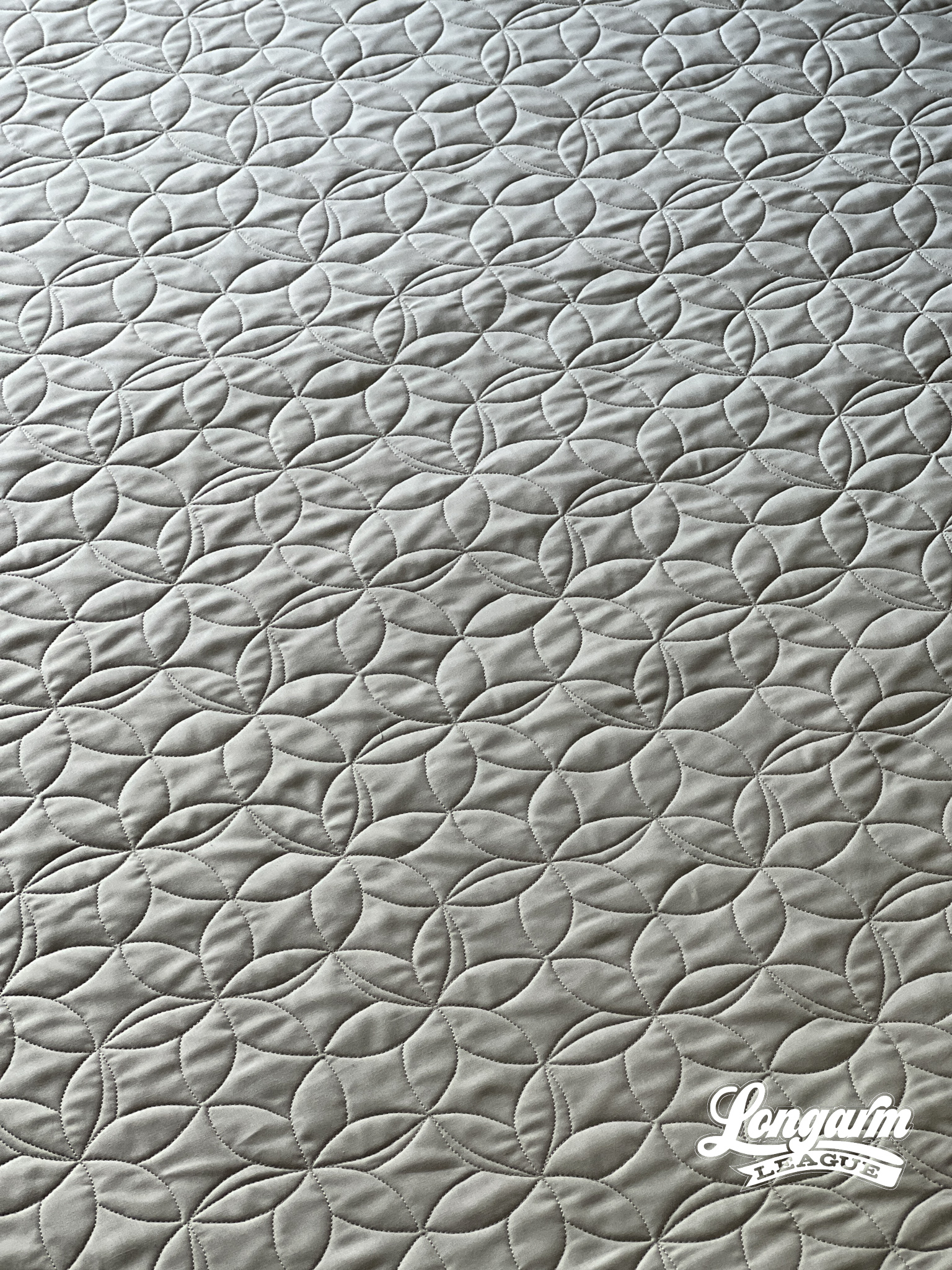
I also like that this design would pass as an interesting geometric element to enhance a quilt top that has no floral element...
Volunteer E2E Quilting Design
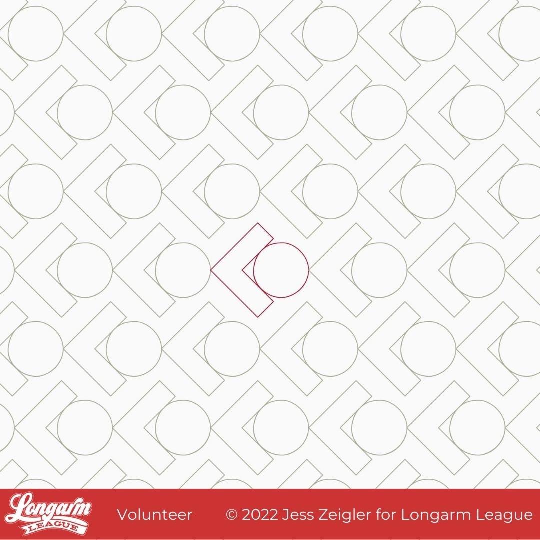
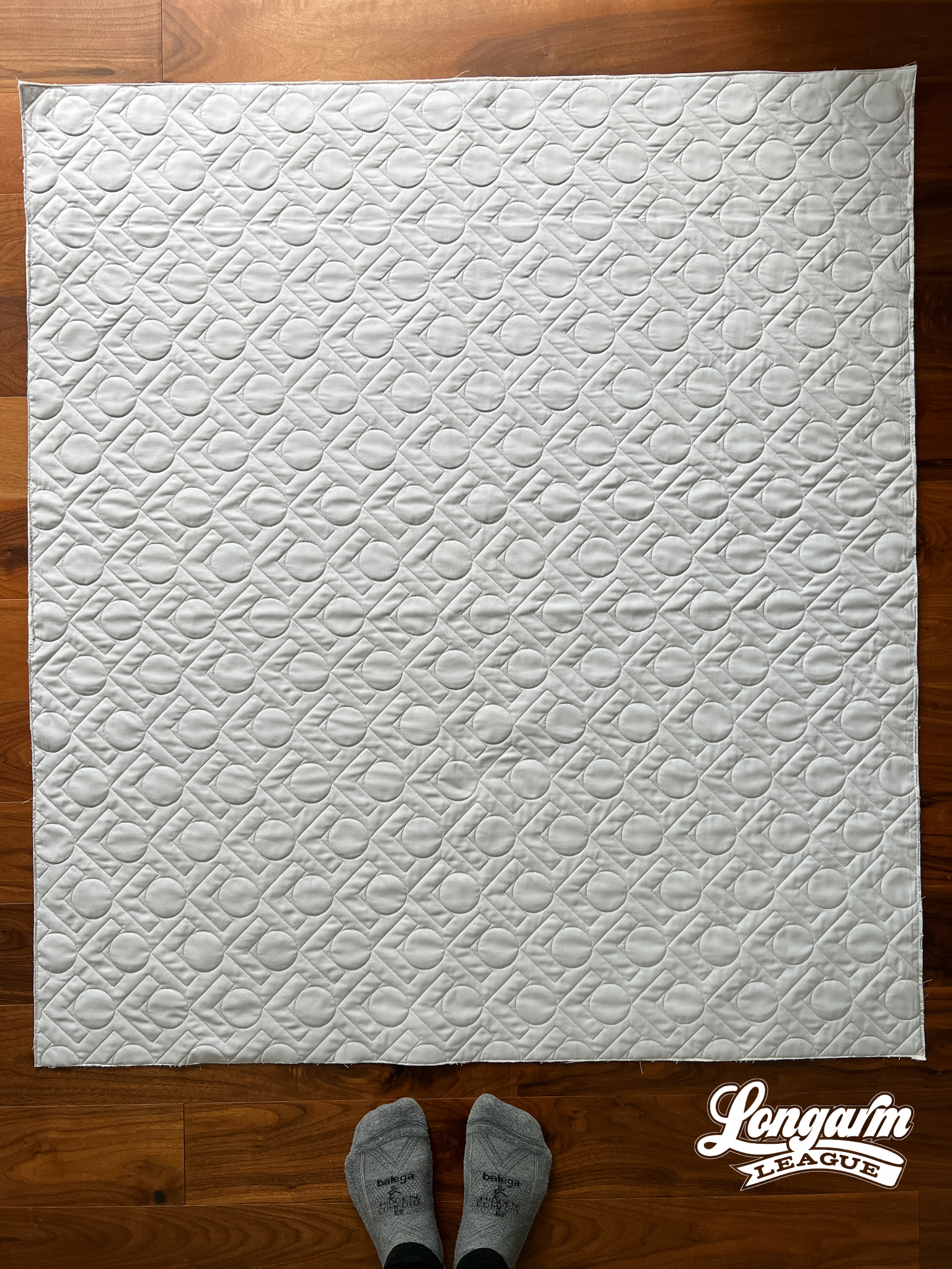
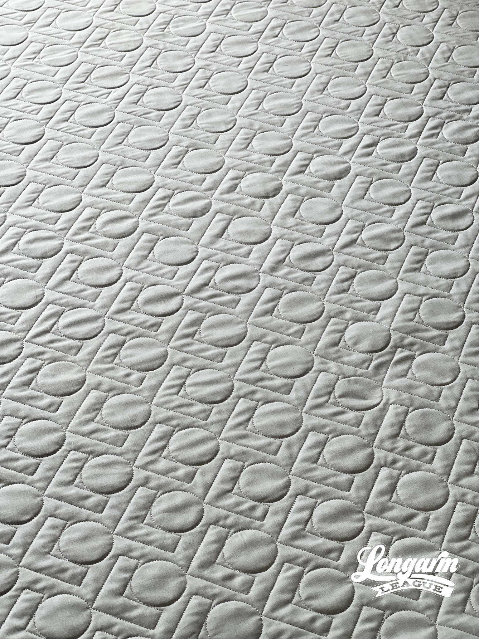
Volunteer is a simple, uncomplicated edge-to-edge quilting design meant to create an interesting and bold texture.
In fact, 'Bold' was the working title of this design as I was saving and re-saving different options along the way. I also briefly considered naming it Lots of Love, but thought that might be too confusing. It looks a bit like LOL, and in the early days of the Internet, people on message boards couldn't decide if LOL stood for Laugh Out Loud or Lots Of Love. 
In the end, I thought Volunteer works as a name because it looks like a person raising their hand. And I like one word names that haven't already been used for other E2E designs.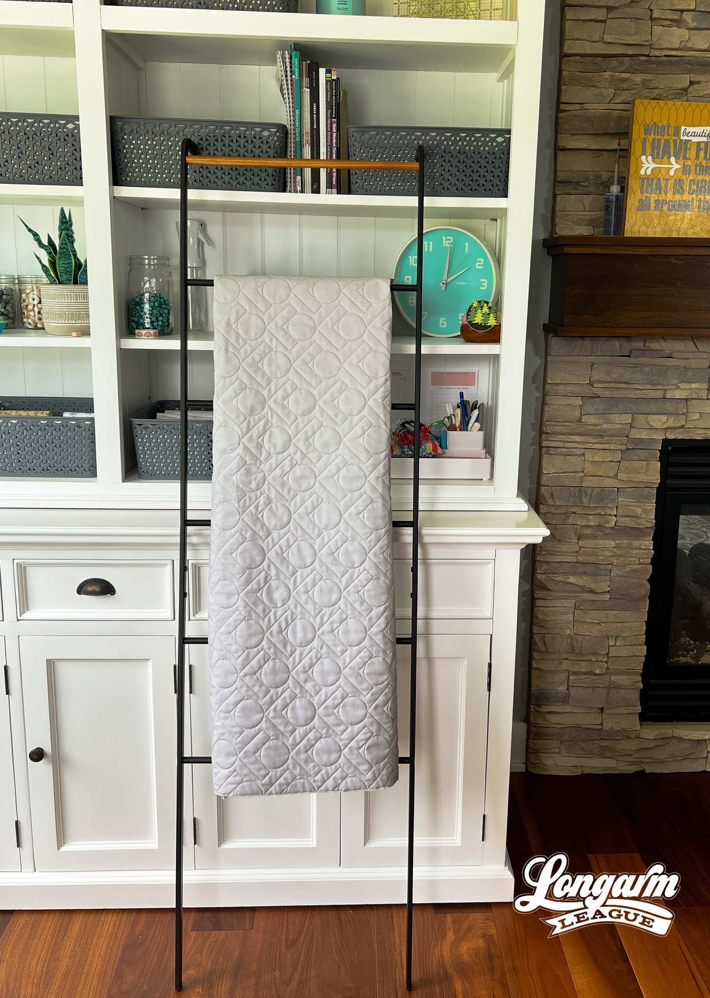
I think this quilting design would be great for modern-looking, geometric or graphically bold quilt patterns or fabrics. Or perhaps a child's quilt!
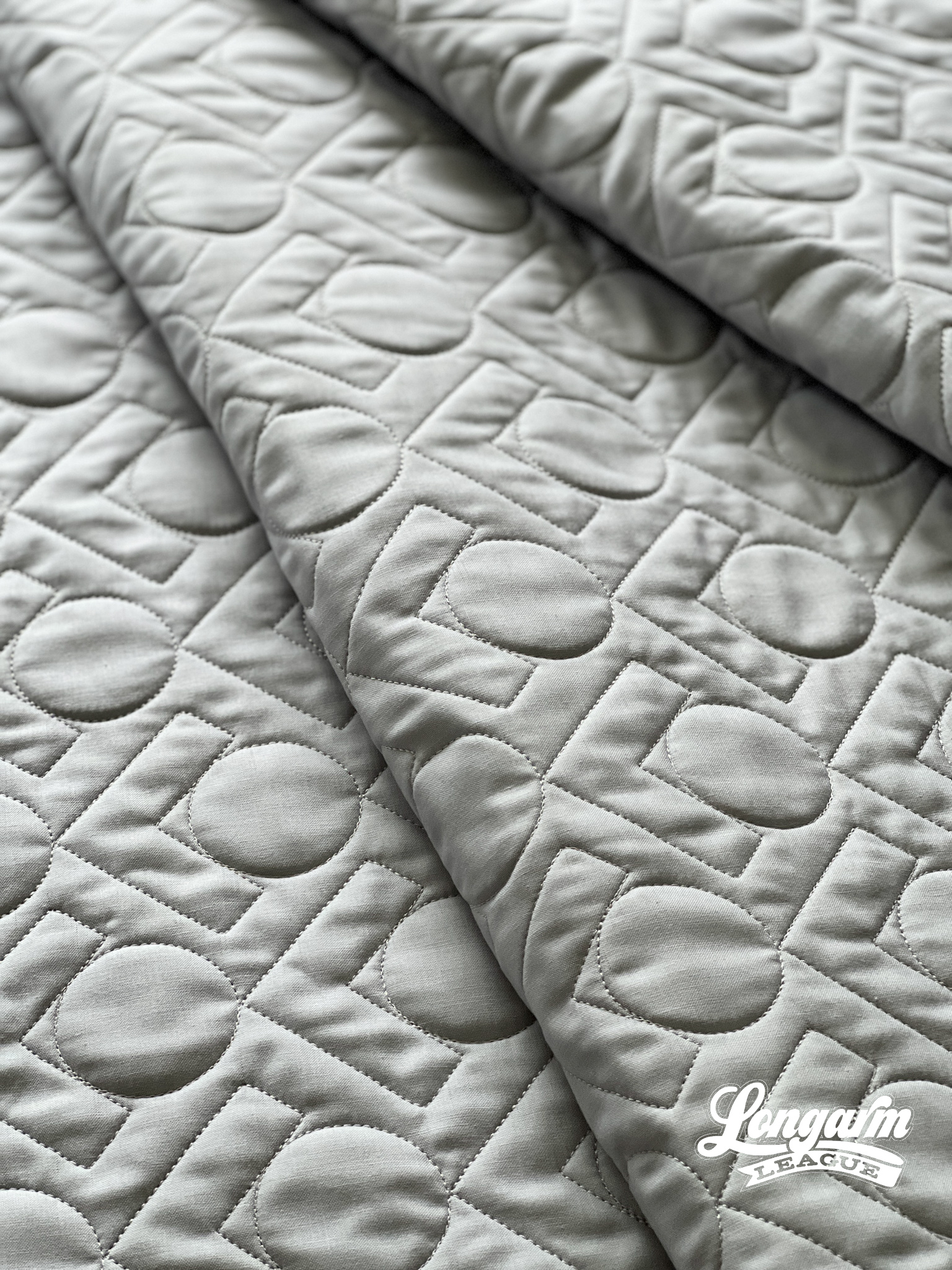
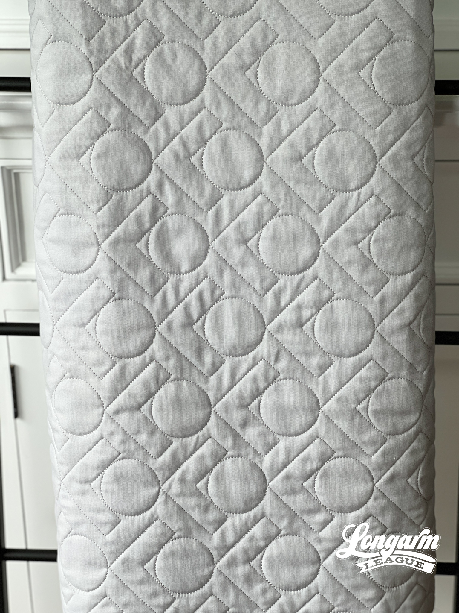
Here are the specifications for how I set up this design using my Intelliquilter on a baby-sized quilt sample (40" x 50" quilt size):
Row height: 2.797"
Gap: -0.743"
Pattern ...
Diamond Loops Digital E2E Design on a Scrappy Squares Quilt
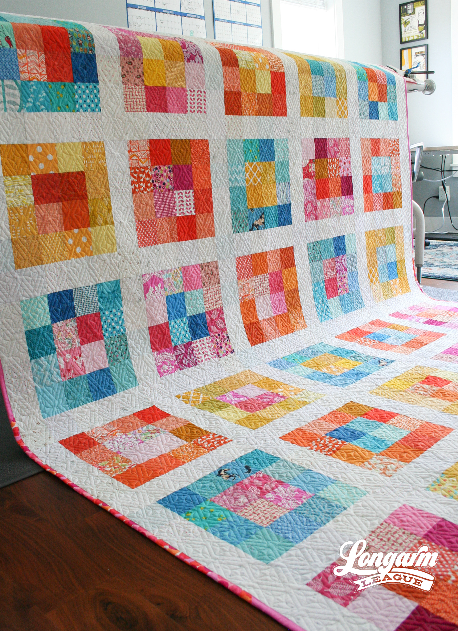
Now that my day job is supporting the Longarm League membership and teaching new longarm quilters how to start a business, I need to be extremely intentional about setting time aside to feed my own creativity or it does not happen.
After a 4-year hiatus, my passion for piecing was reignited this year after being invited to a retreat at Stitch Supply Co. in Altoona, Wisconsin. It was glorious! The desire to plan, cut, and sew a quilt top has stuck with me since retreat. I'm drawing the distinction here between piecing and quilting because I frequently quilt samples of new digital edge-to-edge designs, but that isn't the same feeling as creating patchwork.
It's safe to say, patchwork and I are back "on" again.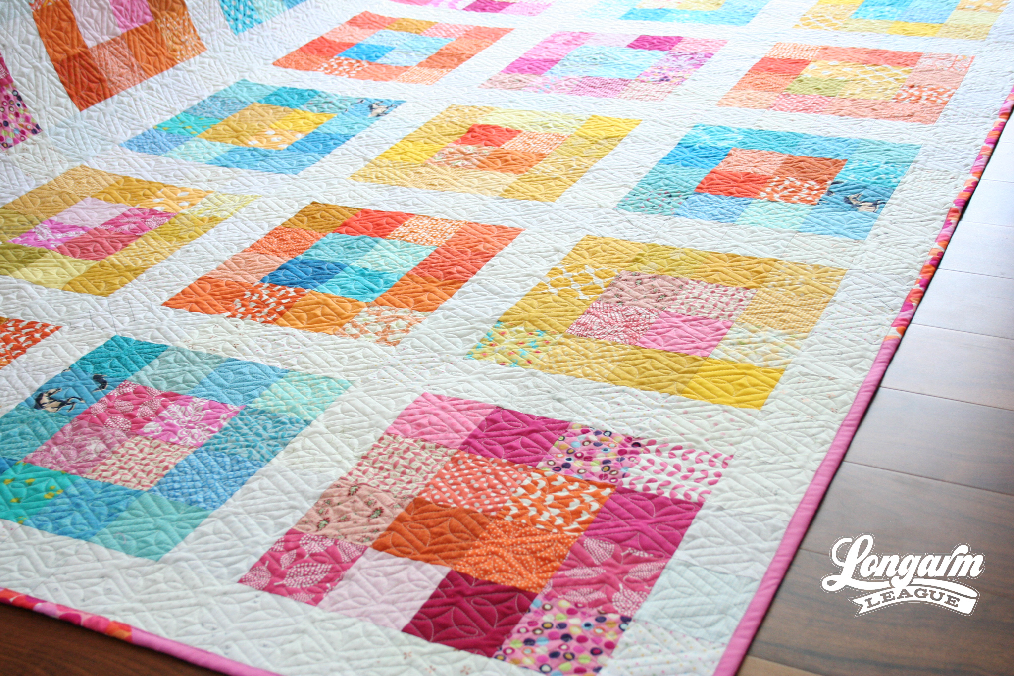
The Patchwork
For this project, I started with a palette in mind. I pulled scraps from bins of pink, orange, yellow, and blue. I decided to work with the teal-y blues although I did let some darker royal shades pass through my filter.
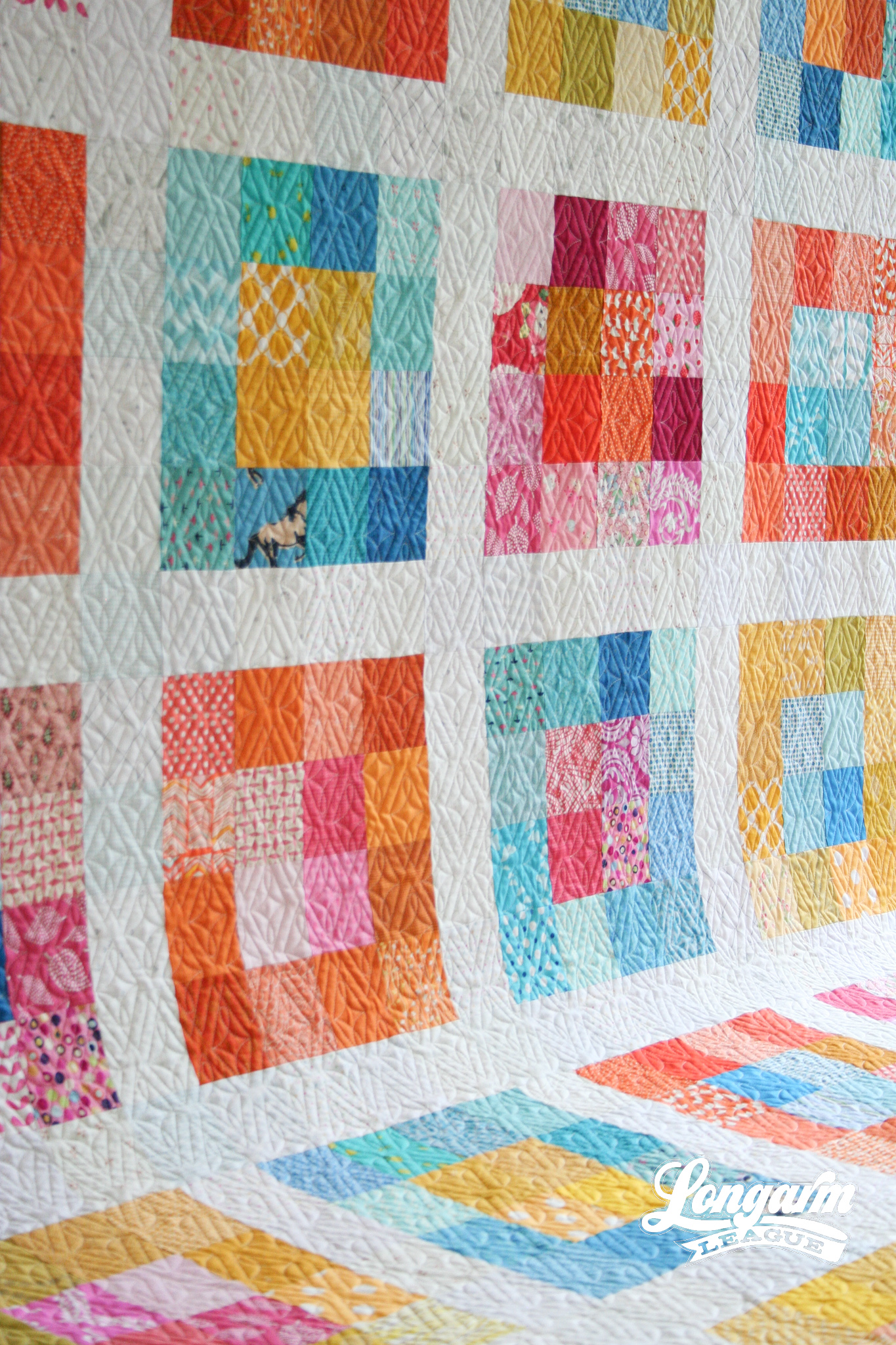
I originally planned to make a lot of ha...
Goth 2 Boss Digital E2E Quilting Design
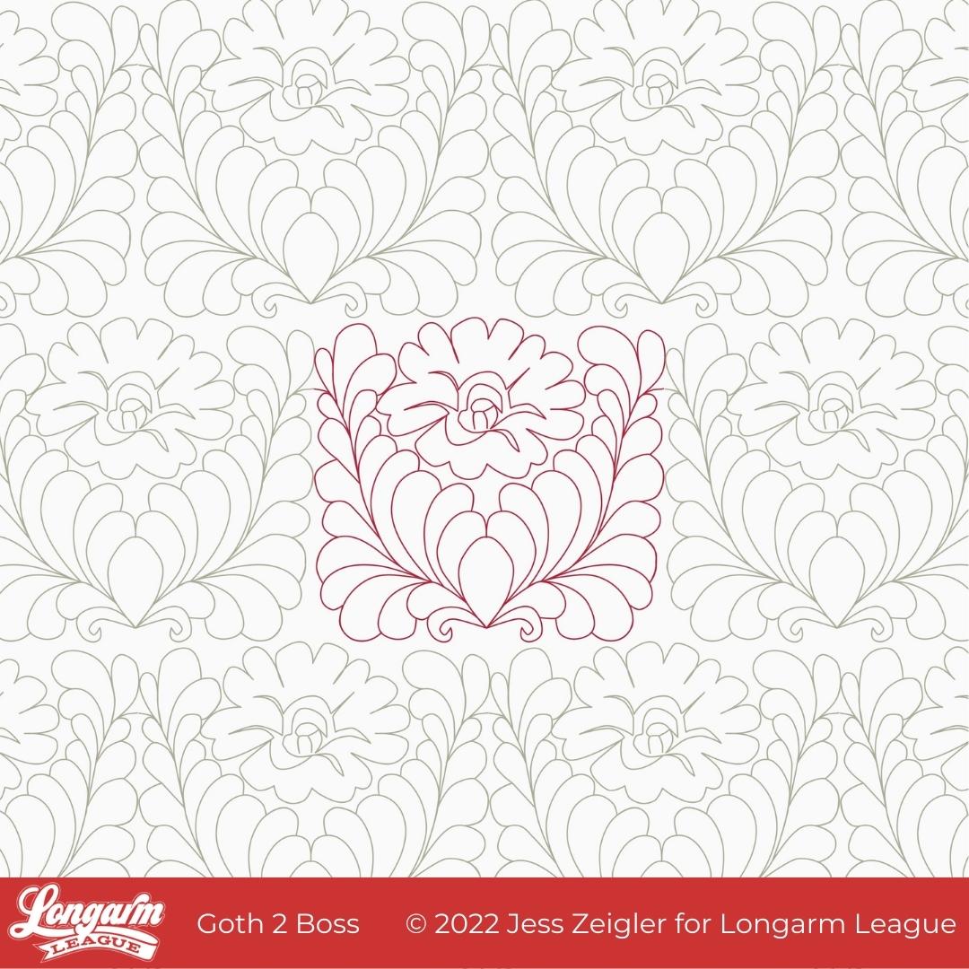
I feel like I owe you an explanation for the name of this design. That will be coming soon.
But first, I thought I'd tell you the inspiration behind it. Back in December of 2021, Josh and I were watching the series called Landscapers that had recently premiered on HBO. It is based on a crime set in the 1990s in England. The series is visually moody, drab, and dark. There's a scene in an upstairs bedroom that had deep red, ornate wallpaper and I found myself asking Josh to stop and go back to a frame that showcased the wallpaper better.
This is what caught my eye.
While it's definitely not the same, this was my first sketch from the inspirational wallpaper:

After playing around with the design a number of times on my reMarkable tablet, I slowly let the feathers get plumper and more prominent as part of the design, allowing me to fill in the space more evenly while keeping the floral center.
Here's how the design evolved as I was sketching: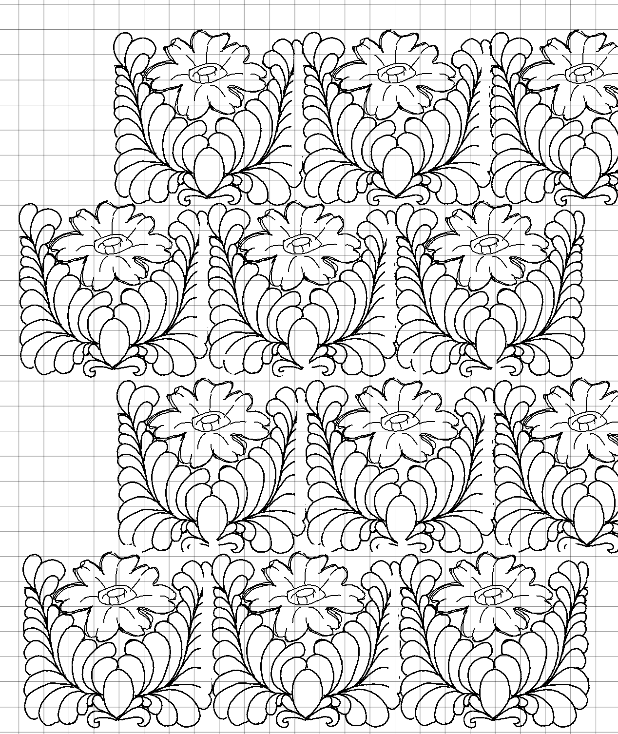
When it comes to feathers,...

Jess Zeigler
Longarm League Commish & Owner of Threaded Quilting Studio, LLC.


