Boho Bulbs Edge-to-Edge Digital Pantograph for Computerized Quilting
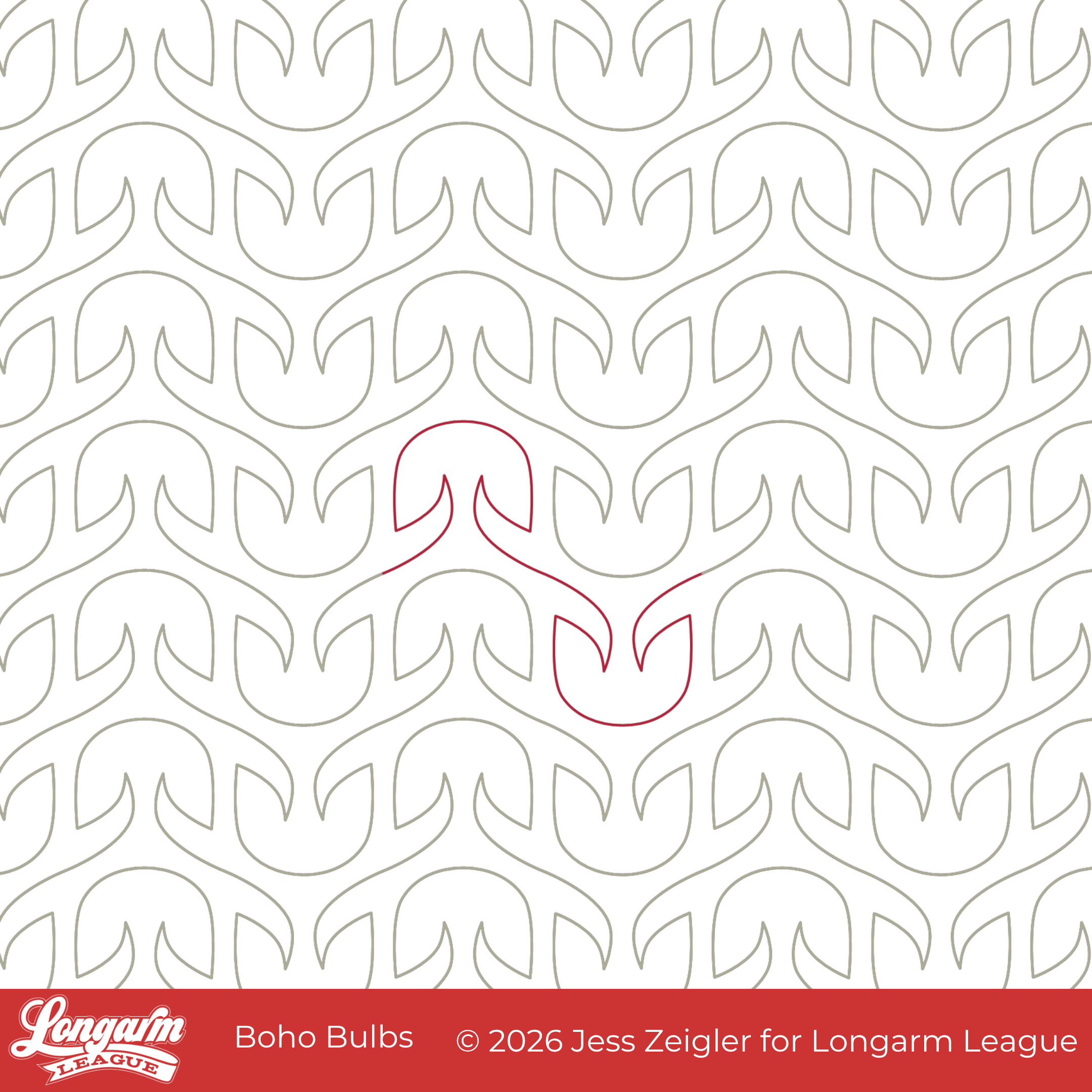
I started playing around with a version of this design in 2022. I named it Willow in my original digital sketch because it resembled more of a willow tree to me. The sides descended further, and there was greater separation between the "leaves" and the "trunk". But I knew it was never quite right, so I kept making adjustments. I played around with making some nodes sharp and pointy, and then round, and then a combination. 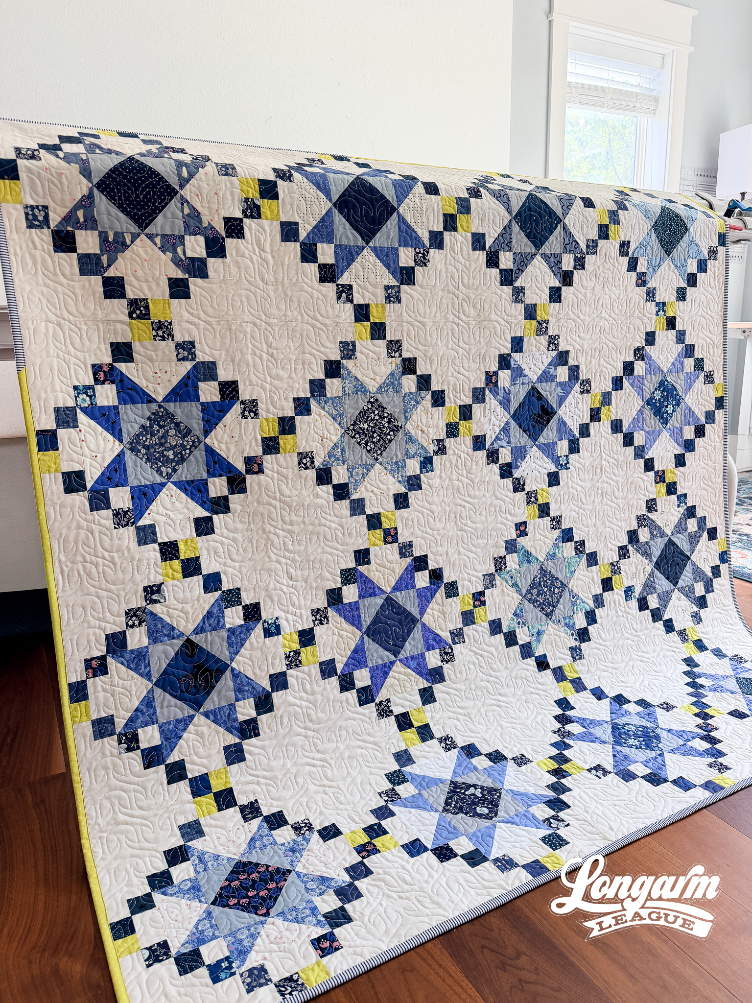
This design started working for me when I shortened up and tapered the sides, and smoothed out the top. Only, then it didn't look like a willow tree anymore, so it needed a new name.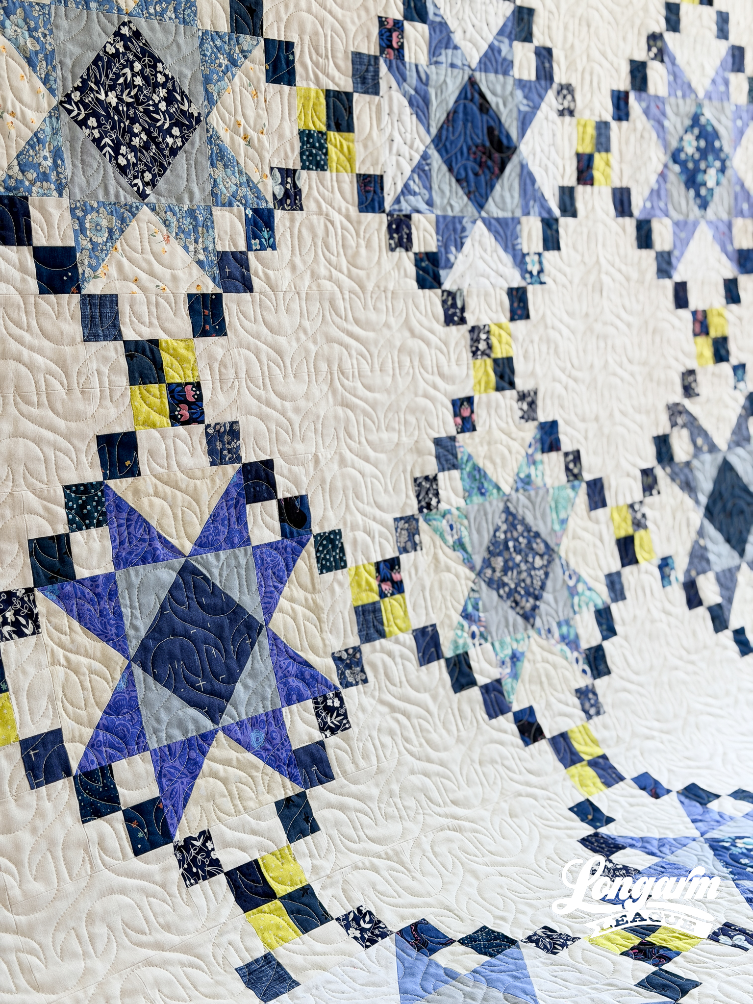
Boho Bulbs draws on a simple, symmetrical, motif both oriented vertically and then inverted to create an interlocking pair that does not need an offset. It's clean and consistent, with just enough personality to keep it from feeling rigid.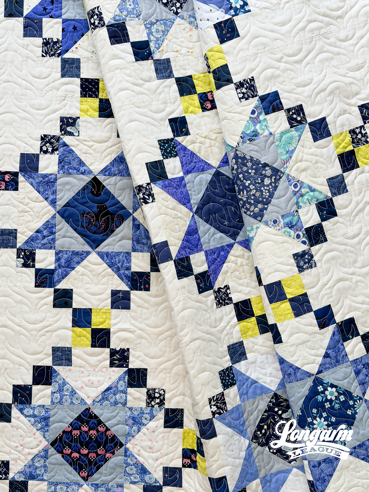
This digital edge-to-edge design is great on floral quilt tops like the one shown in here in the blog post. Its simple, geometric nature also...
Camber E2E Digital Quilting Design
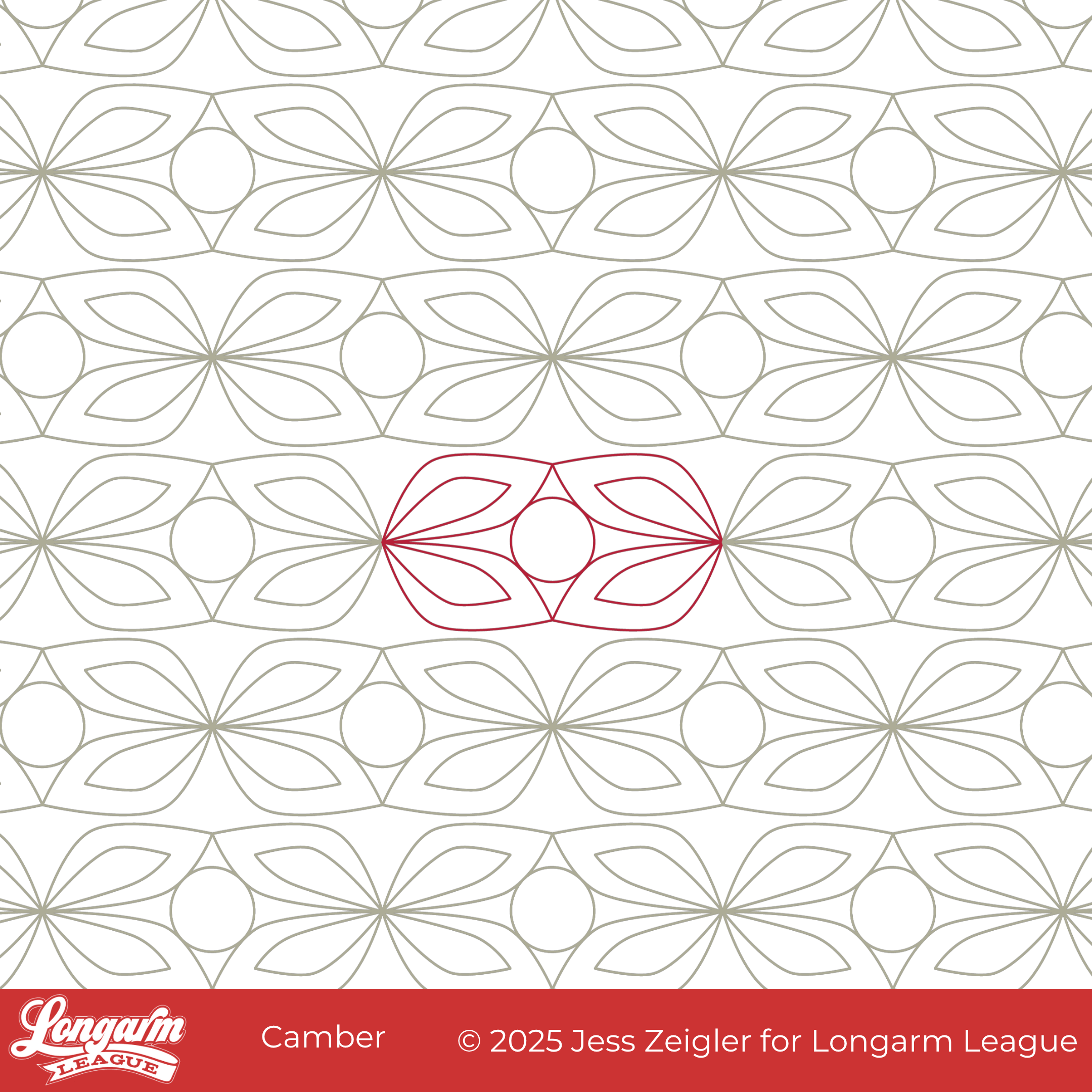
Camber features repeating floral-inspired motifs with petals radiating from a center circle — a clean pattern that feels classic without feeling fussy.
Many of the new pantographs I've designed over the last several months (Modra, Wifi, Bloomlet, and Smokescreen) have had a "freestyle" or a handguided feel to them. In contrast, Camber feels geometric and structured.
Camber also bridges traditional and modern—my favorite way to live life! ☺️ The echoed line within each petal reminds me of Orange Dream, which is my take on a traditional orange peel. Except this design is a lot easier to use because precision alignment between rows is not required.
The slight curvature between rows creates a gentle wave effect that adds dimension. The word camber means the slightly convex or arched shape of a road or other horizontal surface. It’s a nod to movement—a tiny architectural nudge that softens the repeat and keeps the eye moving. Plus, I love the little triangle shapes that emerg...
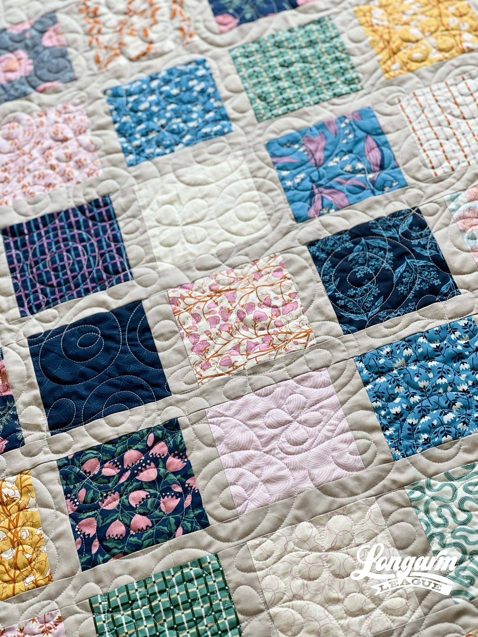
Bloomlet Digital Pantograph | Computerized Edge-to-Edge Design
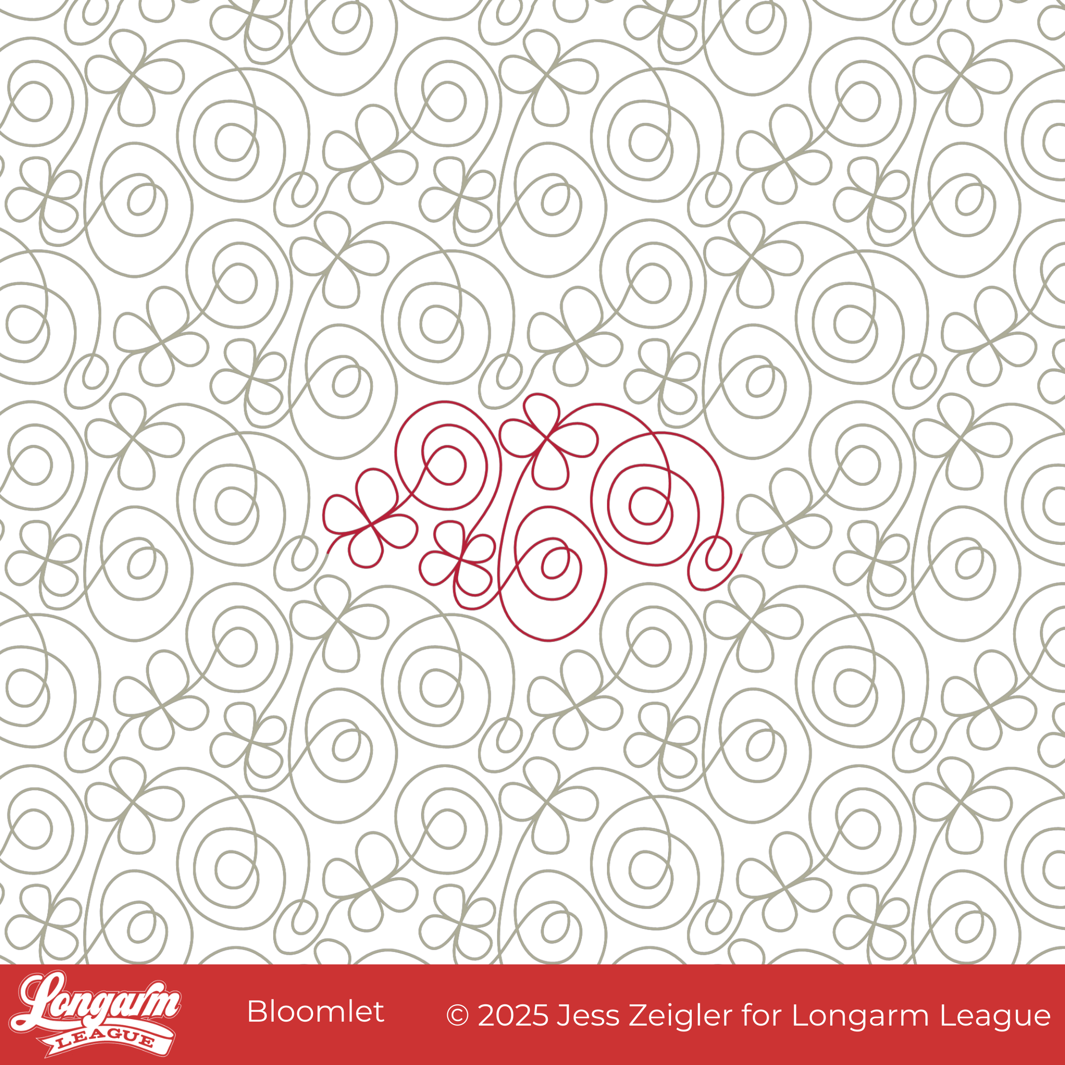
Fresh, fun, and full of charm—our newest edge-to-edge design, Bloomlet, is ready to make your quilts shine.
Bloomlet combines playful spirals with simple four-petal flowers, creating a joyful mix of curves and blooms. It has that lighthearted, whimsical feel that instantly brings a quilt to life. The design flows continuously, so while it looks sweet and detailed, it stitches efficiently from edge to edge.
When I created Peak Blooms (four years ago—wow, time flies!), I loved the little flourish at the center of the blooms. I pulled that same shape out for this design. By enlarging and isolating the petals and then repeating them in this motif, they become a stronger feature of the overall design.
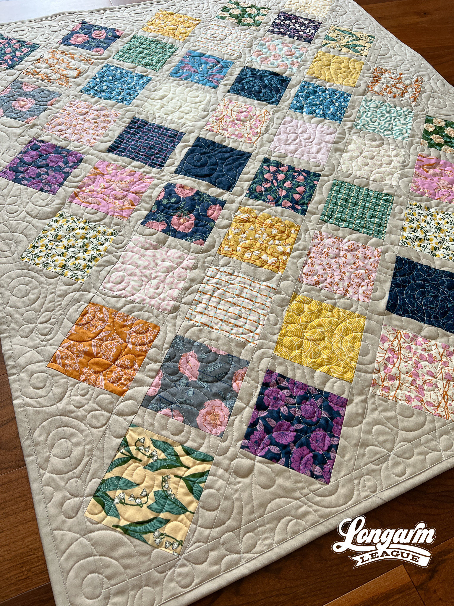
I kinda, sorta designed this pantograph for this quilt. I didn't think a strong geometric design would work well with the patchwork, and the floral prints were inviting a softer, whimsical look. The petals of Bloomlet aren't uniform, and the spirals are asymmetrical as well, m...
Verdance Edge-to-Edge Digital Quilting Design
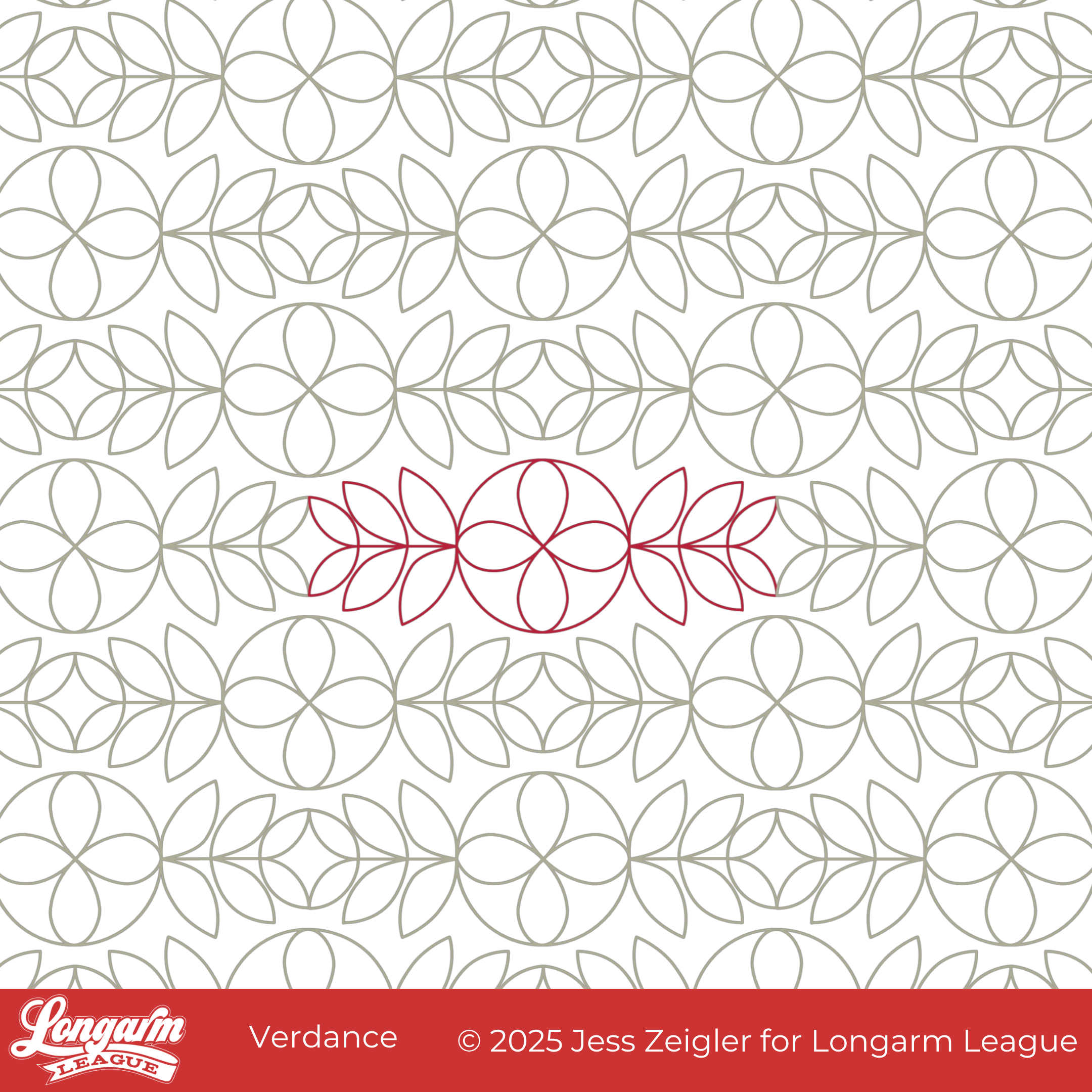
Introducing our latest digital pantograph design: Verdance. The name is a play on the word verdant, which means green with grass or other rich vegetation. With its leaf motifs, Verdance will add a touch of nature-inspired curves to any quilt.
The main feature of the design started with the concept that leaves traveling in opposite directions would form a cute little orange peel. Originally, the larger circles were smaller and empty inside. Actually, the leaves were uniform in size, as were the orange peels and the blank circles. As I stitched out this first iteration, I didn't even get halfway through the first row when I decided to stop and re-work the design.
With the first try, I had to bump up the scale so that the leaves wouldn't be annoyingly small, but doing so made the circles too large for my liking, especially with nothing inside of them. I adjusted the size of all the leaves to create a subtly staggered effect, and I also enlarged the circle to add a decorative f...
Demure Edge-to-Edge Digital Quilting Panto

What good is the Internet if you can't use it to jump on a trend? The first time I saw something relating to "very demure" was an Instagram Reel of a real estate agent in Des Moines, describing the city as "very demure". I thought that was an odd way to describe it, but I continued with my day. In a short amount of time, I saw "very demure, very mindful" pop up in so many other places that I had to google it. Apparently, it originated with TikTok influencer Jools Lebron as a way to describe her look and way of being. It has caught fire from there! Now "very demure, very mindful" is a phrase that is popping up everywhere, and just when I needed a name for my new design. It fits, doesn't it? 
Demure's design starts with the outer petals and ends with the medaillion-like framing around a center circle. The repeating shape is elongated. 
Every other row is staggered at 50% with this design. When arranged, the row-to-row nesting is minor and is not challenging to align when stitch...
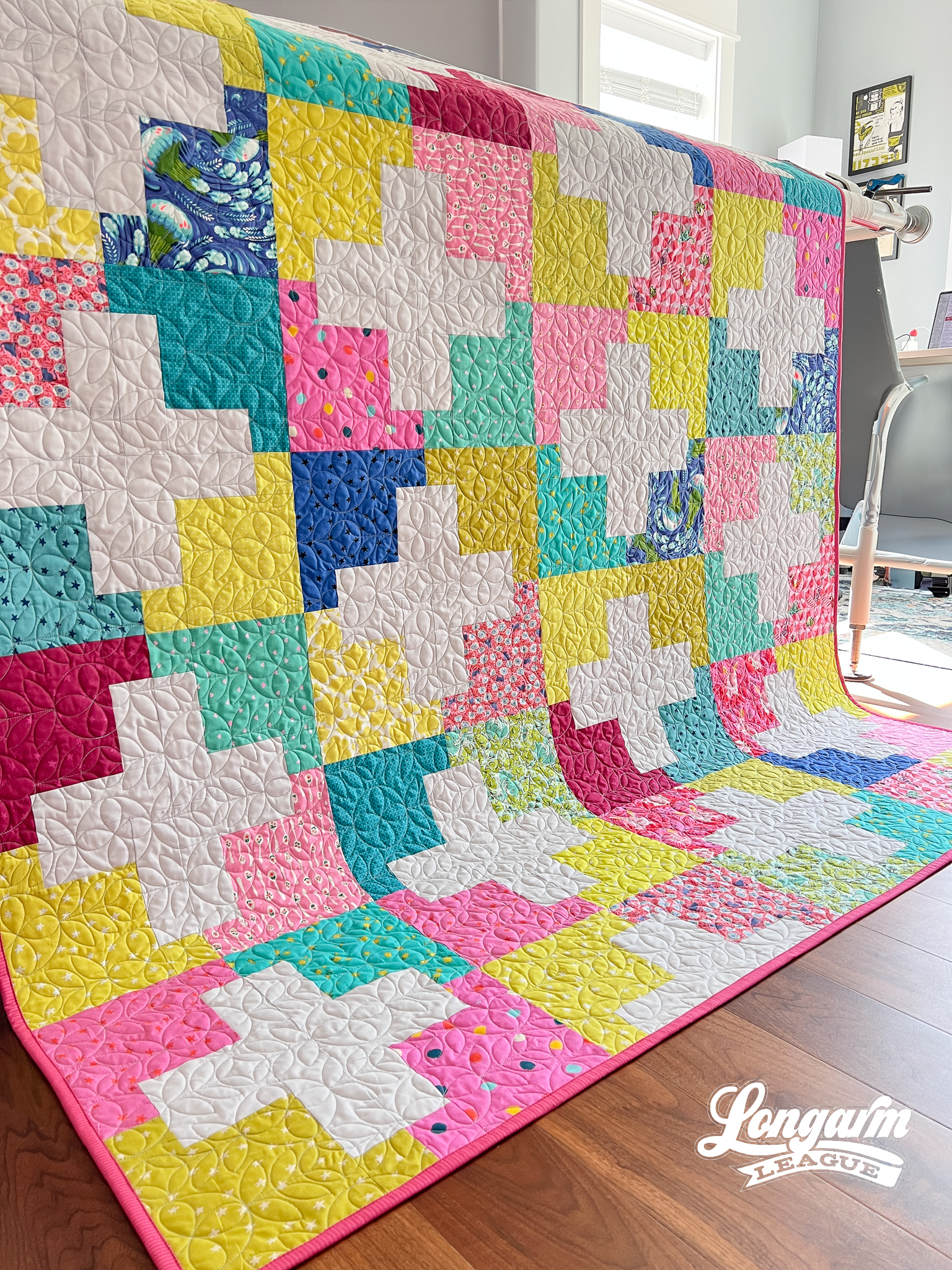
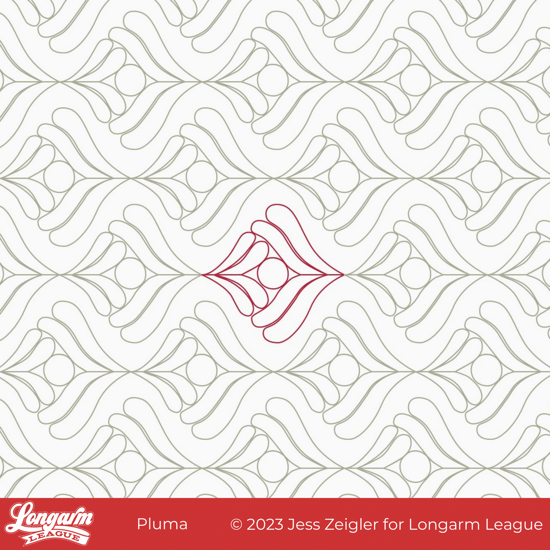
Pluma Digital Quilting Design on the 2023 Stronger Together Quilt
This is Pluma! Not only was it on display in our booth at QuiltCon last weekend, but it was the most popular quilt in our booth! More on the pattern later in this post.
Pluma is a unique digital panto in that it features feather plumes going against each other in each repeat. It's almost as if the larger couplet of plumes swallows the smaller couplet. It makes for interesting movement.
As a way of connecting the two halves of the design, there's a circle in the center of the motif. This provides another interesting textural element.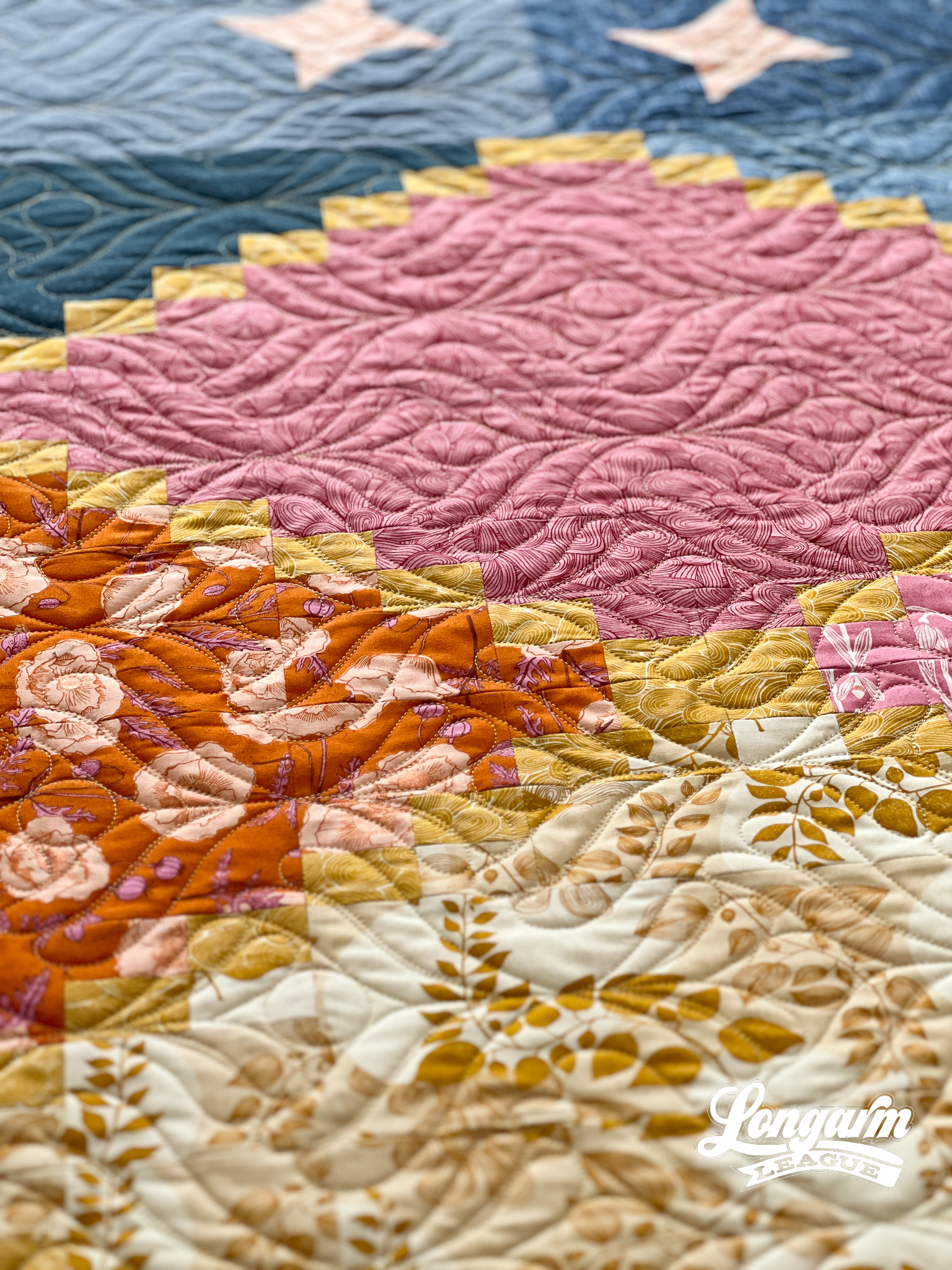
The plumes are stitched out individually with each plume nestled closely with its neighboring plume. While there is some minimal backtracking/overstitching in the design, it does not occur in the feathers.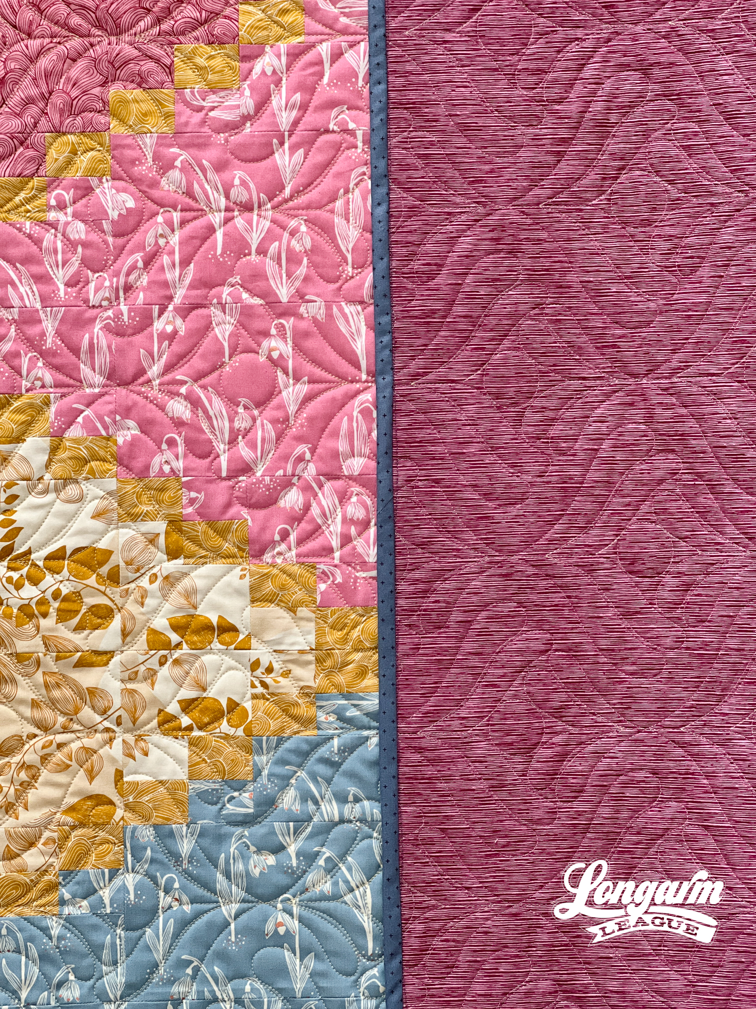
The Quilt Design
I used the 2023 Stronger Together Quilt designed by Michelle Ramsay of Quilts Made with Love. She hosted the Quilt Along for this last month during Black History Month. This pattern can be downloaded with a donation to ...
Sketch Digital Pantograph Quilting Design
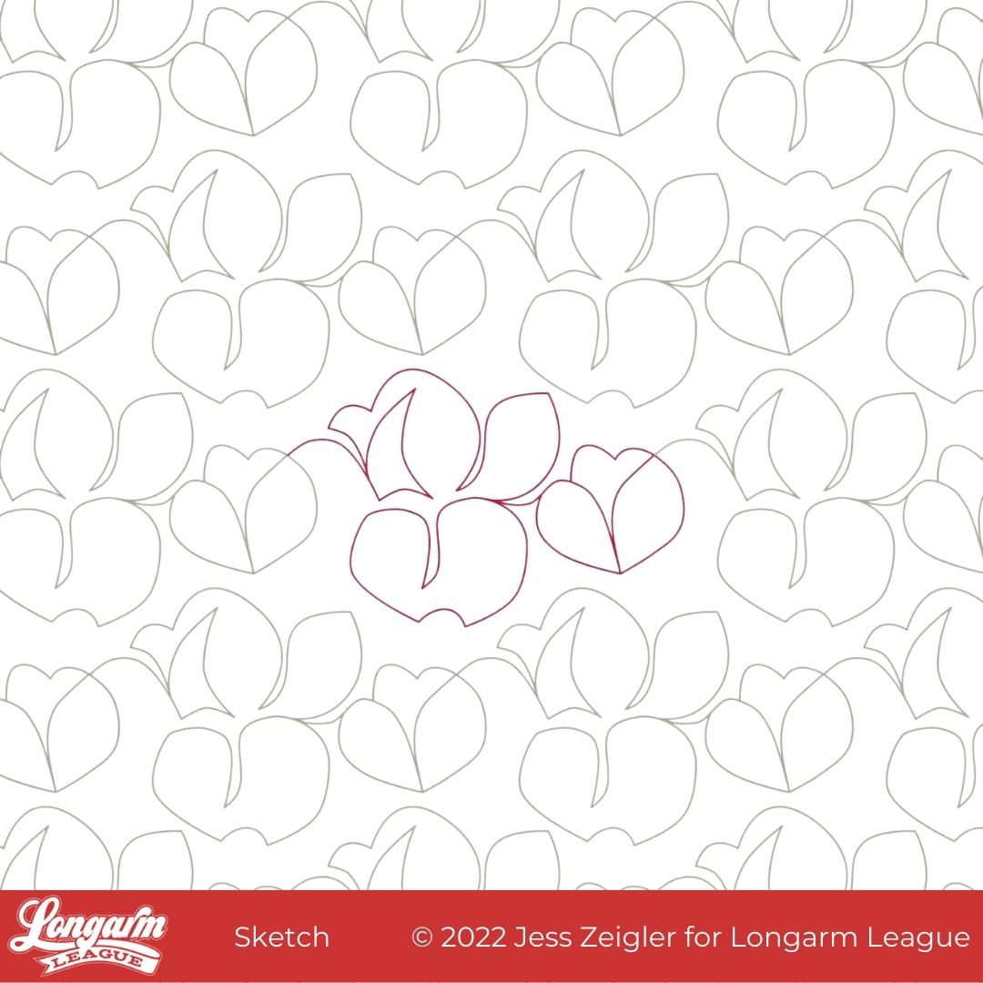
This is Sketch! Up until very recently, I'd planned to name it Cottonwood but when I discovered that's already another designer's pantograph name (with a related hashtag). I decided to go off-script and name it something unique.
The only trouble with having a really abstract design that could look like one hundred things and also nothing? Naming was hard. Why does it seem that I either have great name right away or I'm stress-listing stream of consciousness options and calling on friends and family for help? There's no in-between!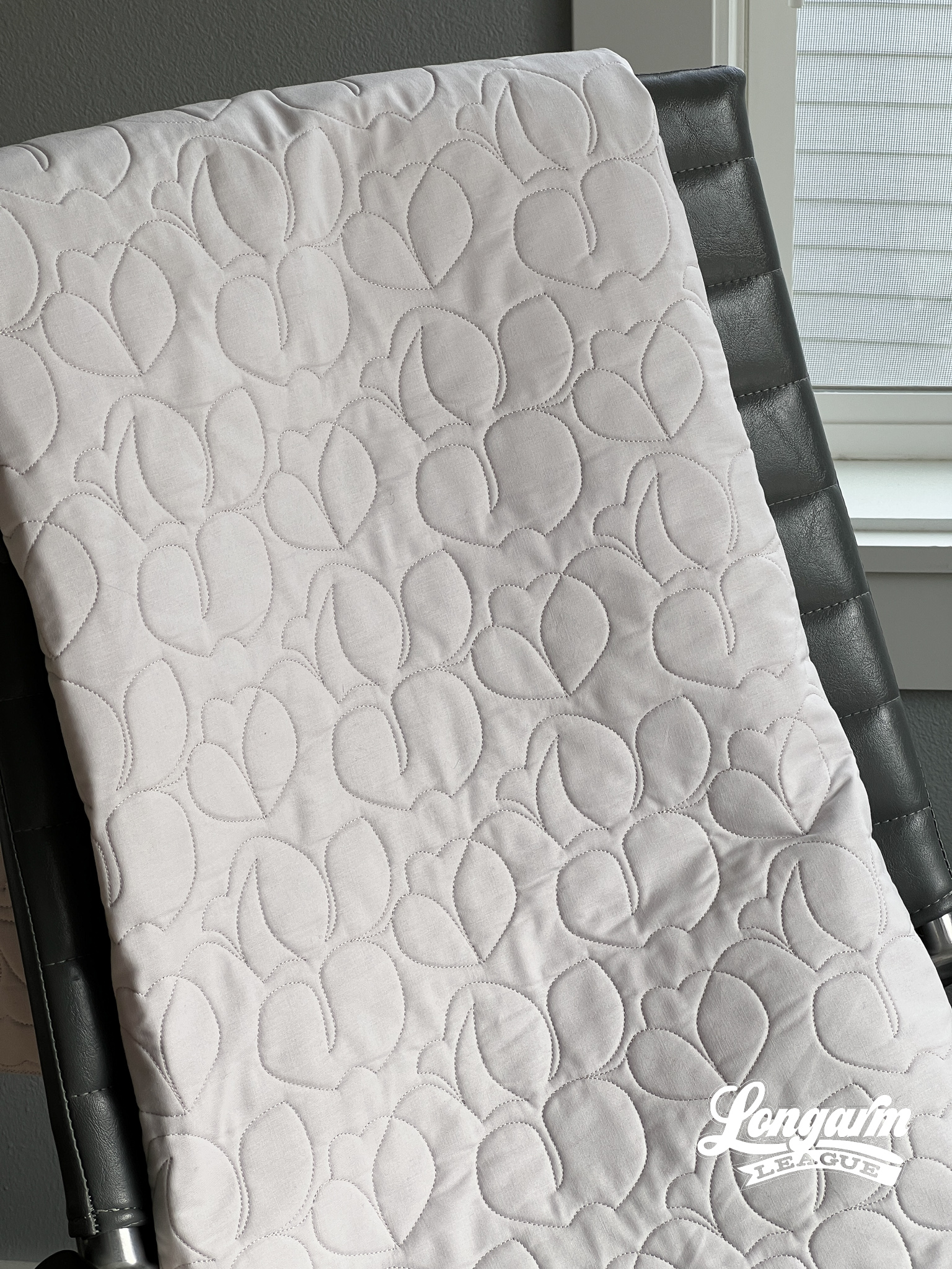
What I like about this design is that it's much more abstract and off-kilter than designs I normally create. There's a fun energy to this design—a bit folksy and quirky. I'm ordinarily not one to use negative space when it comes to pantograph designs, but I have to say that I like the organic-looking spacing of the motifs between the rows with this design. It looks more free-flowin', like a sketch!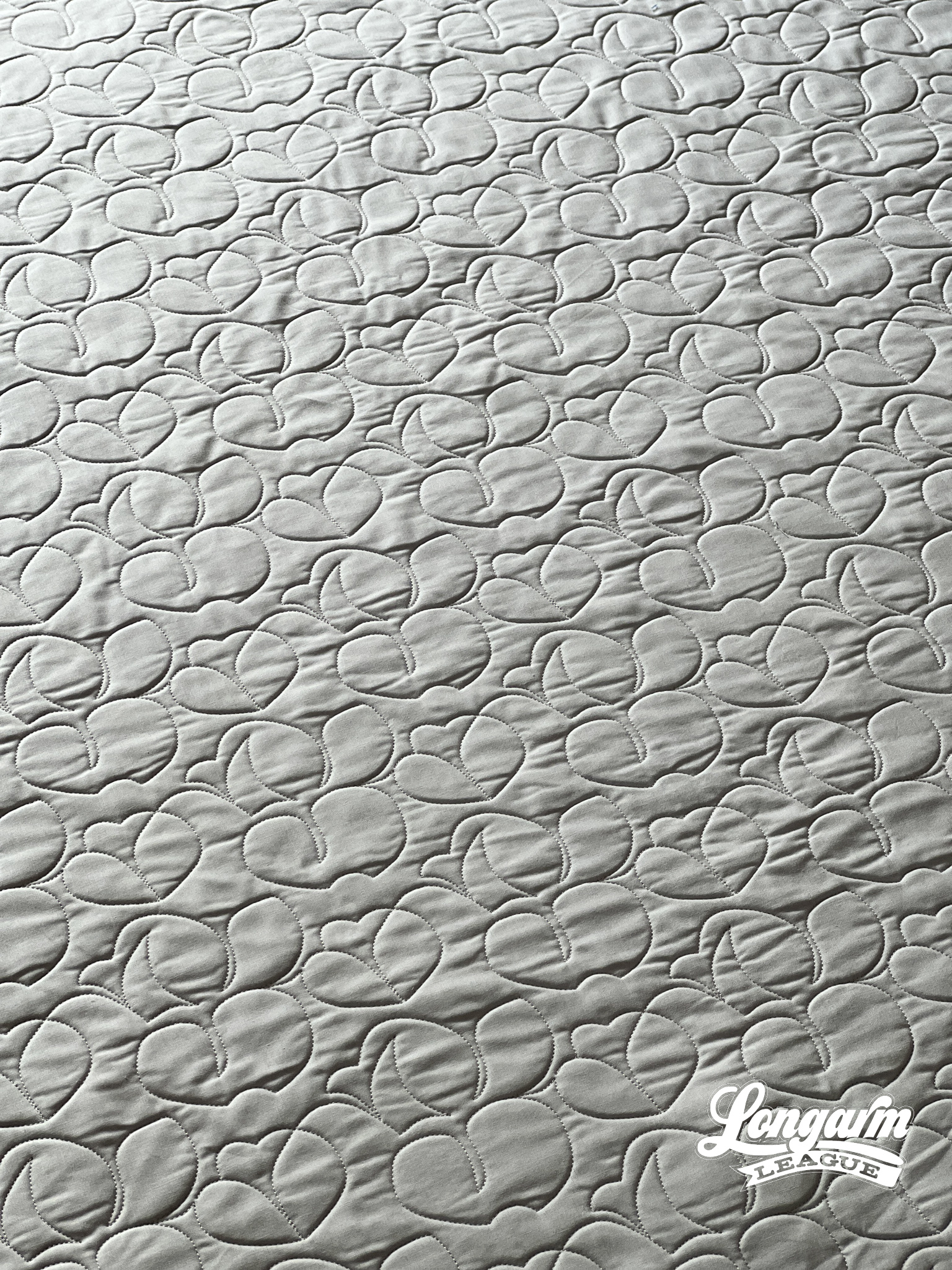
I also like that the overall texture reads as ro...
Pretty Petals Digital Quilting Design
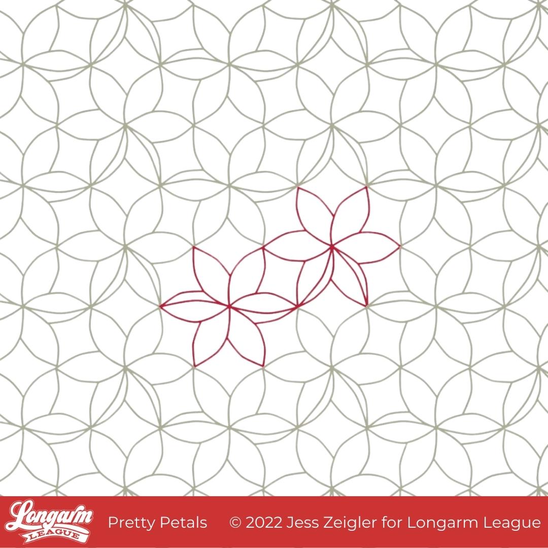
I'm glad the time has come to release Pretty Petals into the world! As a designer, I can't help but have varying levels of excitement about the designs I work on. I'm sure this is totally normal with any creative job. I can't say this is my favorite design ever, but it's up there because of the overall texture it creates! 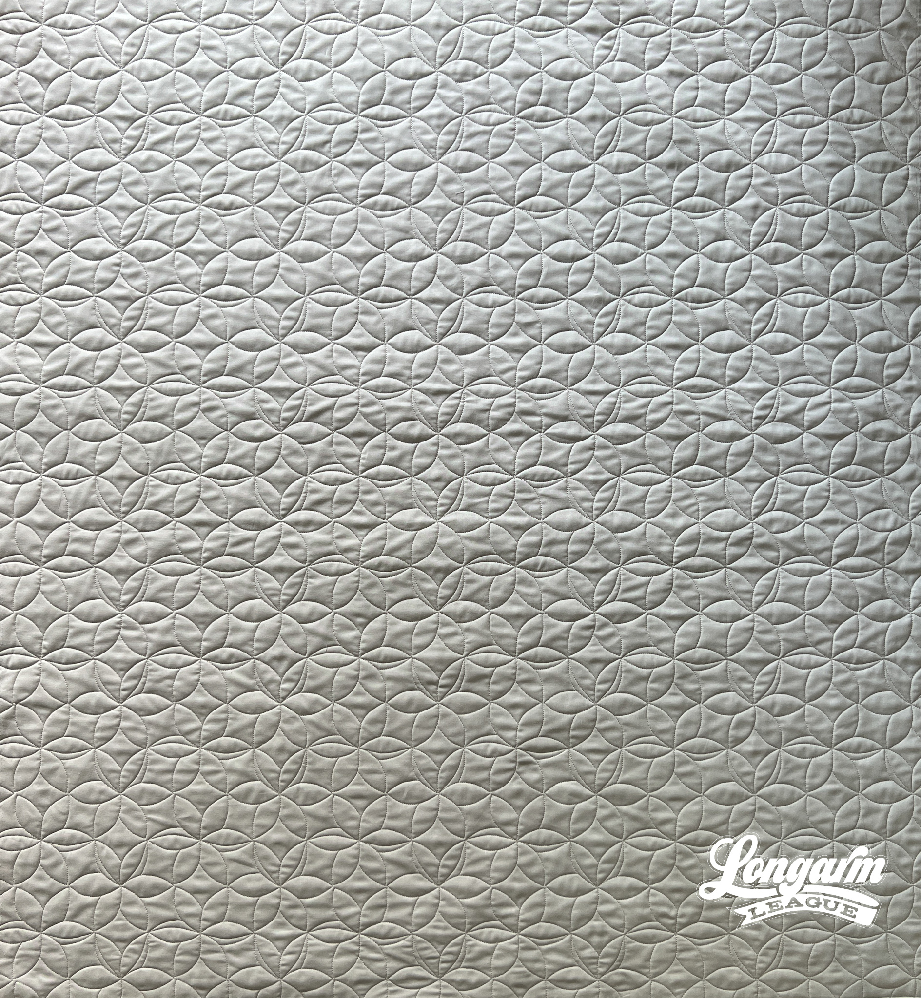
What I like about the design is the relative uniformity of the lines and spacing throughout the top. It just makes my heart happy. I like that it produces interesting texture that you don't have to think too much about. I like that it creates a background of pleasant arc-shapes that'll allow the focus to be on the piecing.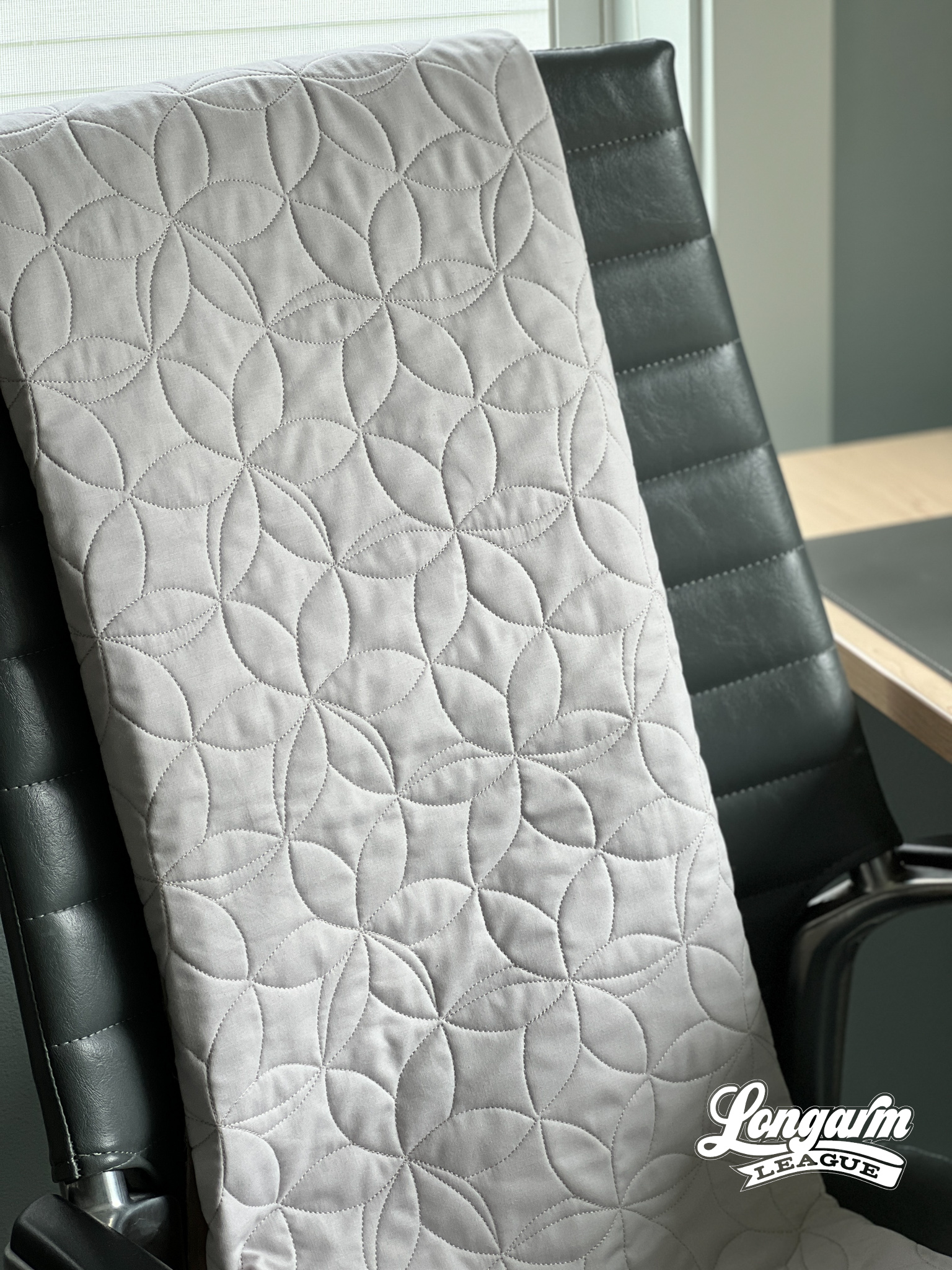
Floral themes are common in quilting in both the fabric selections available and in the quilt patterns themselves, so I like that this digital pantograph has a floral element that should compliment a floral top.
I also like that this design would pass as an interesting geometric element to enhance a quilt top that has no floral element...
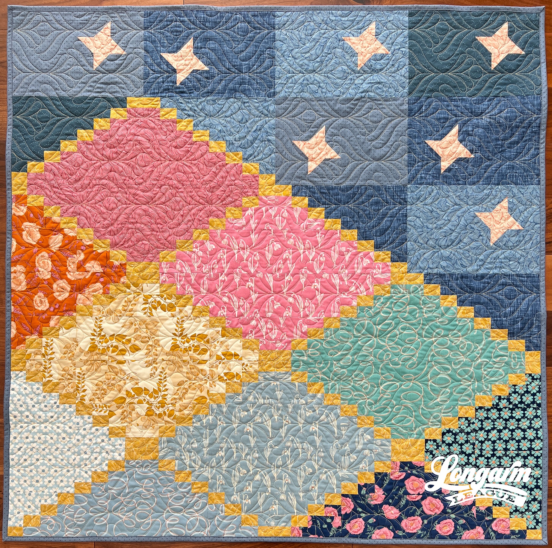
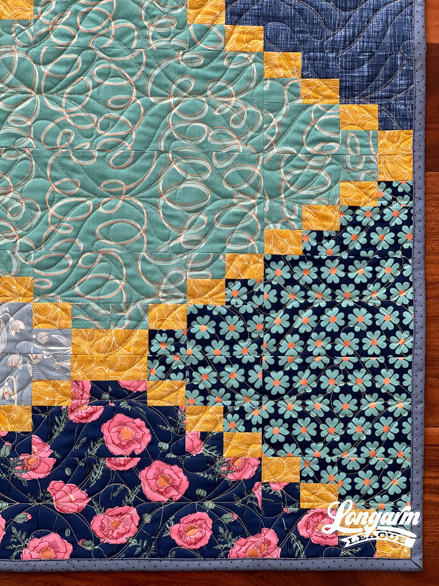
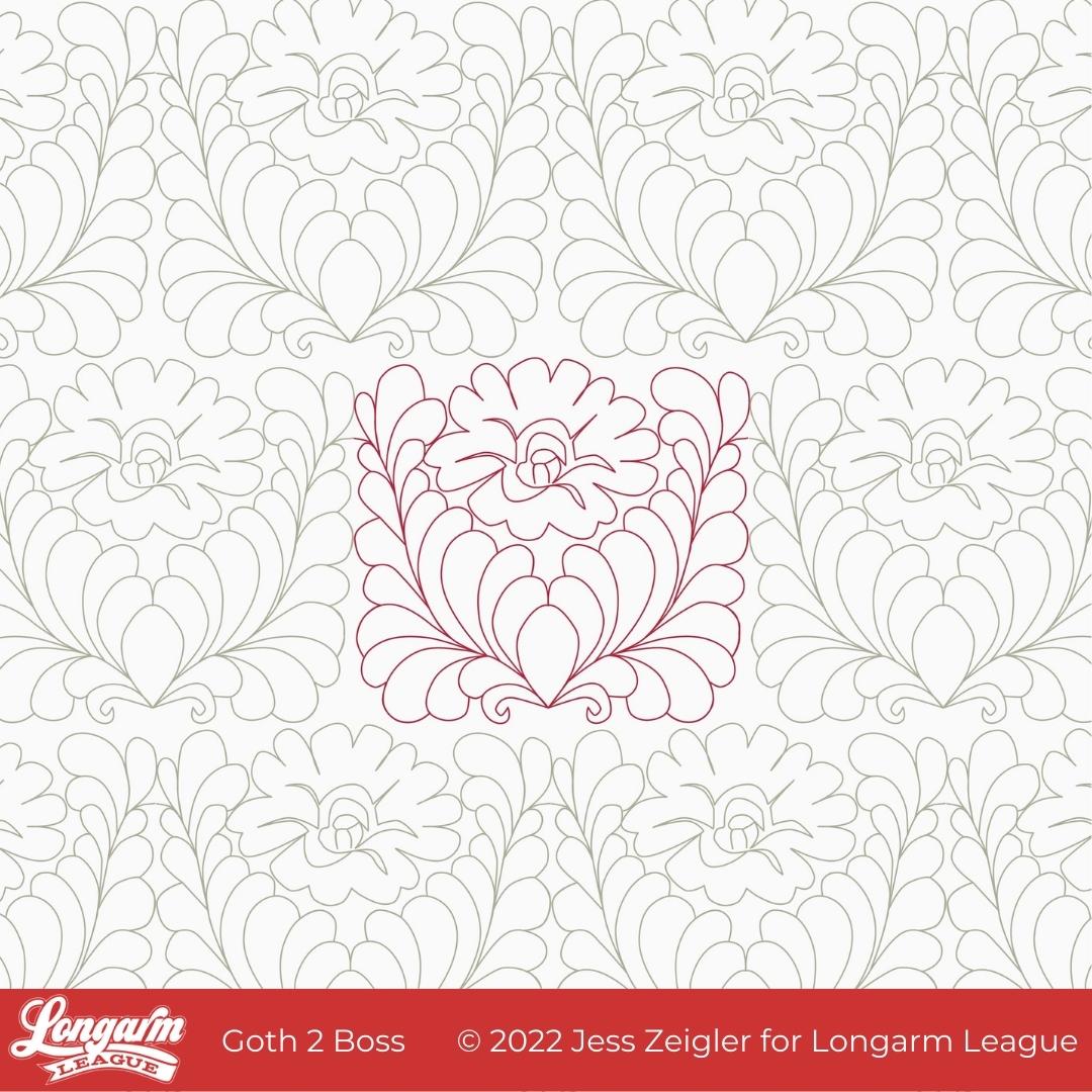
Goth 2 Boss Digital E2E Quilting Design
I feel like I owe you an explanation for the name of this design. That will be coming soon.
But first, I thought I'd tell you the inspiration behind it. Back in December of 2021, Josh and I were watching the series called Landscapers that had recently premiered on HBO. It is based on a crime set in the 1990s in England. The series is visually moody, drab, and dark. There's a scene in an upstairs bedroom that had deep red, ornate wallpaper and I found myself asking Josh to stop and go back to a frame that showcased the wallpaper better.
This is what caught my eye.
While it's definitely not the same, this was my first sketch from the inspirational wallpaper:

After playing around with the design a number of times on my reMarkable tablet, I slowly let the feathers get plumper and more prominent as part of the design, allowing me to fill in the space more evenly while keeping the floral center.
Here's how the design evolved as I was sketching: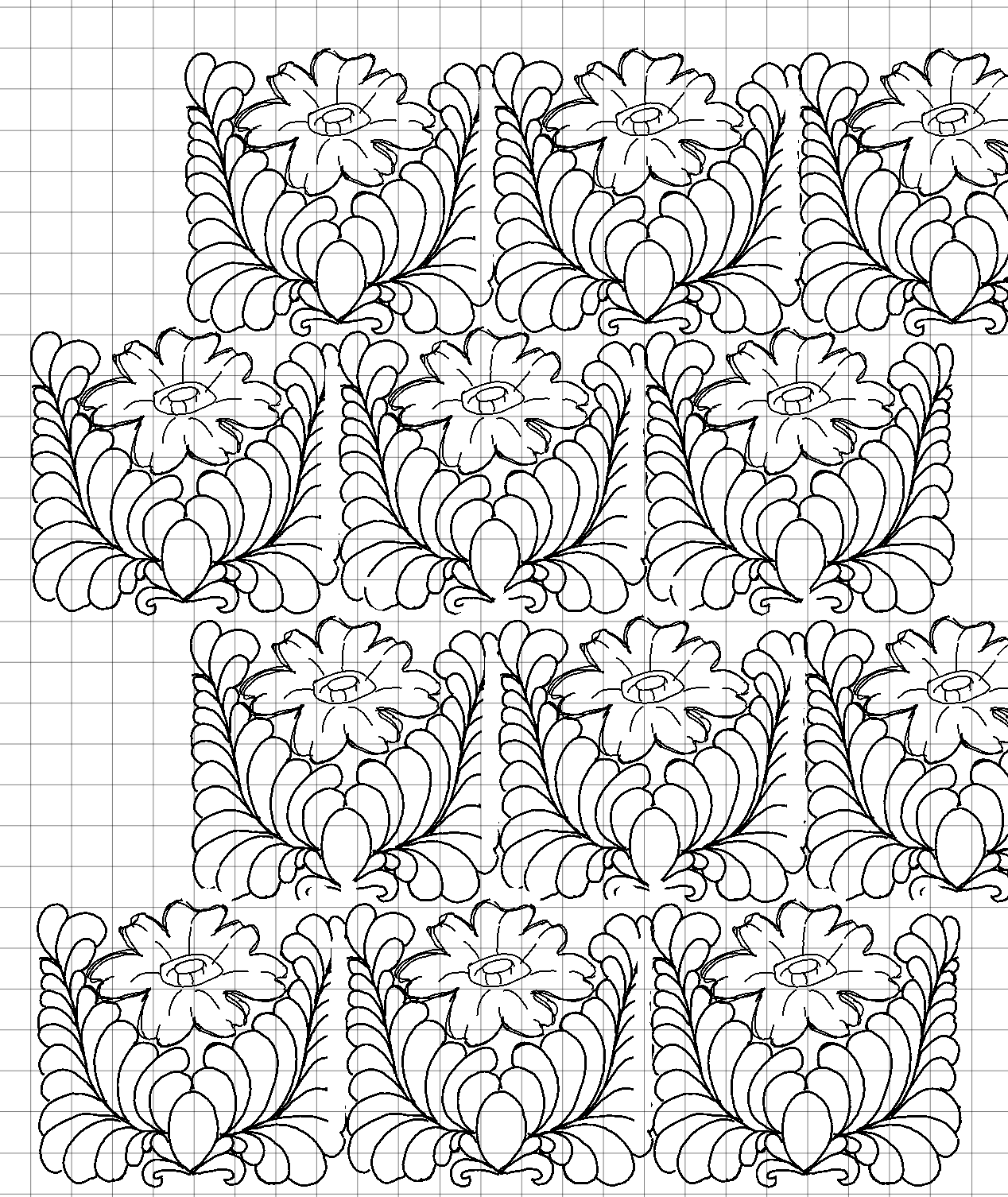
When it comes to feathers,...
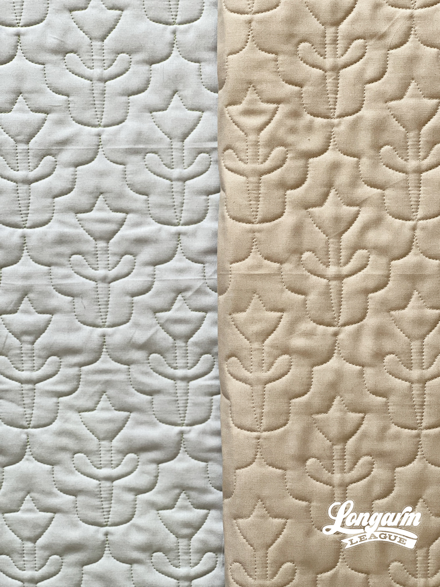
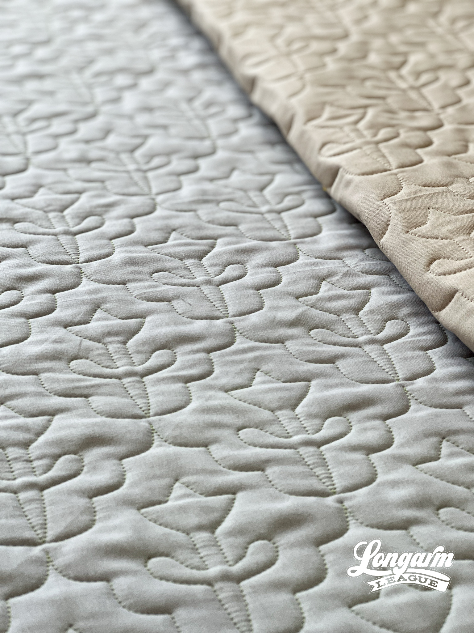
May Flowers Digital Quilting Design
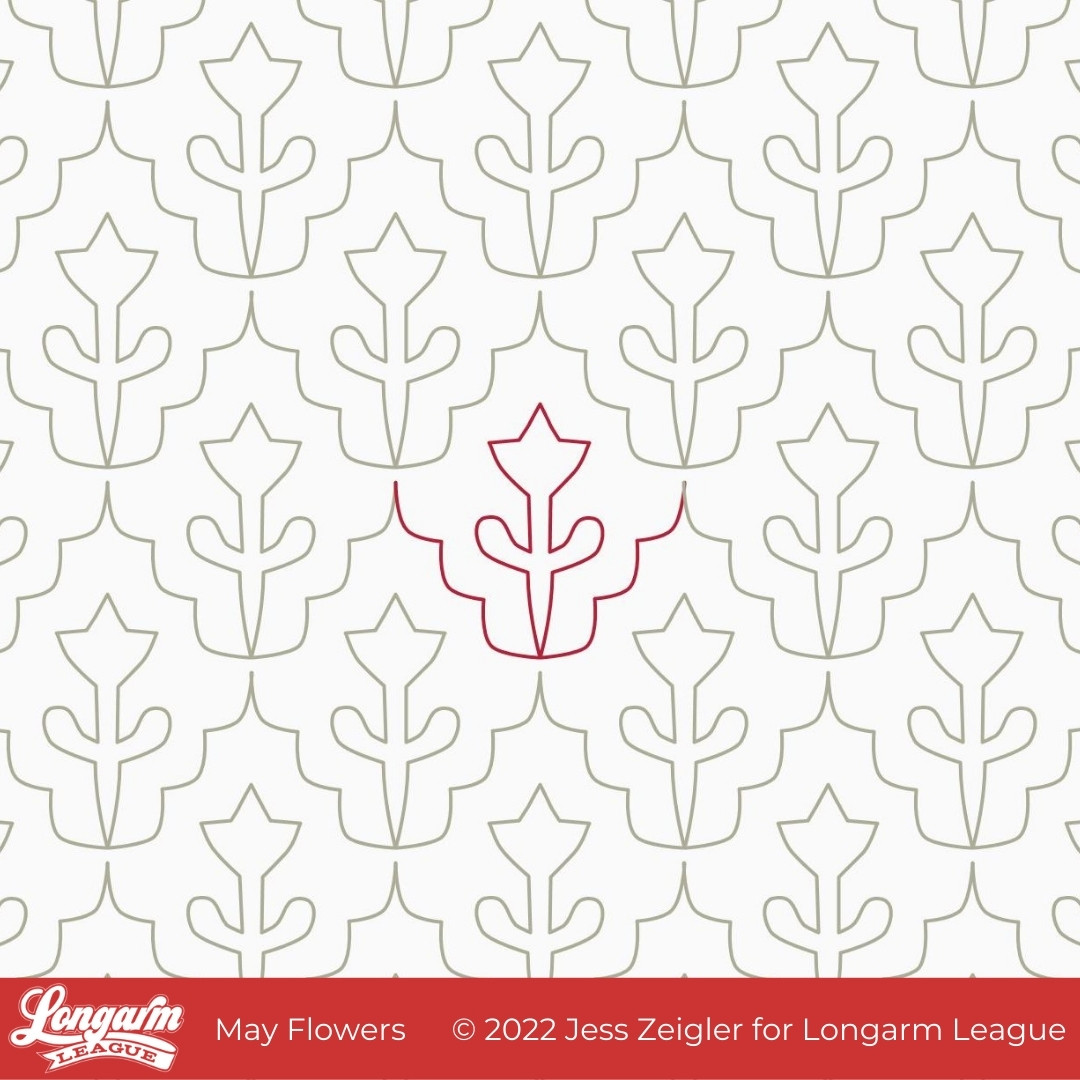
You know what they say about April showers... they bring May Flowers!
April was a dreary, wet month where I live in Central Iowa and it's actually continuing into the first few days of May. But we have hope that sunshine and flowers will appear very soon!
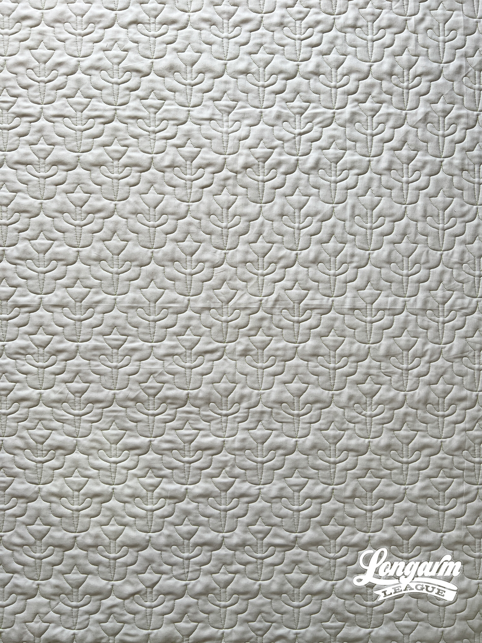
I really love Scandinavian design and I hope that comes across in this simple tulip-esque pantograph. To jazz it up just a bit, I added a scalloped edge to the repeat. It should be a great choice for the upcoming spring quilts in your queue.
May Flowers could be used both on traditional and modern quilts—the scale is adaptable, as well. I'll give you my details for this sample below.
Here are my specifics using a baby-sized sample in the photos (45" x 45" quilt size):
Row height: 3"
Gap: -1"*
Pattern height: 4"
Offset: 50%
Backtracking: none
*Gap refers to the space I'm allowing between rows. I use an Intelliquilter for my computerized quilting, and because that measurement is quantifiable, I provide it here.
The row h...

Jess Zeigler
Longarm League Commish & Owner of Threaded Quilting Studio, LLC.


