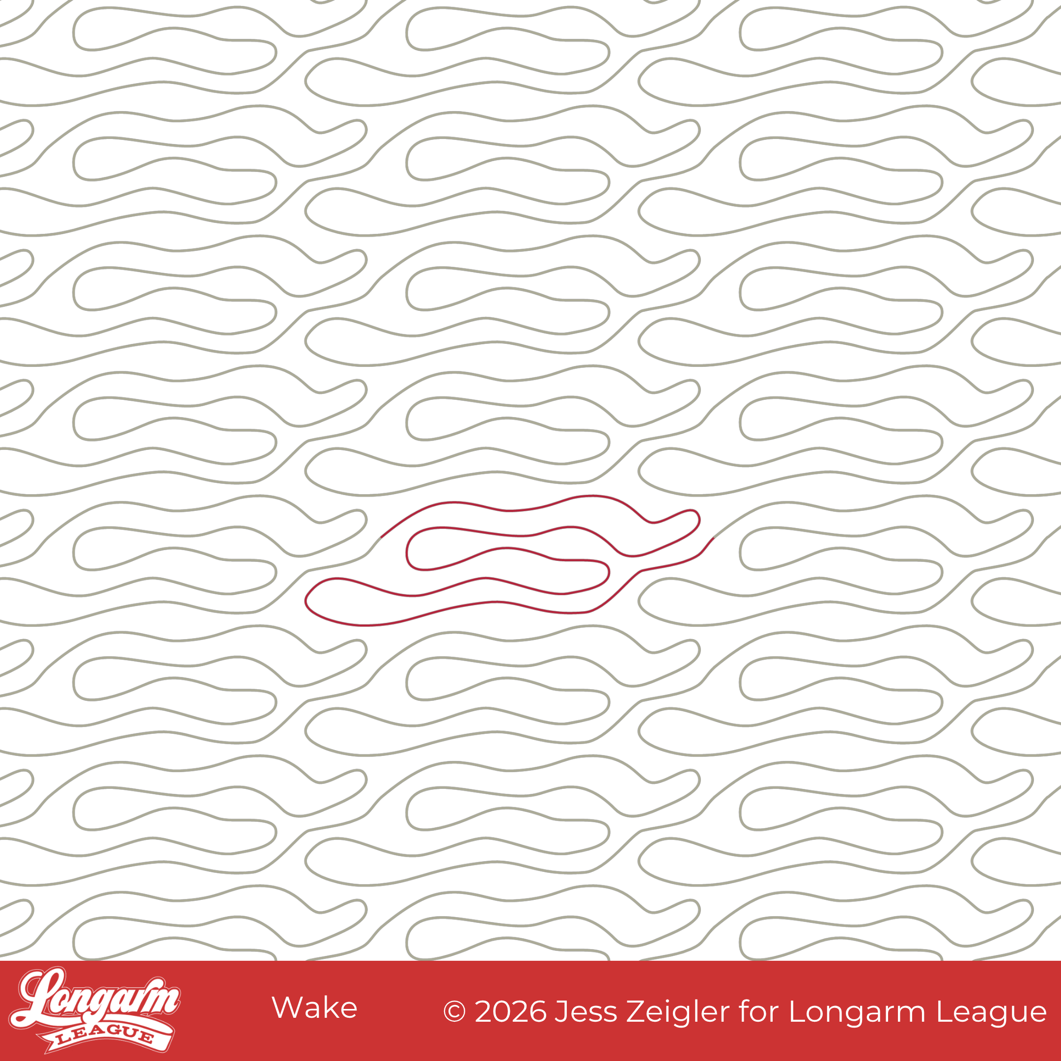
Wake Edge-to-Edge Computerized Quilting Design
I can finally put this design to bed! :) Like last month's Boho Bulbs release, this design has been in the works for several years. It started with a date night at a local sushi restaurant. I was inspired by their back wall:
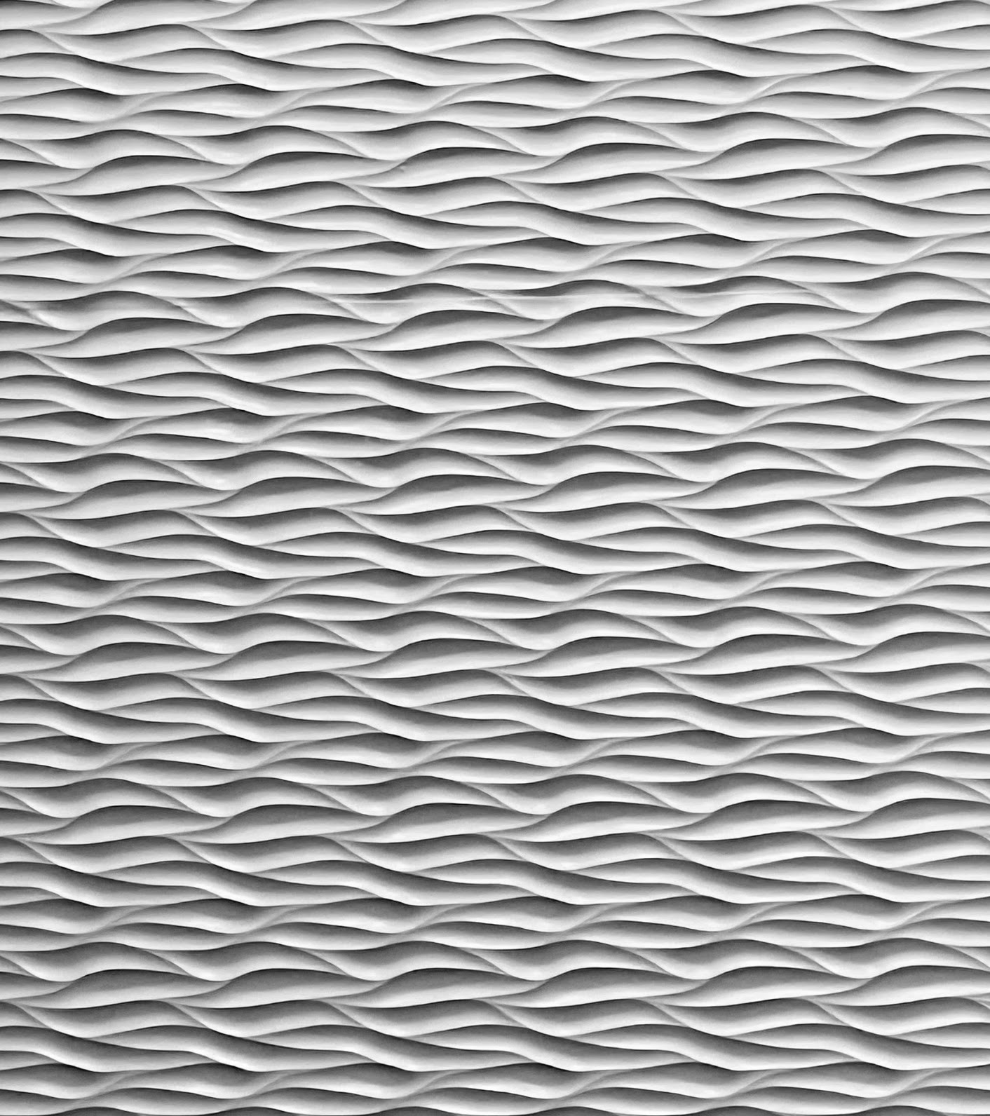
Isn't it cool?!
I loved how the lighting in the restaurant brought so much dimension and interest to the monochromatic wall. I immediately thought of quilting texture and took a picture with my phone. I started a sketch in my design software, but never fully fleshed out the design until now.
The challenge was conveying the strong horizontal orientation of the lines while coming up with a repeat that didn't have any backtracking and was easy to align/realign. 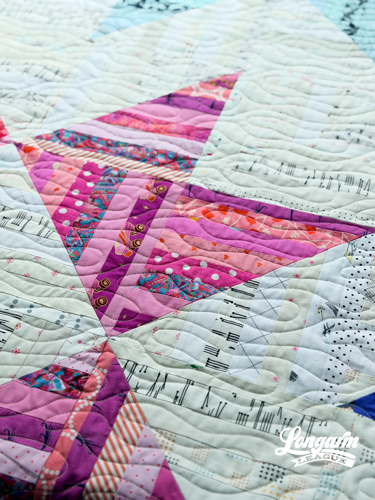
While I like the way the lines of the dimensional panels of the restaurant converge and nest together, I thought rounded ends and gaps between the long back and forth lines would be easier to stitch while still getting the horizontal flow and texture of the inspiration piece.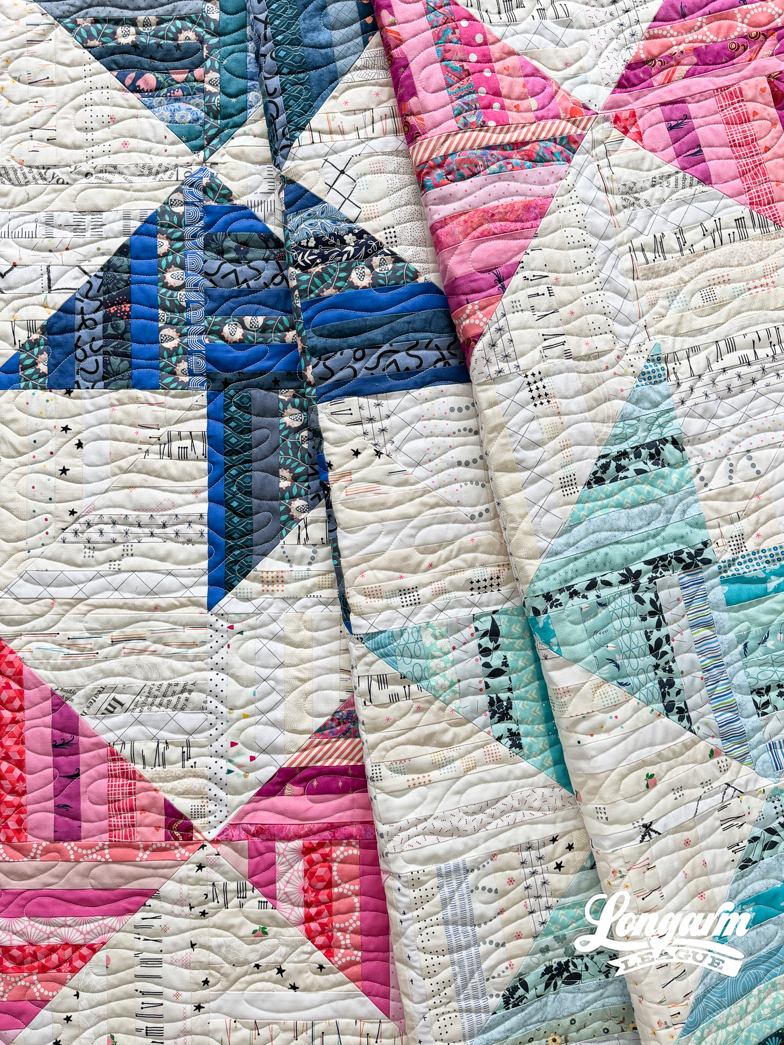
I named this design Wake...
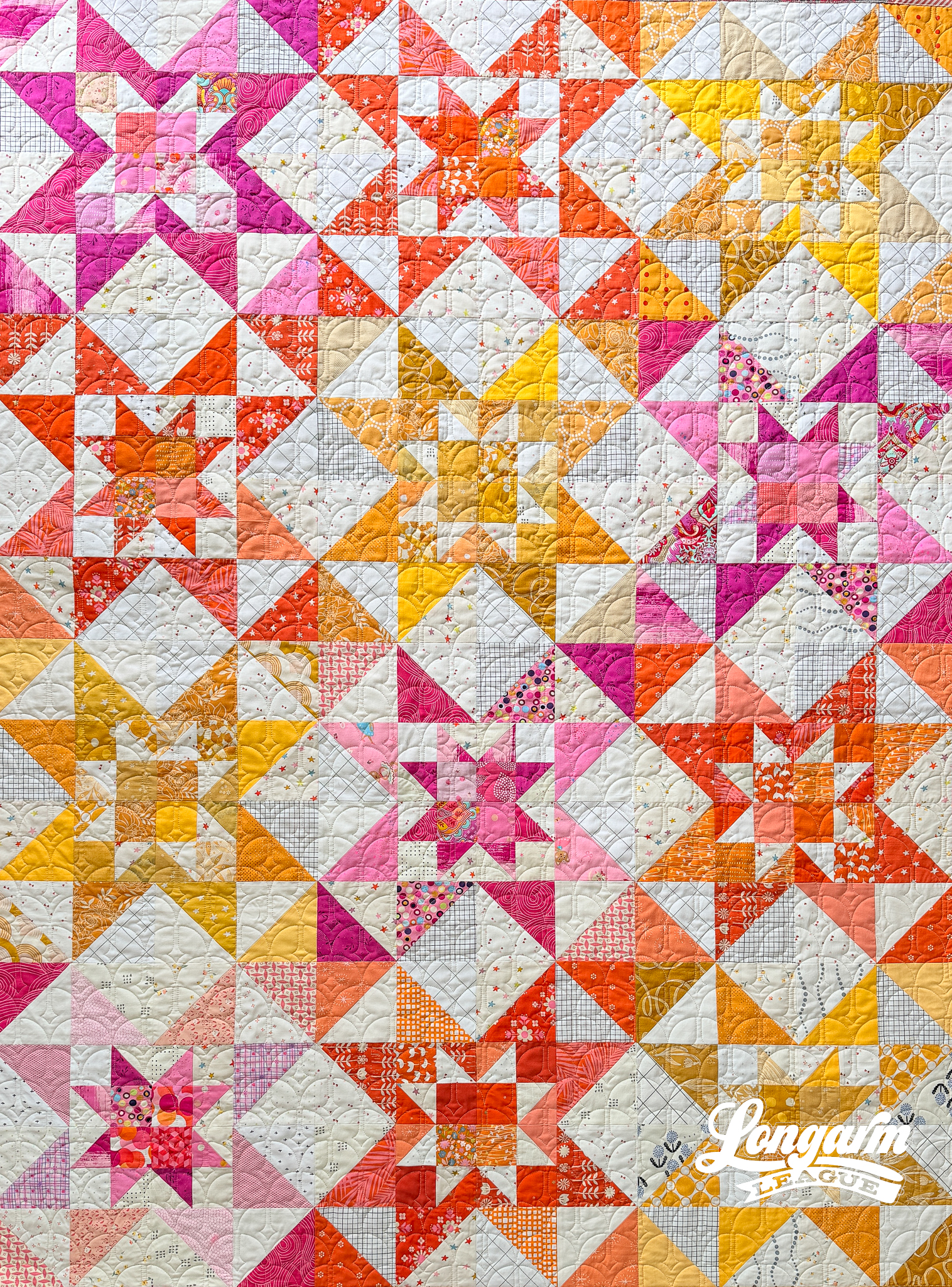
Falling Star Digital Edge-to-Edge Quilting Pantograph
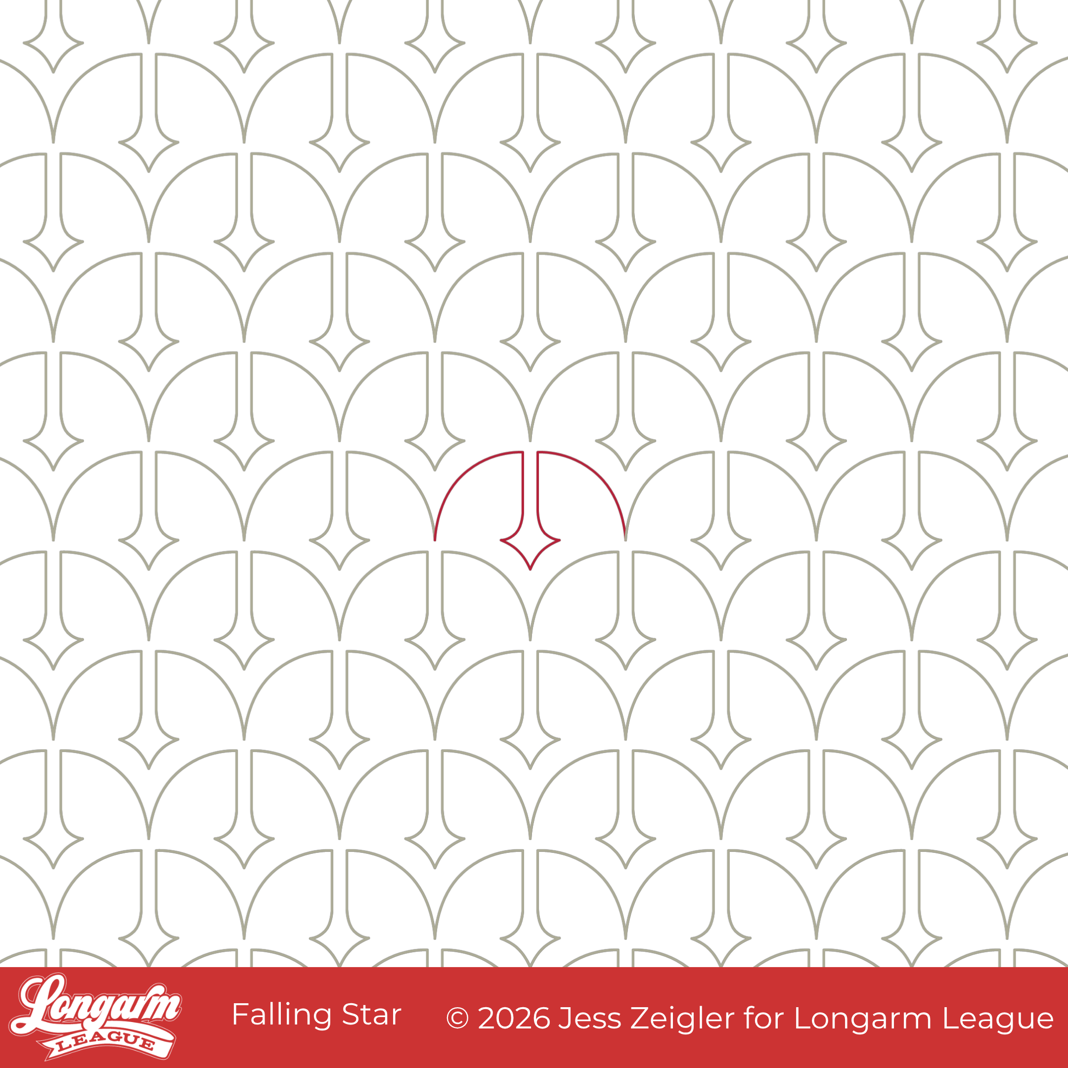
Falling Star is a clamshell variant featuring a stylized star.
That's it! Thanks for visiting my blog! 👋 *waves goodbye*
This design has been hanging out in my sketchbook longer than its cousin Held Hearts (which was an emergency design made specifically for the quilt in the blog post linked above).
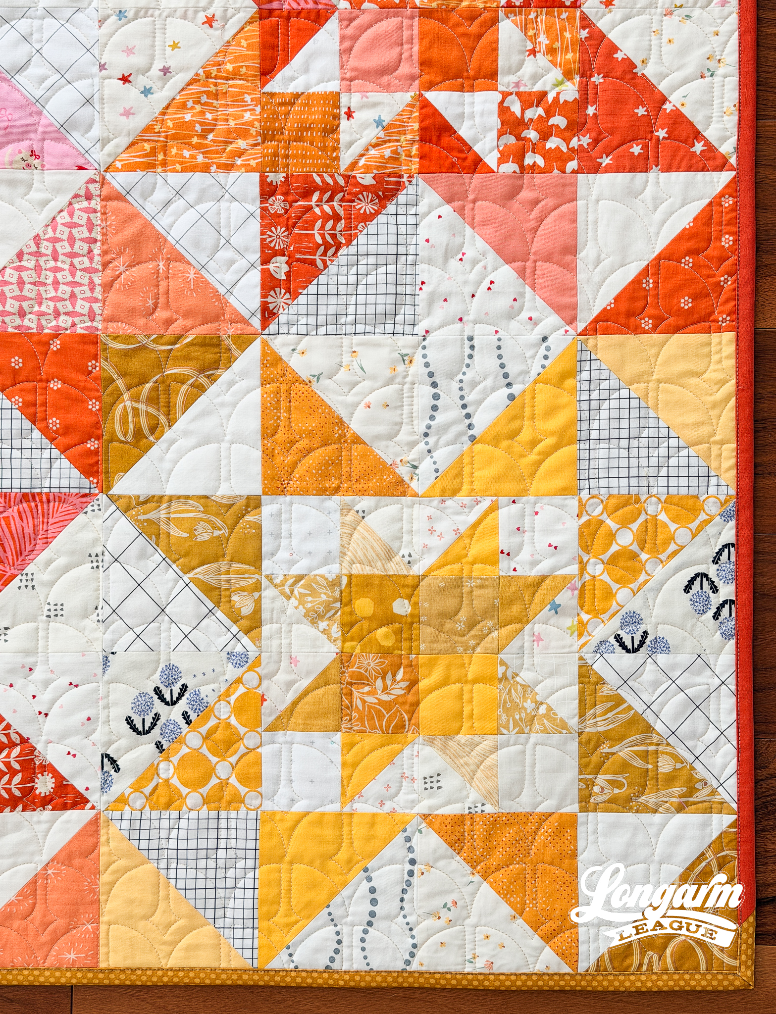
What makes this design distinctive is the split at the crown of the clamshell shape. And that split descends into a simplified star shape. Could we call it a twinkle? Yes, let's! The beautiful thing about the split is that it eliminates the need for any backtracking and is its own design element.
What I like about this little twinkle of a shape is that it echoes the same curves as the joining of the clamshells in the row below, nestling in just so.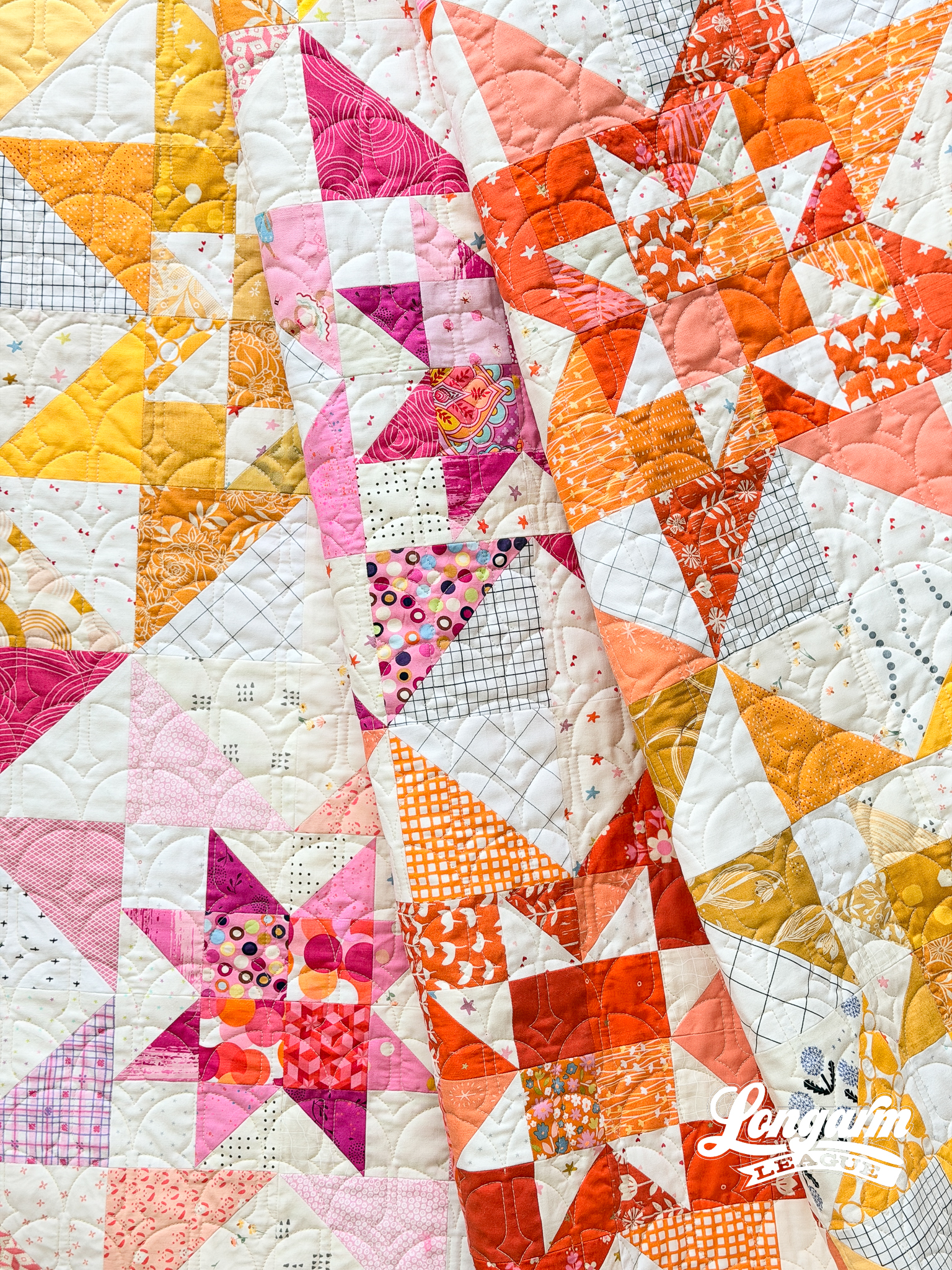
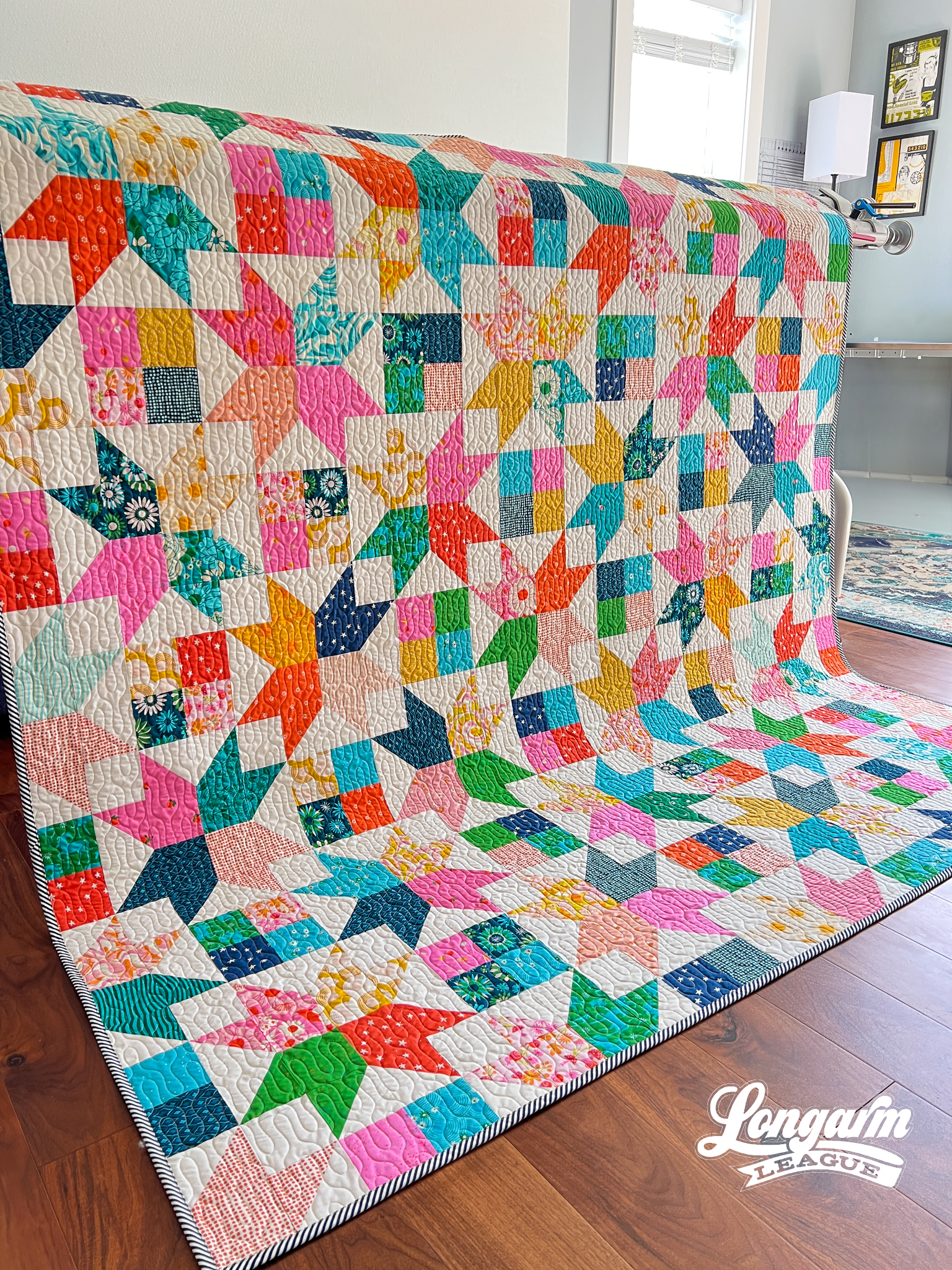
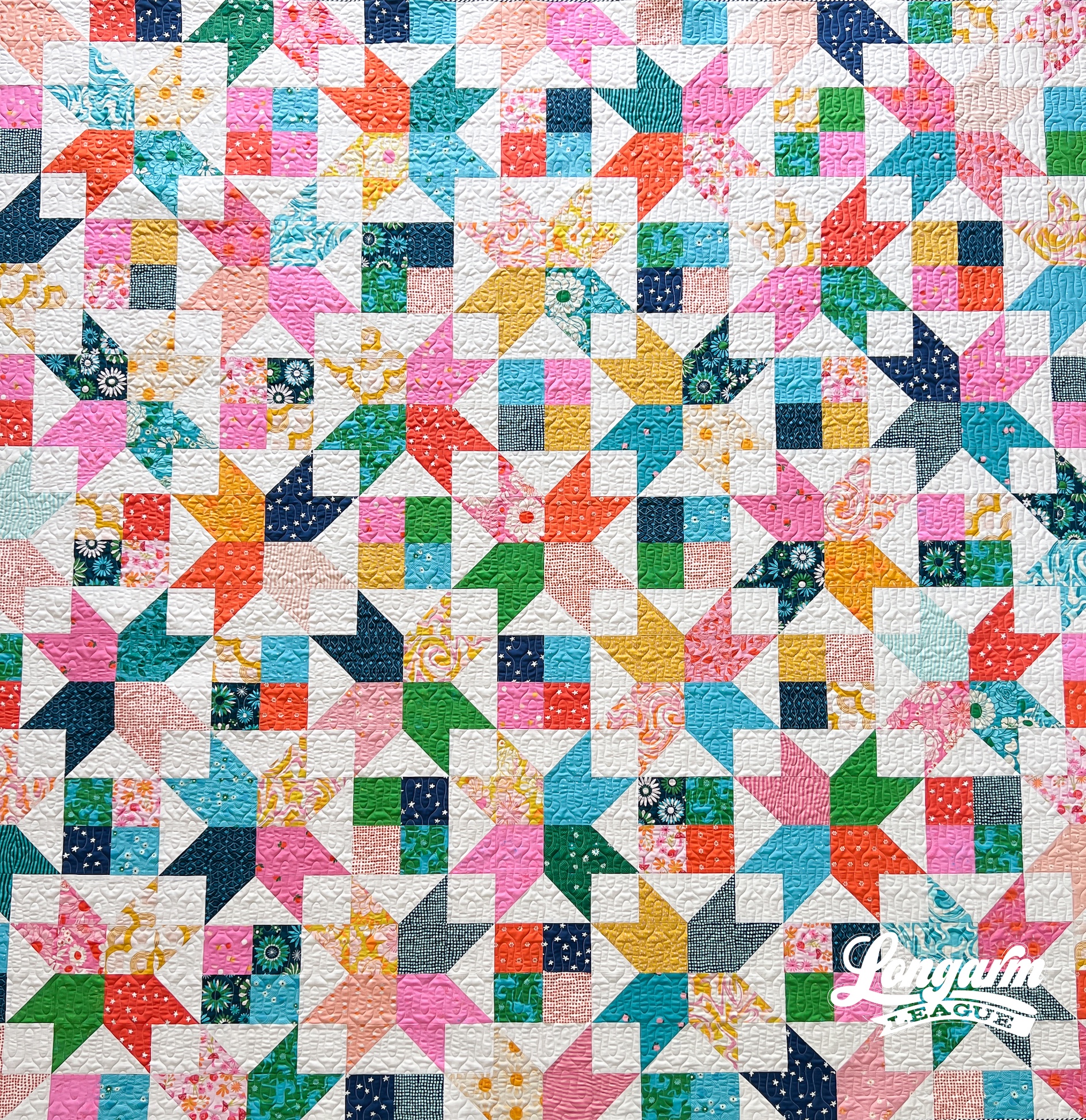
It's a dainty little design that's meant to sparkle in the background, which is great for a busy, scrappy quilt like this one.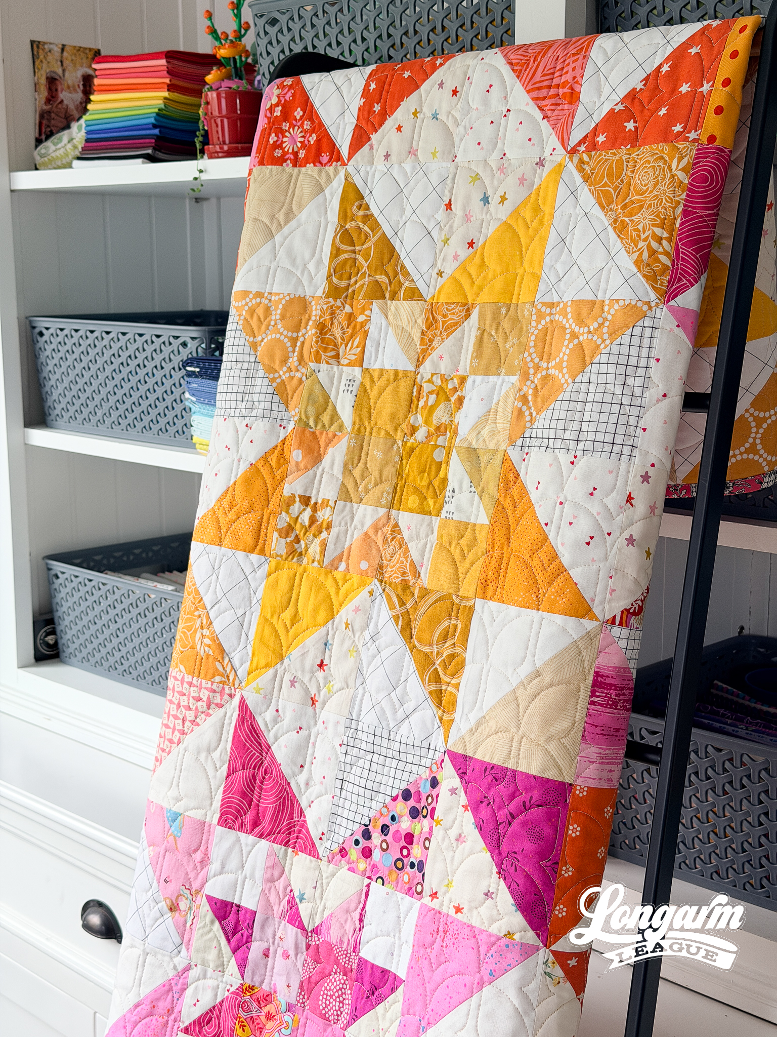
The Quilt
Quilt Pattern
I believe I stumbled upon this quilt pattern and purchased it through Etsy, but I'...
Cottage Blooms E2E Digital Quilting Design

First, there was Peak Blooms.
Then, I took the center motif and incorporated it into an organic-looking edge-to-edge design with spirals called Bloomlet.
Now, the same center motif is in its simplest form yet: in a gently undulating, rhythmic string of petals. 
At a glance, I love how overall this design reads like juicy, rounded shapes. The texture is spectacular, even on a quilt top with busy prints like the one shown in this blog post.

It's fast to stitch thanks to its simple design and smooth stitch path.
There's enough space between the four-petaled motifs for some breathing room, and yet the staggered rows (the offset amount is 25% with this one) create an interesting, off-kilter dynamic that isn't perfectly symmetrical. I believe that helps give this design a charming, somewhat loose, home-spun quality.
I think this design would be great for quilts with busy prints, floral-themed tops, or when a client requests quilting with a loose or minimal density.
The Quilt
Quil...
Simple Pines Digital Edge-to-Edge Pantograph
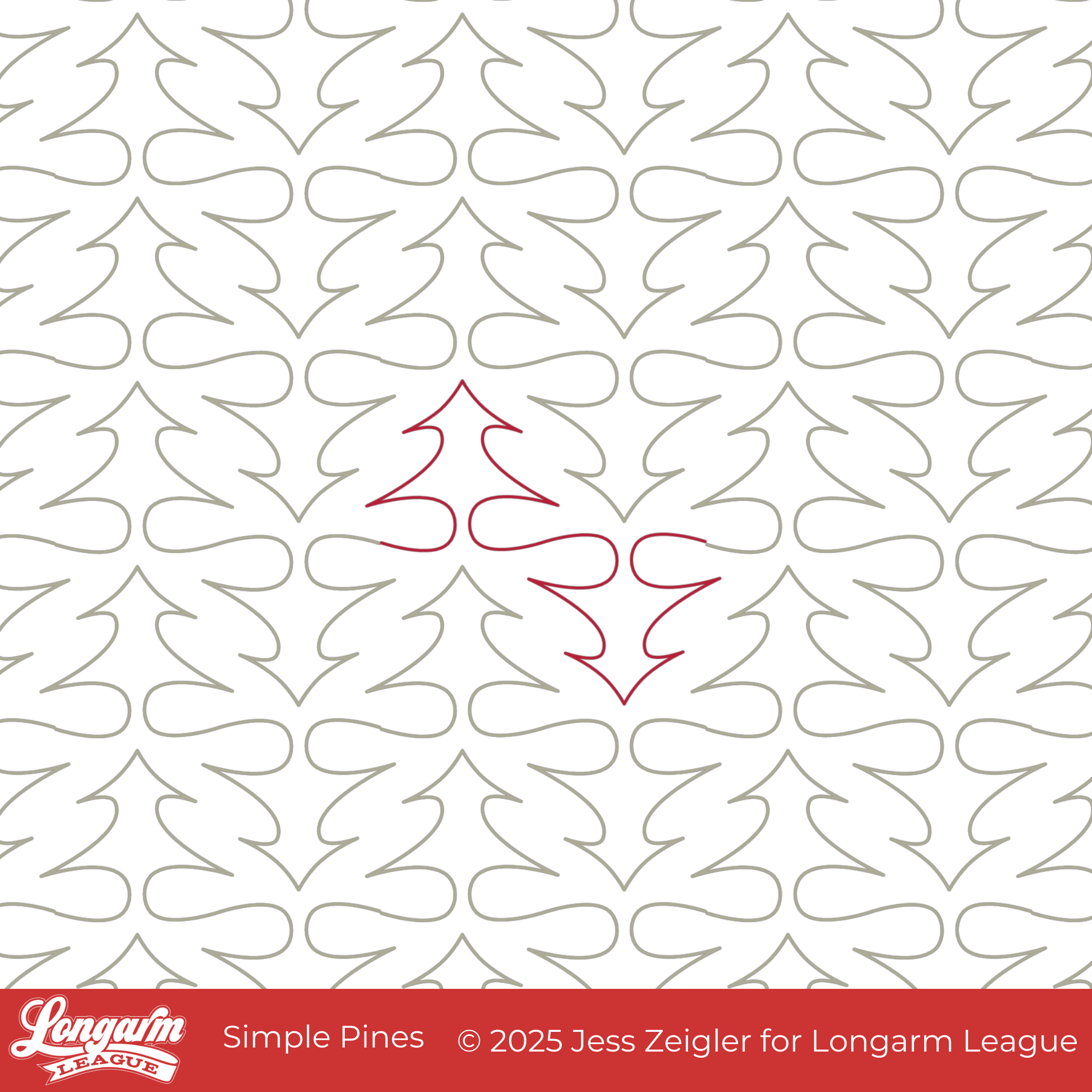
Confession time: I've had a "Christmas tree" panto sketch in my design software for well over a year now, but it just wasn't working. Cut to a few weeks ago: I became inspired by the new pattern, Tree Rows, designed by Emily Dennis of Quilty Love.
I love the SUPER simplified patchwork of the trees, and that made me take a fresh look at the panto design I'd been working on. I removed a bauble, deleted a few branches, and made the boughs curvy. Suddenly, it was a panto I wanted to use on this very quilt pattern.
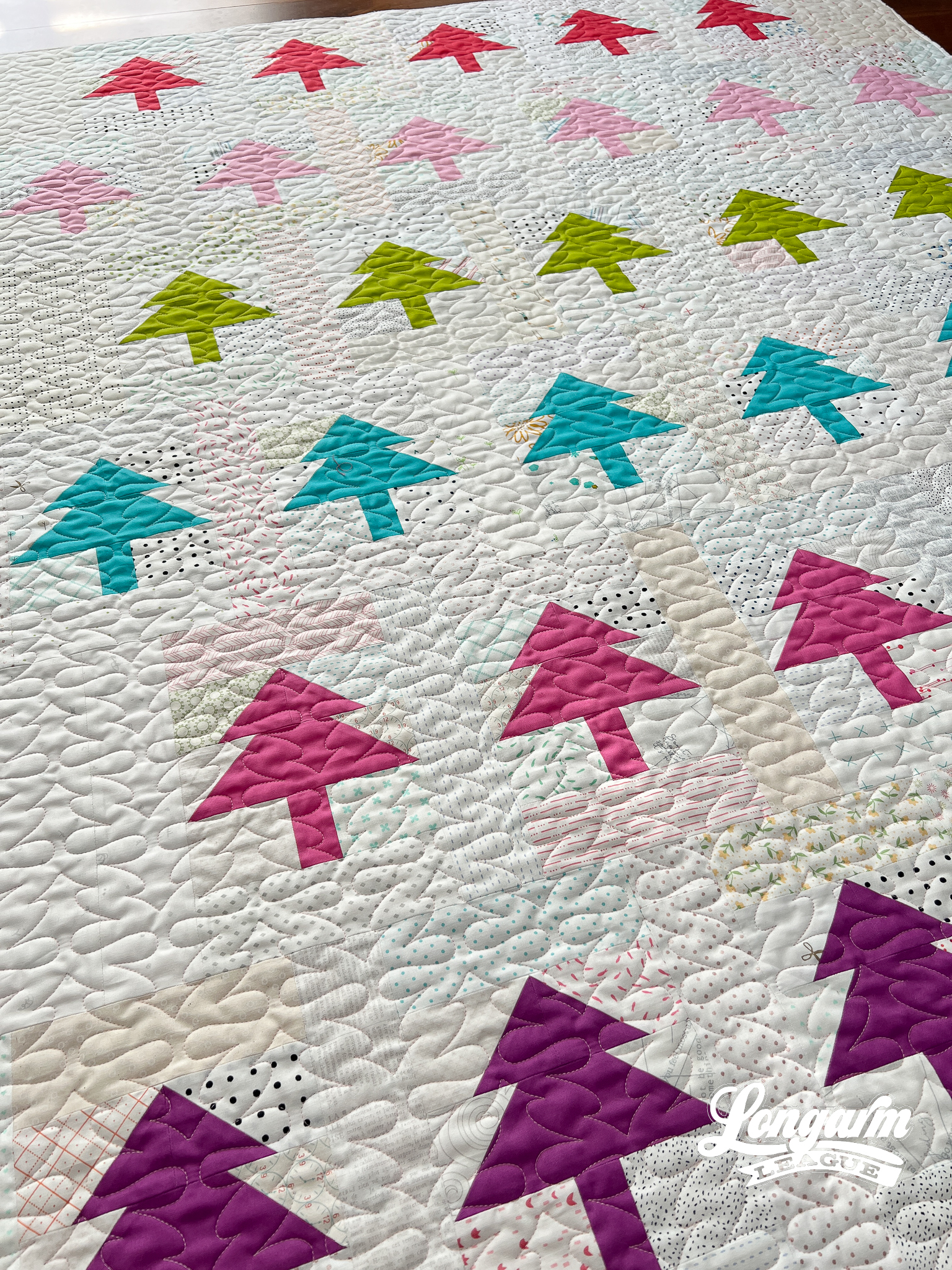
As a panto designer, I'm very much drawn to graphically interesting quilting and the texture it produces. I adore the pillowy softness that comes from the transitions between trees; it feels a bit unexpected for a tree panto. In fact, I don't think the overall texture reads immediately as "tree", and maybe that's what I like most about it.
When tiled across a quilt, the shapes interlock in a soft, flowing way.
This design would, of course, be appropriate for Christmas ...
Lloyd | Digital Quilting Design for Computerized Longarm Machines
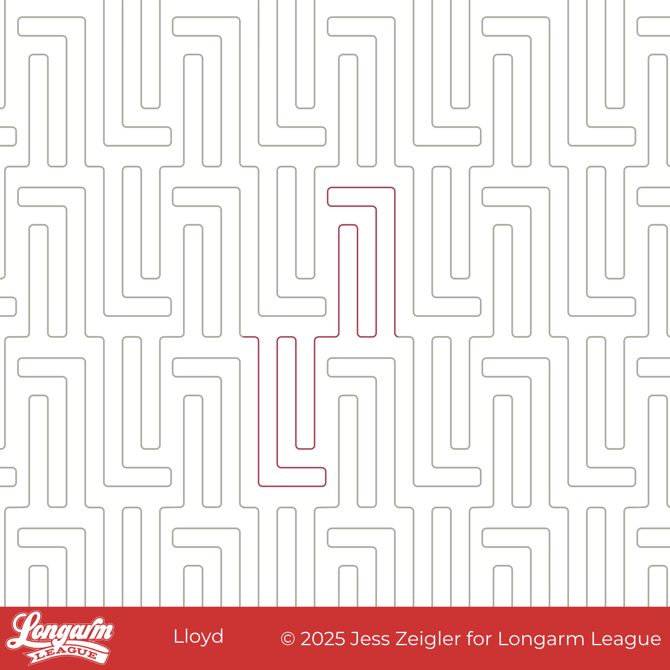
Geometric, architectural, structured, linear. This edge-to-edge design has a distinct vertical orientation; it's simpler than a maze, more complex than straight lines. Since the components resemble a capital letter L followed by a lowercase "l" (and then mirrored and inverted), I thought it would be fitting to name it Lloyd.
When Josh and I recently went away for a long weekend and stayed at an Airbnb on Lloyd Street, I decided now was the time to release it. I actually set aside the design I already tested and went ahead with this one. It'll keep for another time!
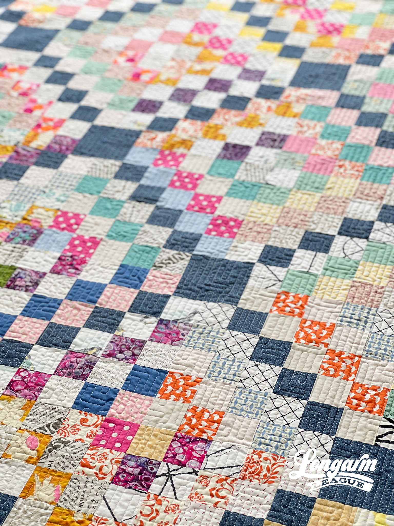
I was delighted by how the design gave this scrappy version of the Scrappy Trip Around the World quilt a unified and cohesive look. I love how it turned out!
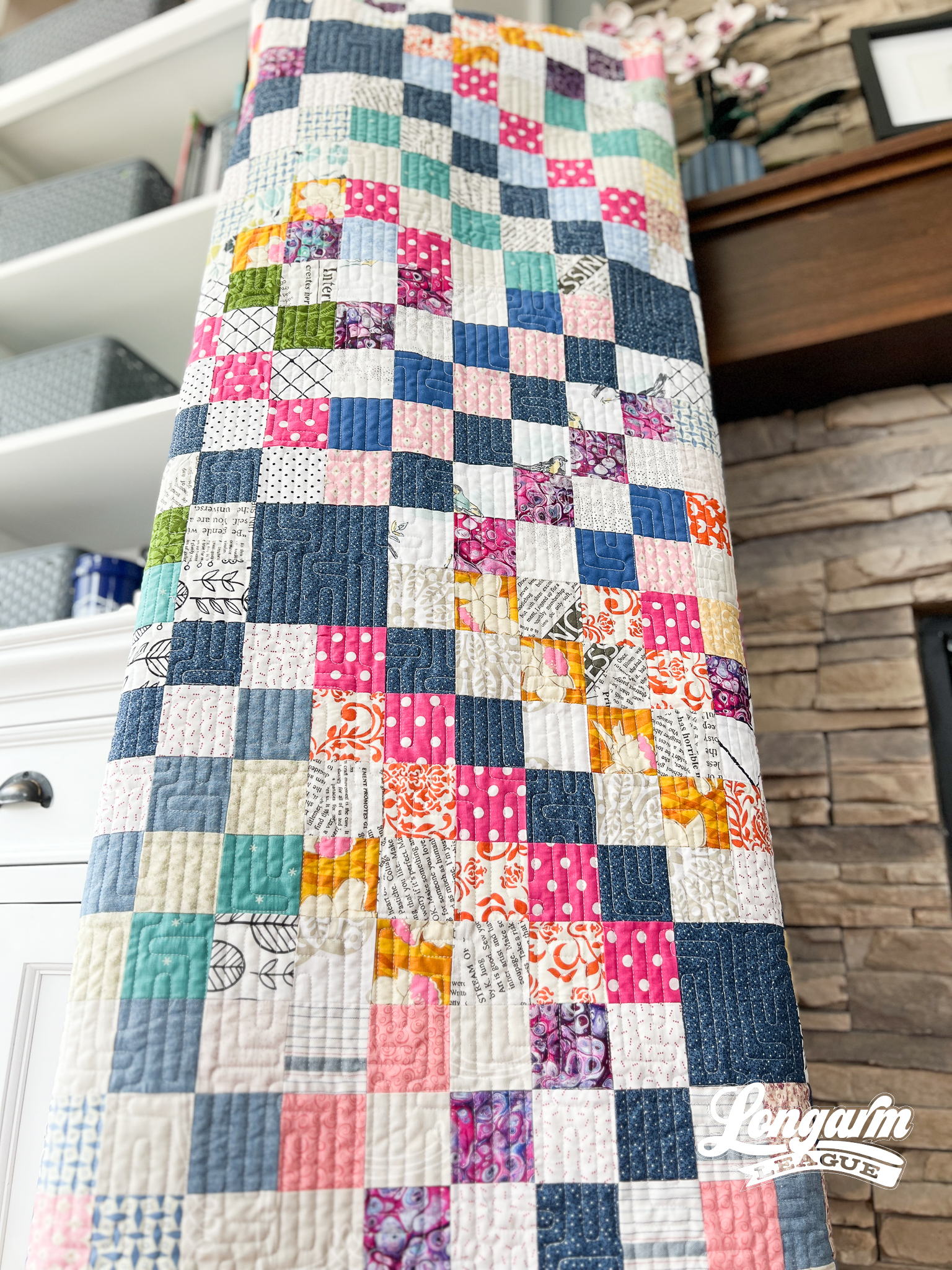
As for the digital panto, I decided to round the corners of all the line segments, and I love how that simple element adds the slightest softness to an otherwise rigid and angular look. 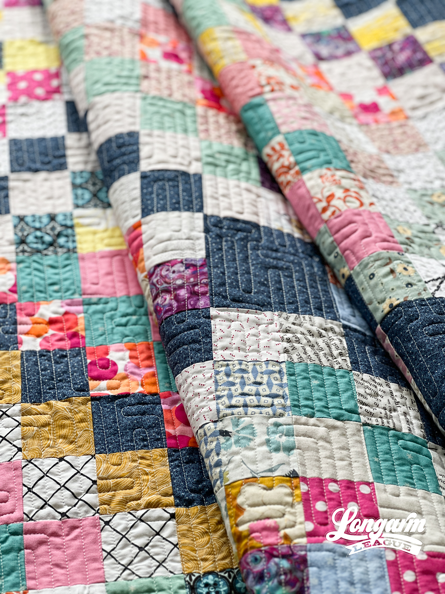
Lloyd would be great for quilt tops that feature vertical or linear ...
Modra E2E Digital Longarm Quilting Design

Feeling groovy? Our newest edge-to-edge design brings a healthy dose of retro rhythm and abstract movement to your quilts. Meet Modra, a modern meandering classic in the making.
This design originated as an interpretation of a city skyline—if you can believe it—with all rectangular shapes and mostly 90º angles. I wanted different sizes and shapes of "buildings", but when it looked very sharp and uninviting, I changed the line nodes to smooth in my software and was delighted! I loved the "ribbon candy" of it all, maintaining the irregular intervals and sizes.
I couldn't help but think it hinted at a mid-century look. It's quirky but polished, free-flowing but intentional. There are places where the stitch path overlaps slightly.
I chose to quilt Modra on this quilt top because of the variation of the lines. I generally don't like to put simple repeated E2E designs on a quilt made of only 2" squares. I prefer some variety when the patchwork is uniform.
Modra stitches like...
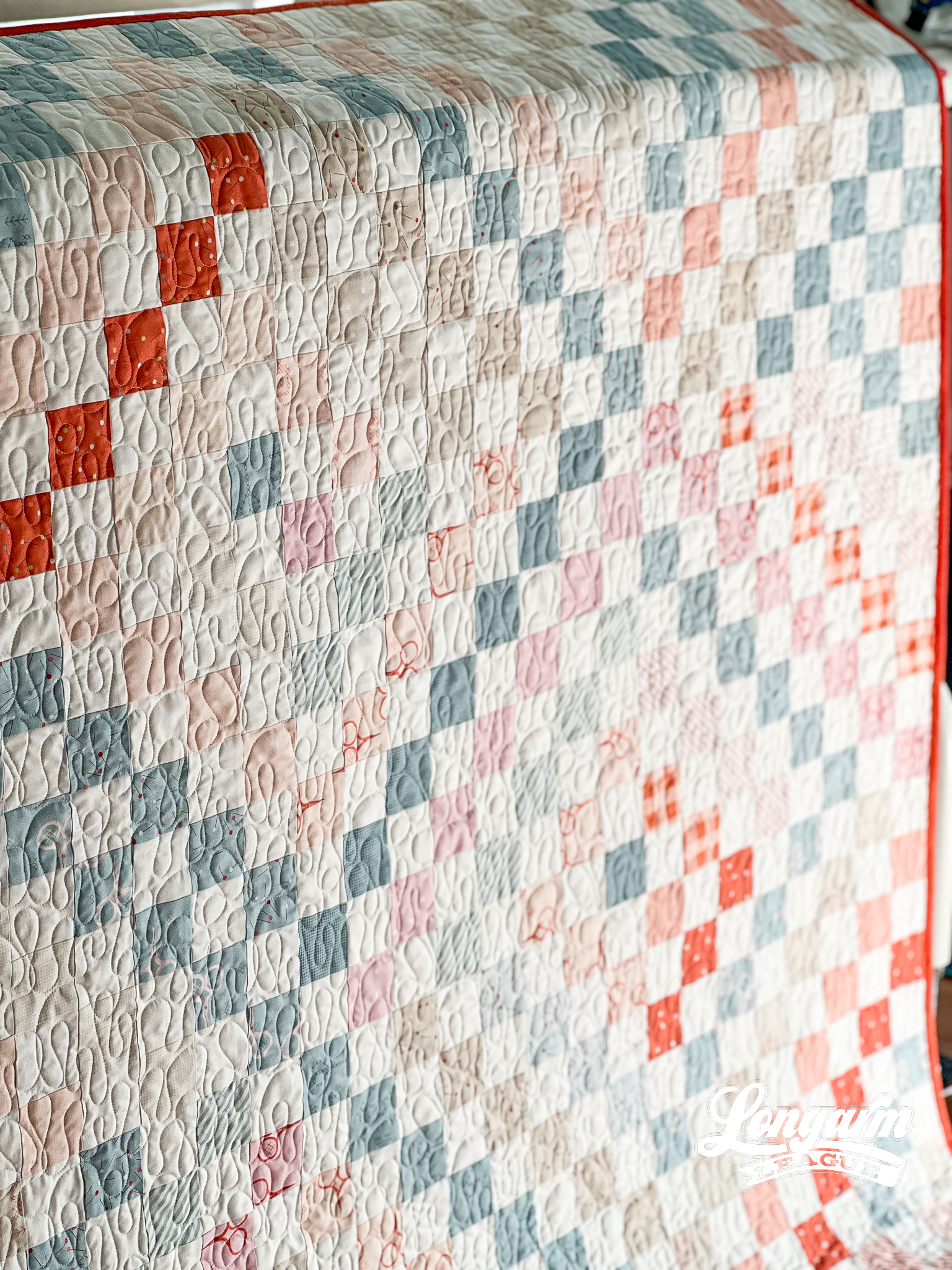
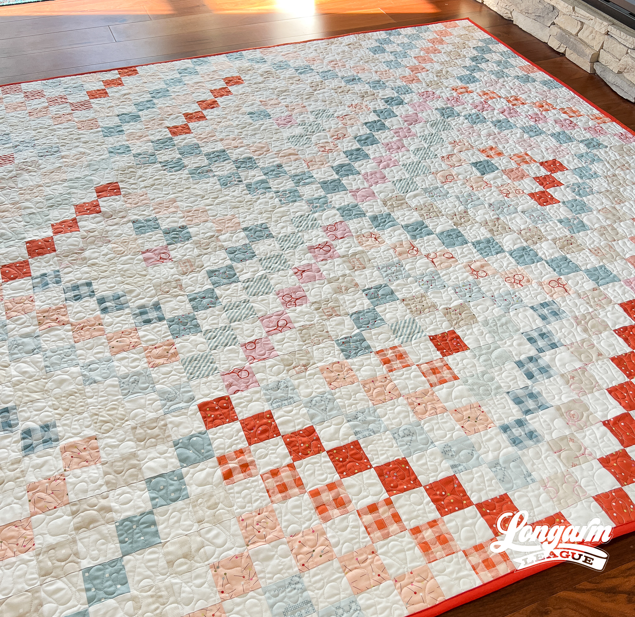
Liquid Edge-to-Edge Digital Quilting Design

As I was working on this design, I kept thinking how similar it is to the Wishbone design. It may even look more like a wishbone than Wishbone?! My husband thought I should call it Tuning Fork, which would have also been an accurate description. I decided the one-word name 'Liquid' represented the flow and drip of the design.
This has been one of my favorite combos of quilt pattern + pantograph for quite some time! I can't help but have favorites.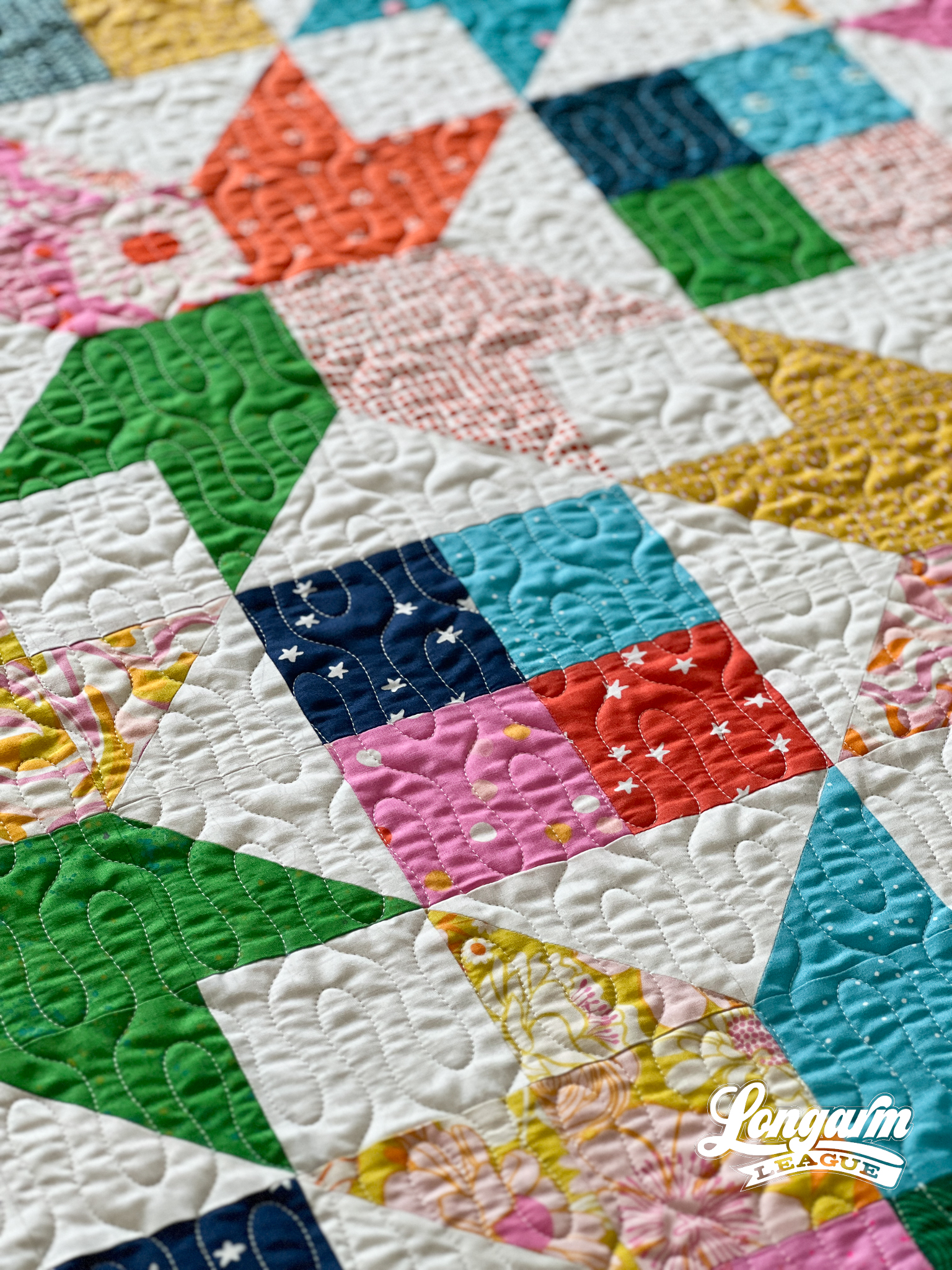
I think the simplicity of this design gives it versatility and can be used in different styles of patchwork: contemporary, modern, water-themed, you-name-it. The curvy shape gives it an element of fun and playfulness.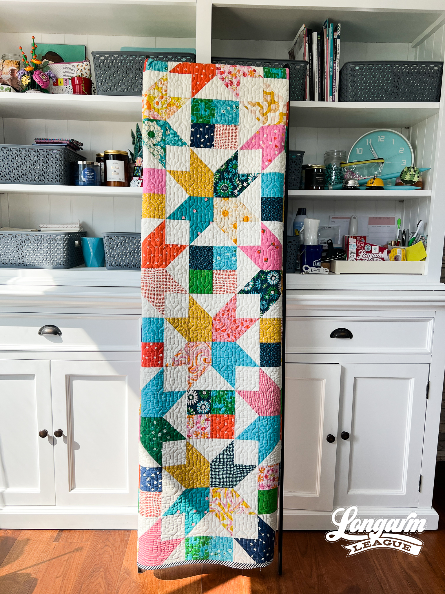
The Quilt
Quilt Pattern
The pattern I used for this quilt is called Amelia by Crystal Manning. Once again, I was prepping for a retreat and needed some ideas of quilts to make before leaving. I believe I found this pattern while browsing on Pinterest, and my star-loving heart pitter-pattered with joy!
I love ...
Lovebirds Edge-to-Edge Digital Quilting Pantograph

I'll always prefer a "graphic" style of panto design over a novelty one. That's my preferred aesthetic. With that in mind, meet Lovebirds! It's a kinda-sorta, lovey-dovey (ahem) take on a novelty concept for Valentine's Day... and beyond.

In each repeat, you'll find two pairs of lovebirds joined in an amorous but discreet pose. Awfully romantical! 💕
The mirrored shapes, gentle curves, and circles still work together to give the design a graphically strong quality that will result in a nice texture when quilted.

The Quilt
Quilt Pattern
I hopped aboard the bandwagon and joined Quilty Love's Patchwork Hearts II Quilt Along that started a few weeks ago (January 2025). Having sewn many of Emily Dennis's patterns before, I knew this would be fast-n-fun and a great way to use the fabrics I already had instead of buying new. It is a quick-win kind of project. The original Patchwork Hearts pattern is smaller in scale and while it would take more time, it's also very cute and requi...
Boa Extended Width Quilting Design

Boa consists of a simple, repeating serpentine shape. I designed it as an extended-width file to maintain the consistent spacing of the lines throughout each row of stitching.
If you are new to extended-width pantograph designs, I'd encourage you to visit this blog post that provides more information and help with set-up. They are different than traditional edge-to-edge designs and may require different configurations or settings with your software.
This quilting design is sure to bring whimsy to any quilt top! For that reason, I think a quilt top with bright colors, children's quilts, modern quilts, or even water or snake-themed quilts would be perfect candidates for the Boa design.

The Quilt
I used the Raspberry Kiss block tutorial from Wooden Spoon Quilts to make this quilt top.
The x-shaped patchwork requires only small amounts of fabric, which gives you a lot of bang for your buck when you pair it with a high-contrast background like I did.
I'm not quite sure what...
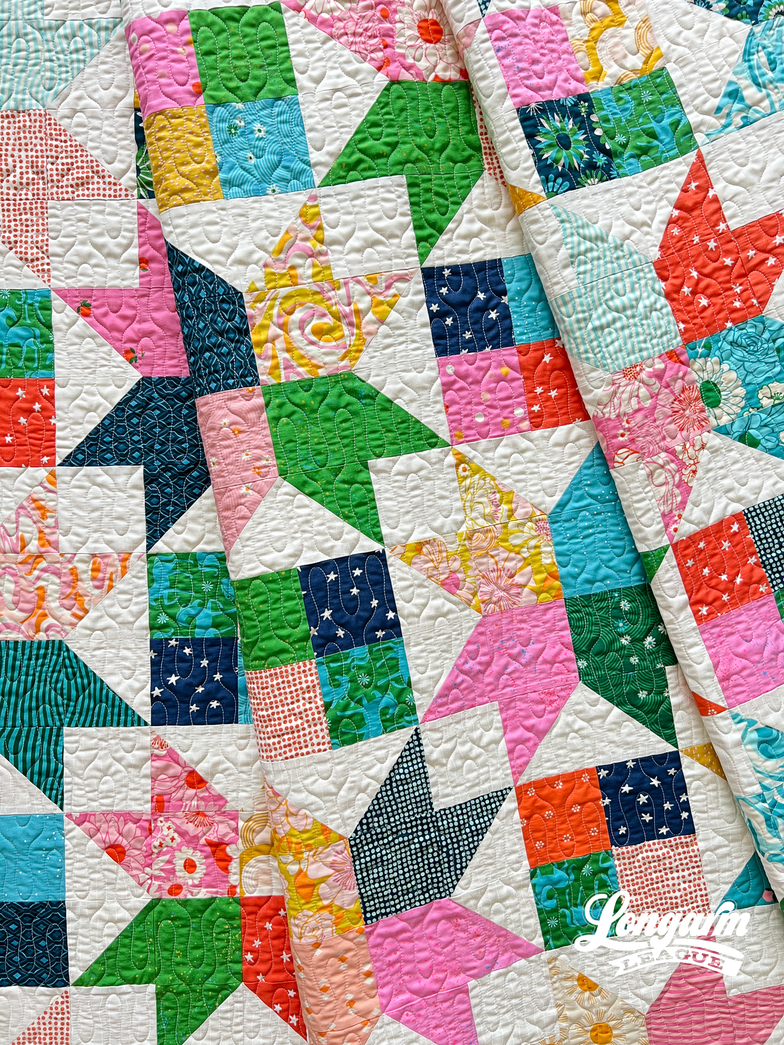
Always Digital Quilting E2E Design
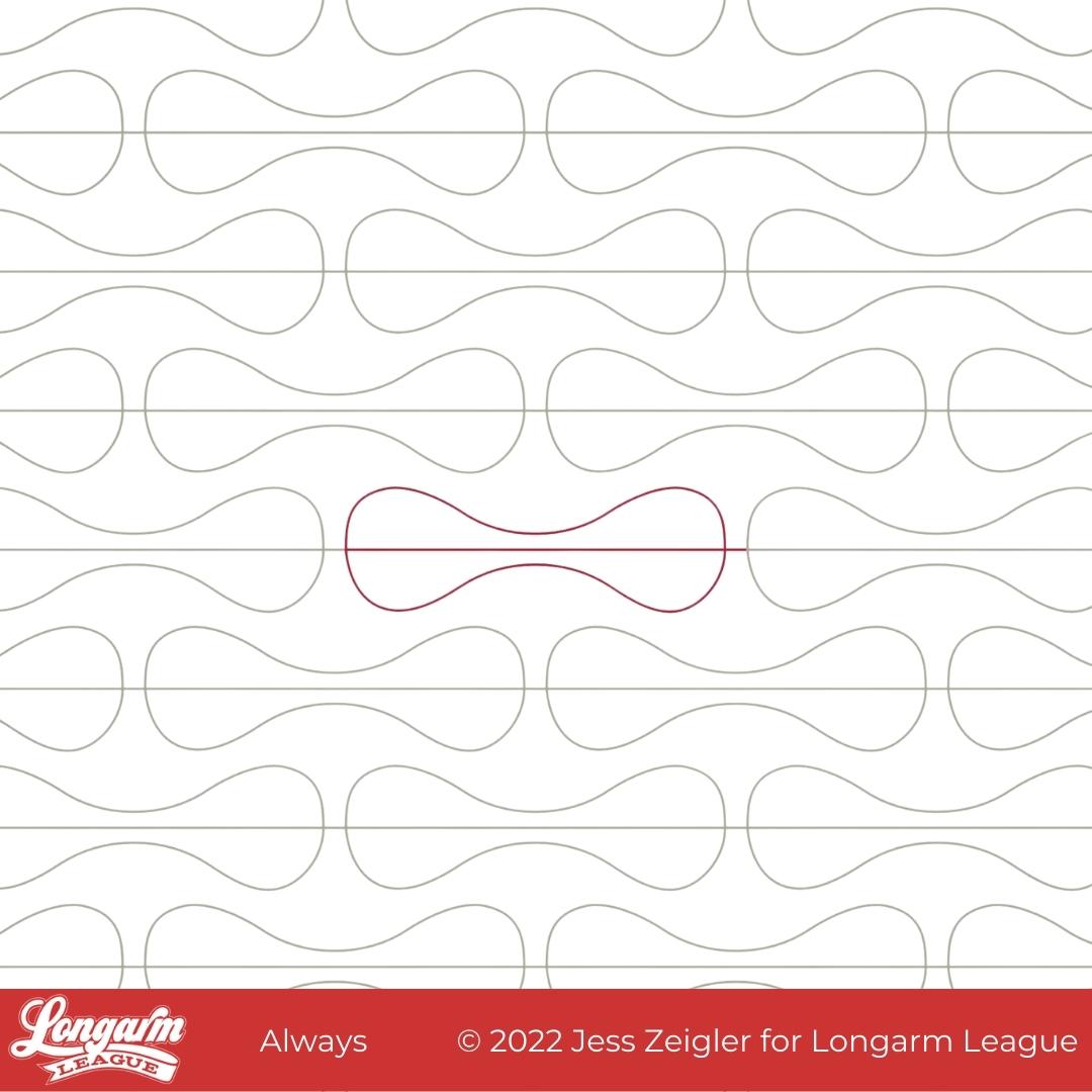
Always is a new digital pantograph design that is a breeze to stitch out. The curvy contours of this shape work so well in providing a pleasant contrast with the straight lines and angles of most patchwork.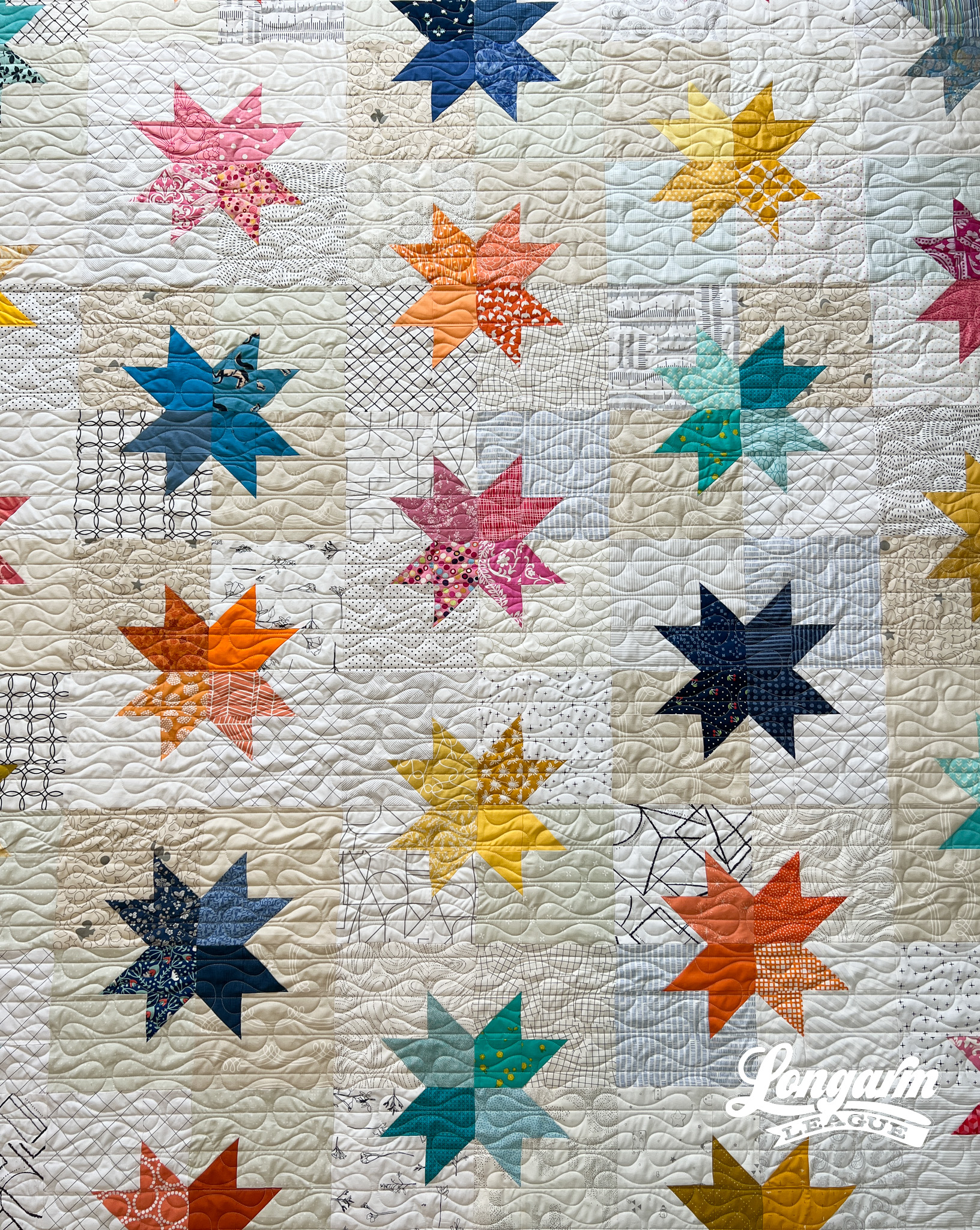
There's a retro feel to this design, too, but will fit the "mood" of many contemporary or modern quilts.
The Name
You might know from reading my previous blog posts that I often use a working title for designs before they get released and need a "real" name. Well, the working title for this one was Lightdays because of the shape resembling a pad. And well, growing up I could count on that particular brand being tucked away in the bathroom cupboards, so that's what my mind went to. My sister thought this was hysterical when I texted her the design with the name, and that's all that really matters. 😂
But obviously I couldn't actually use Lightdays as a name. I didn't want it to be THAT obvious or cause anyone to avoid using the pantograph because of the name. I asked my fr...

Jess Zeigler
Longarm League Commish & Owner of Threaded Quilting Studio, LLC.


