
Wake Edge-to-Edge Computerized Quilting Design
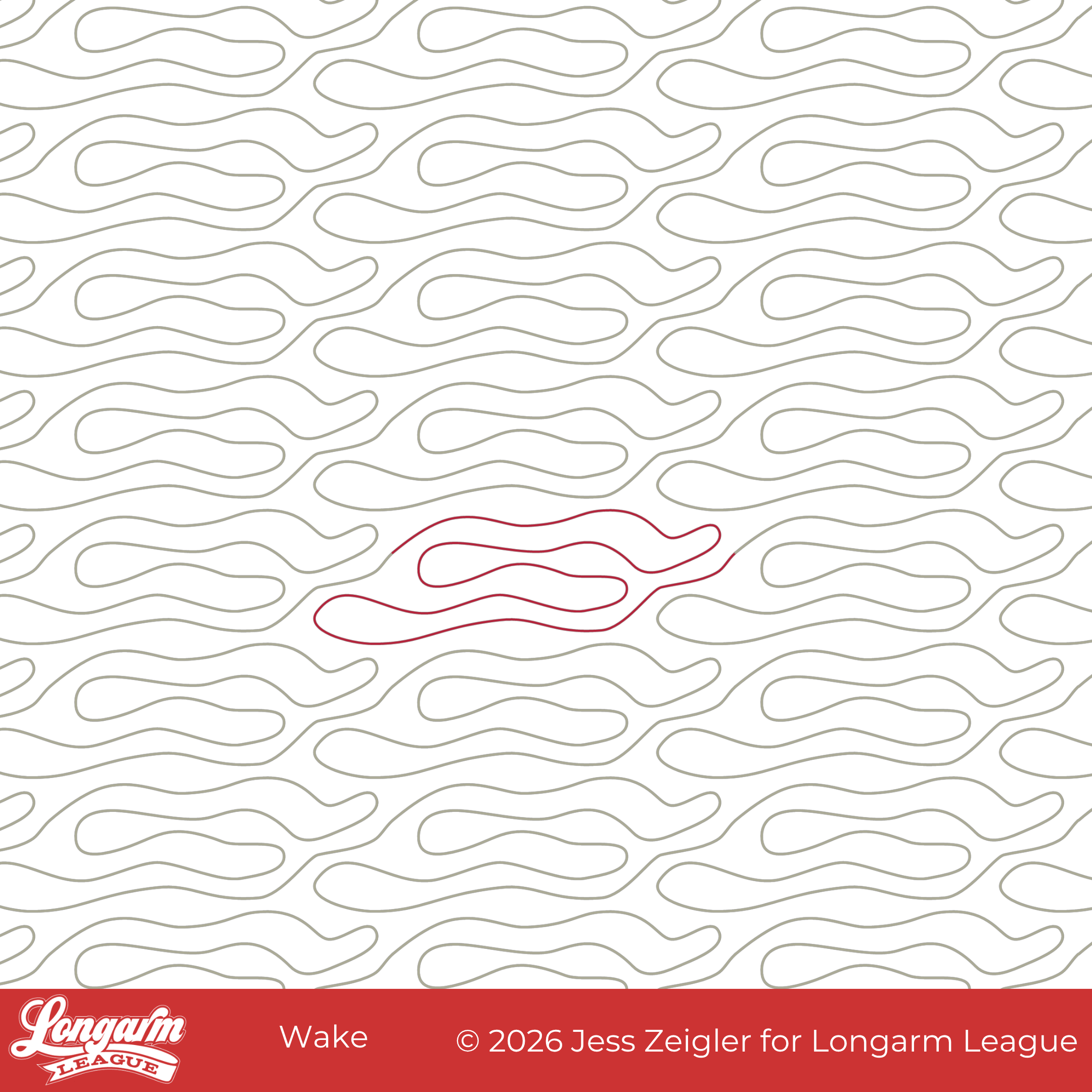
I can finally put this design to bed! :) Like last month's Boho Bulbs release, this design has been in the works for several years. It started with a date night at a local sushi restaurant. I was inspired by their back wall:
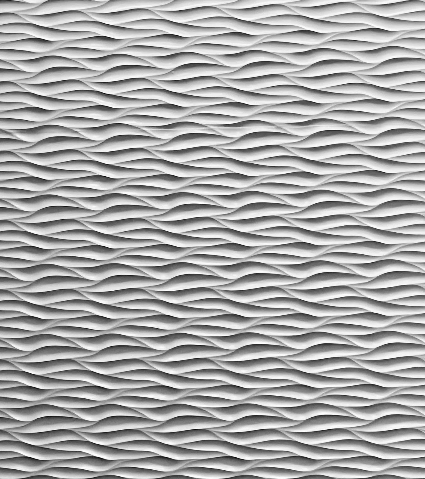
Isn't it cool?!
I loved how the lighting in the restaurant brought so much dimension and interest to the monochromatic wall. I immediately thought of quilting texture and took a picture with my phone. I started a sketch in my design software, but never fully fleshed out the design until now.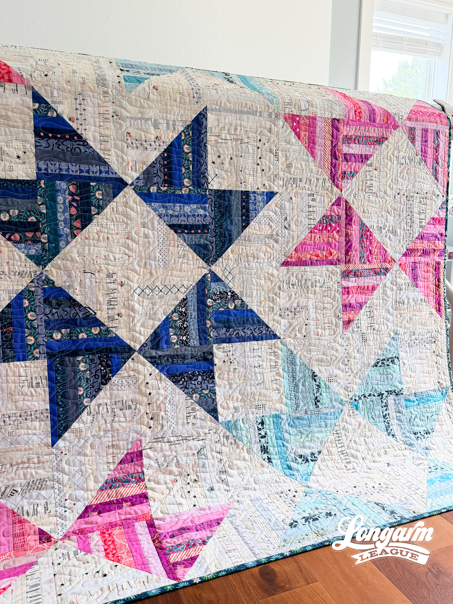
The challenge was conveying the strong horizontal orientation of the lines while coming up with a repeat that didn't have any backtracking and was easy to align/realign. 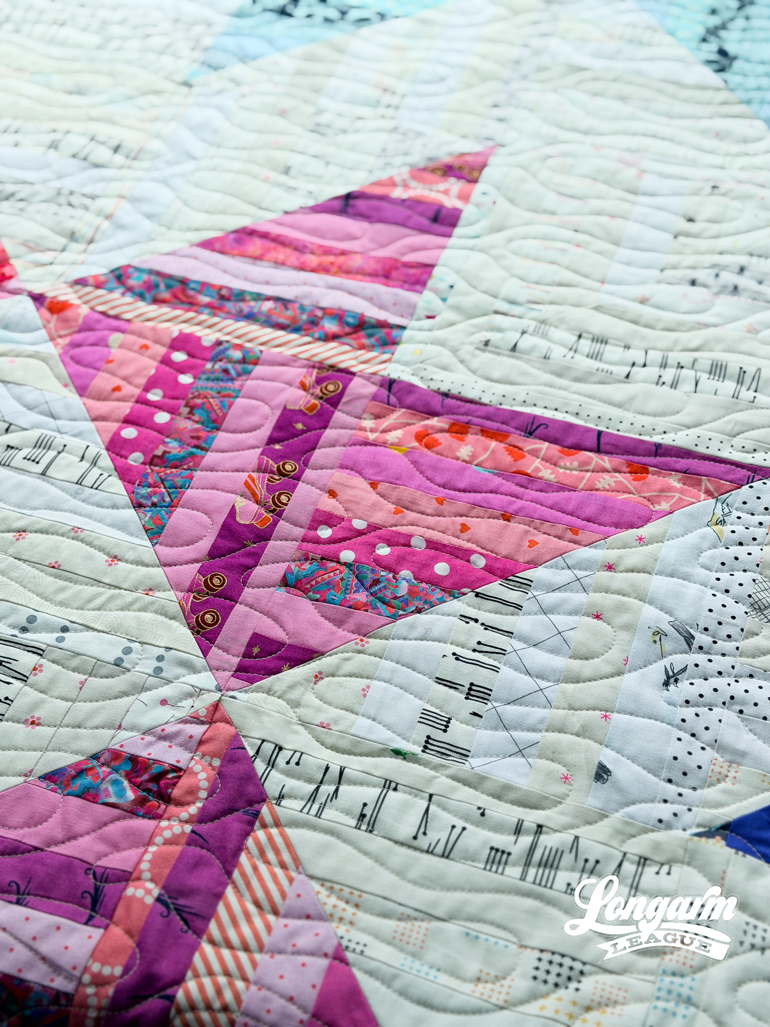
While I like the way the lines of the dimensional panels of the restaurant converge and nest together, I thought rounded ends and gaps between the long back and forth lines would be easier to stitch while still getting the horizontal flow and texture of the inspiration piece.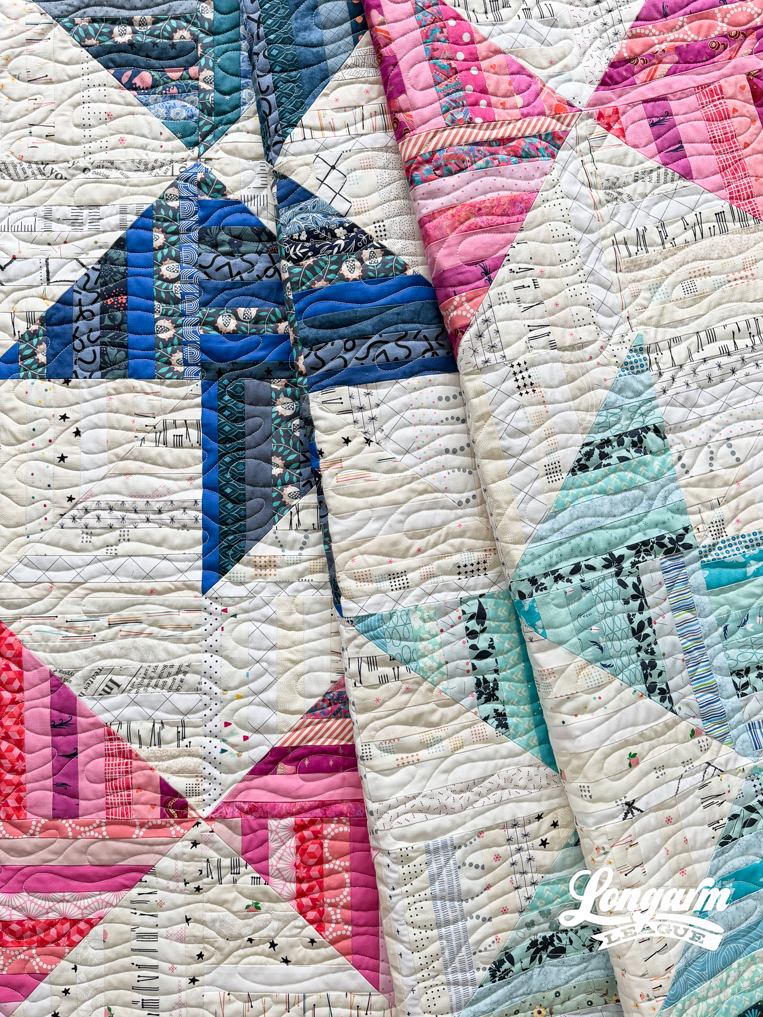
I named this design Wake...
Liquid Edge-to-Edge Digital Quilting Design
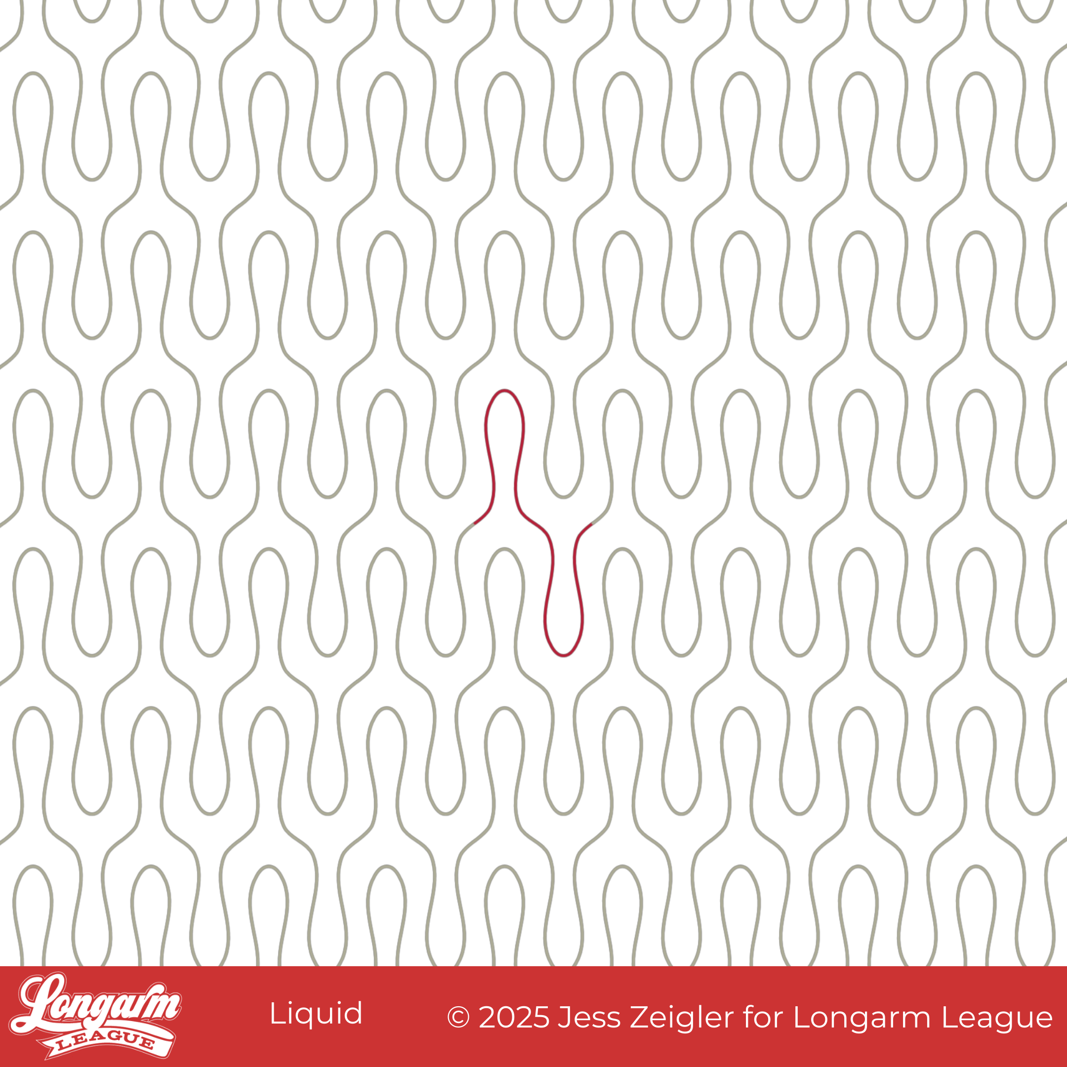
As I was working on this design, I kept thinking how similar it is to the Wishbone design. It may even look more like a wishbone than Wishbone?! My husband thought I should call it Tuning Fork, which would have also been an accurate description. I decided the one-word name 'Liquid' represented the flow and drip of the design.
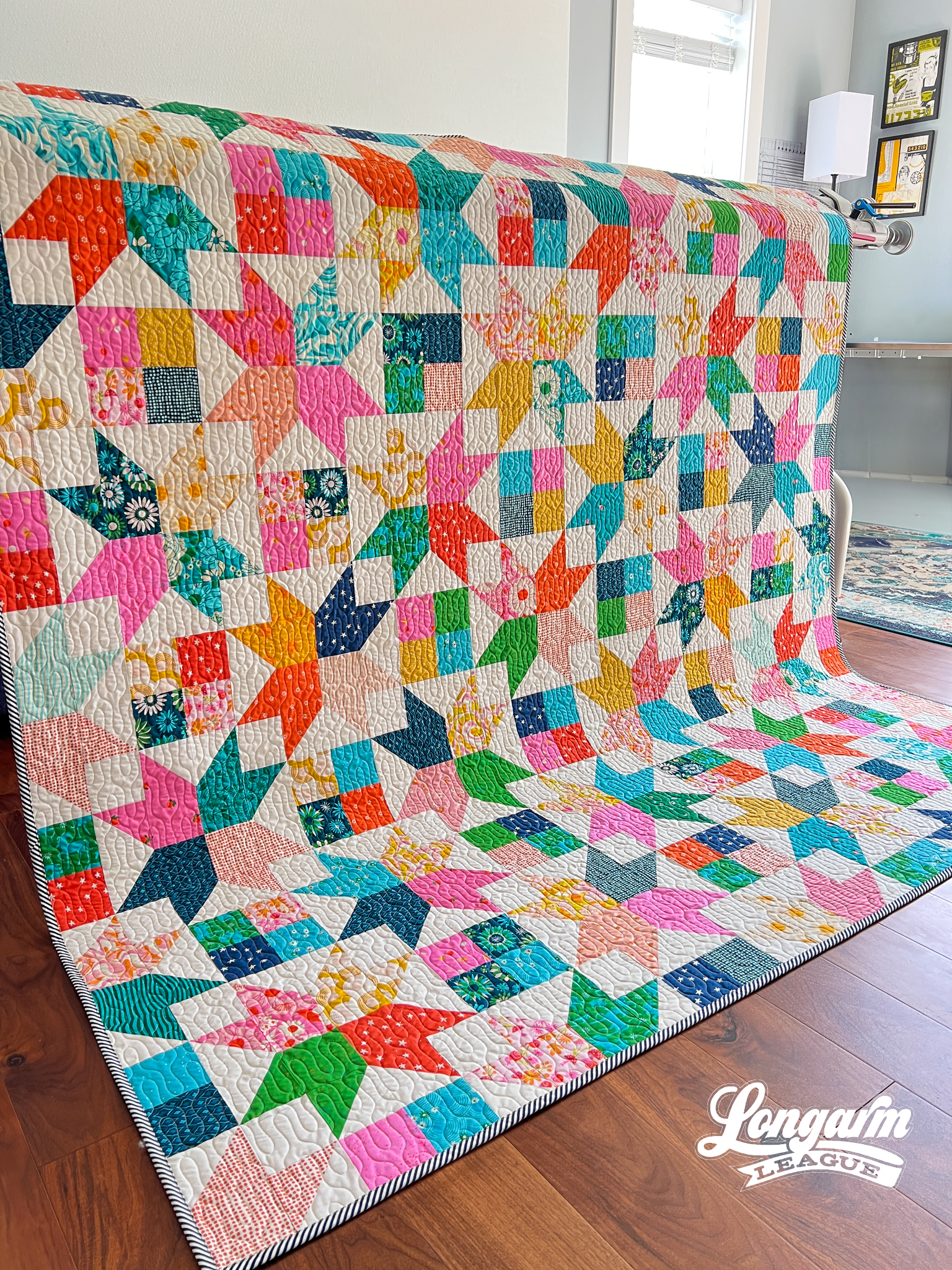
This has been one of my favorite combos of quilt pattern + pantograph for quite some time! I can't help but have favorites.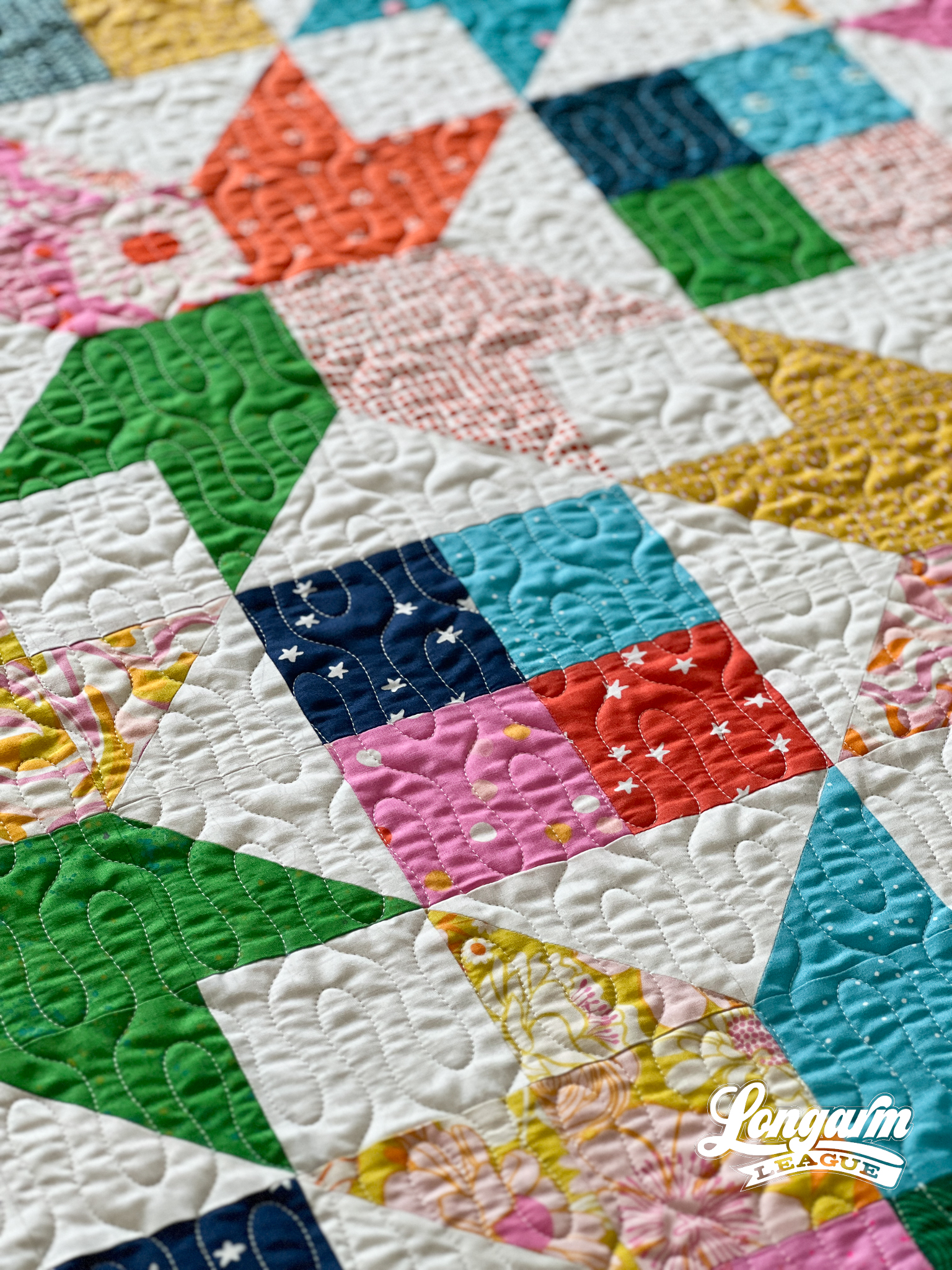
I think the simplicity of this design gives it versatility and can be used in different styles of patchwork: contemporary, modern, water-themed, you-name-it. The curvy shape gives it an element of fun and playfulness.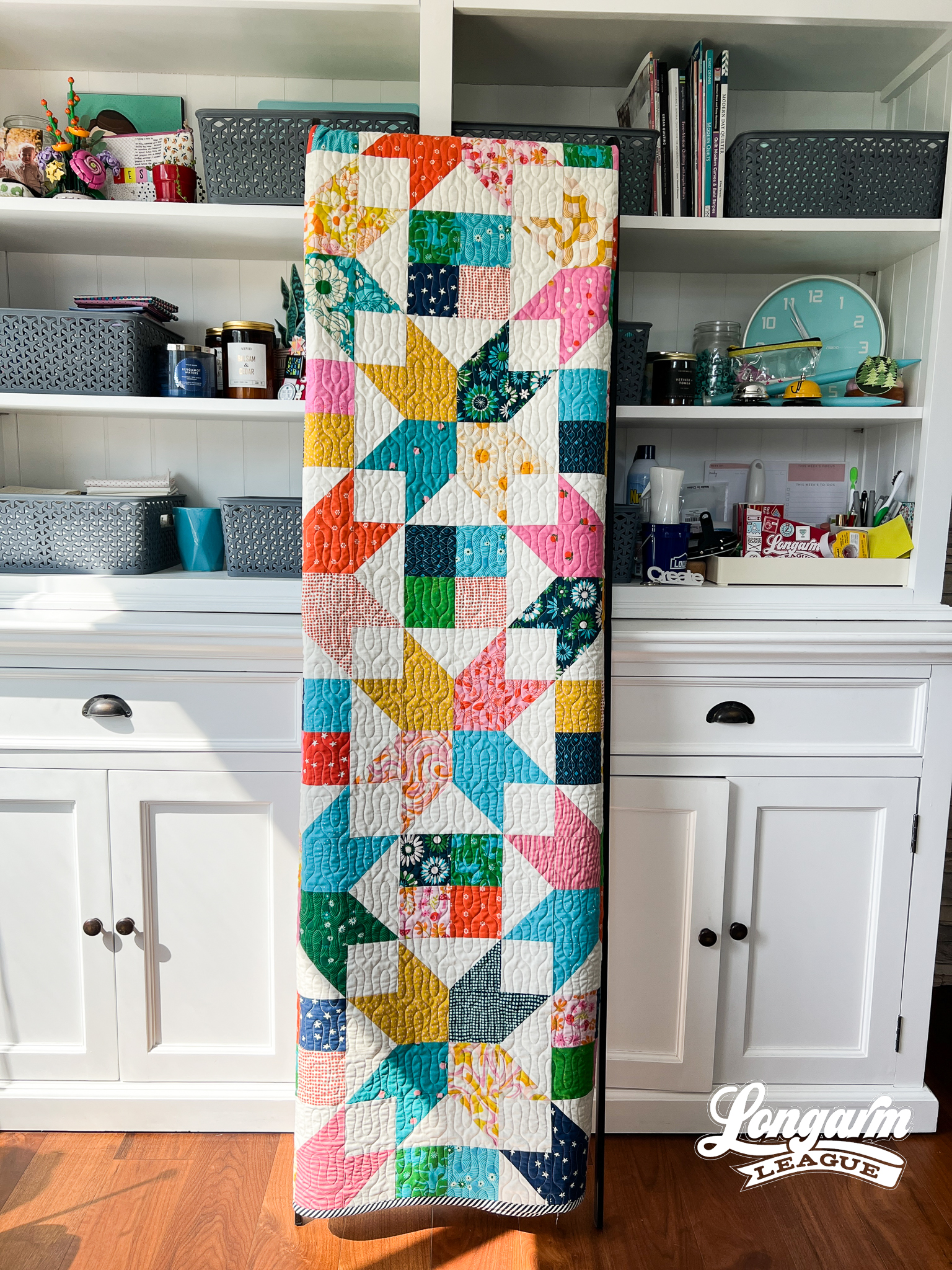
The Quilt
Quilt Pattern
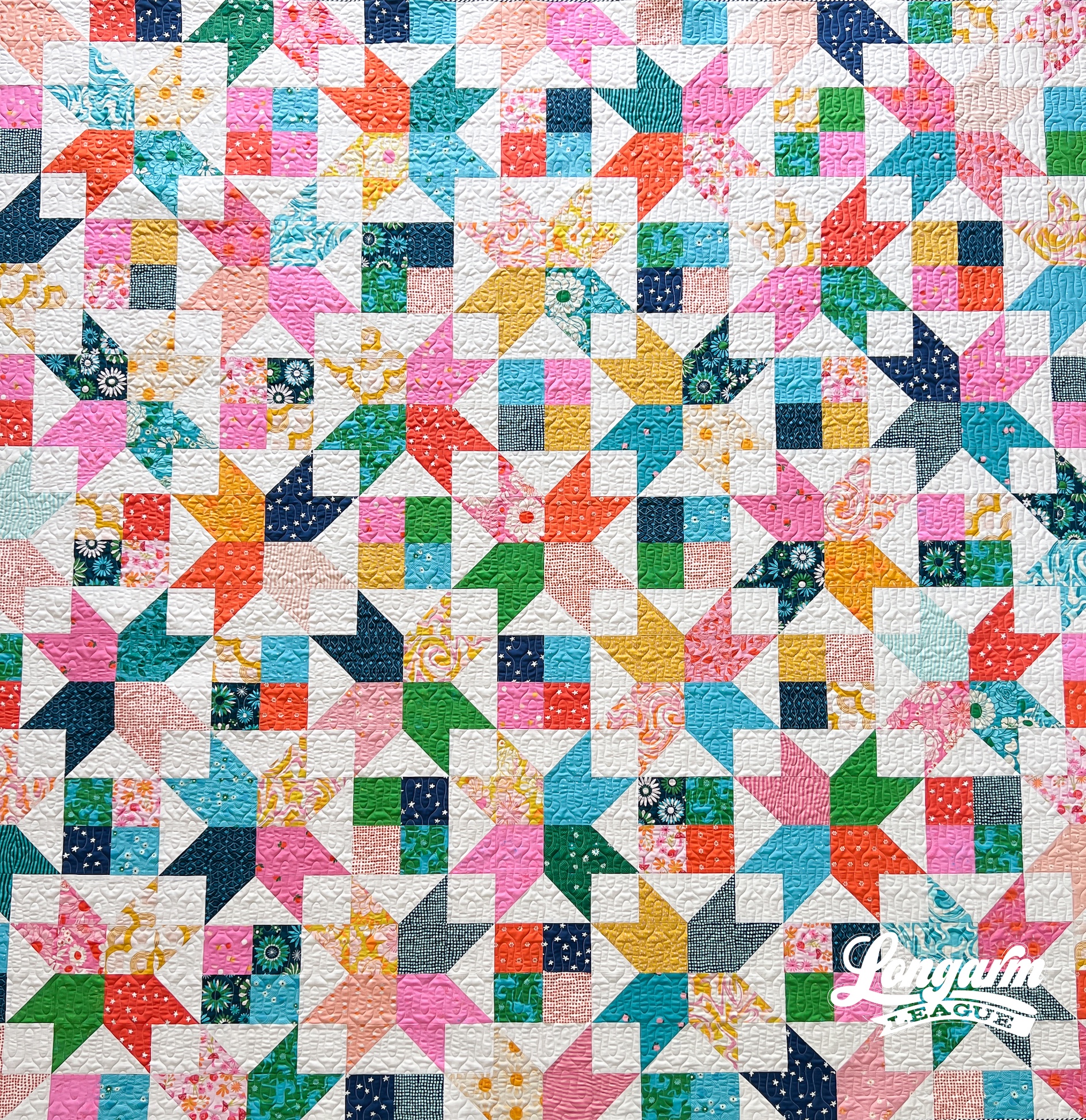
The pattern I used for this quilt is called Amelia by Crystal Manning. Once again, I was prepping for a retreat and needed some ideas of quilts to make before leaving. I believe I found this pattern while browsing on Pinterest, and my star-loving heart pitter-pattered with joy!
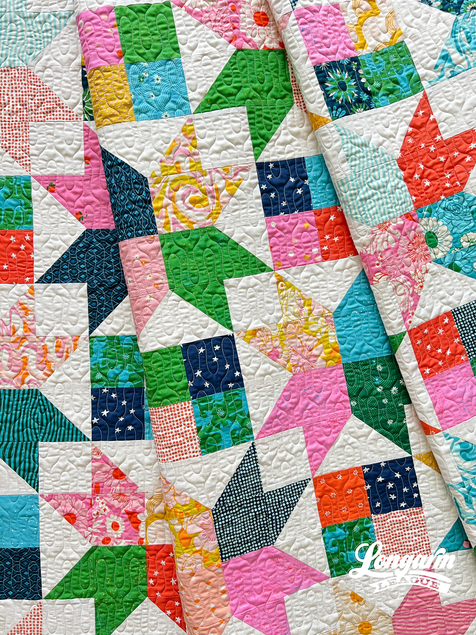
I love ...
Demure Edge-to-Edge Digital Quilting Panto

What good is the Internet if you can't use it to jump on a trend? The first time I saw something relating to "very demure" was an Instagram Reel of a real estate agent in Des Moines, describing the city as "very demure". I thought that was an odd way to describe it, but I continued with my day. In a short amount of time, I saw "very demure, very mindful" pop up in so many other places that I had to google it. Apparently, it originated with TikTok influencer Jools Lebron as a way to describe her look and way of being. It has caught fire from there! Now "very demure, very mindful" is a phrase that is popping up everywhere, and just when I needed a name for my new design. It fits, doesn't it? 
Demure's design starts with the outer petals and ends with the medaillion-like framing around a center circle. The repeating shape is elongated. 
Every other row is staggered at 50% with this design. When arranged, the row-to-row nesting is minor and is not challenging to align when stitch...
Oil Spill Longarm Quilting Digital E2E Design

This is Oil Spill, a digital edge-to-edge design created for multi-directional movement!
I've always wanted to design a version of a serpentine meander. It was one of the first styles of free-motion quilting I fell in love with twenty years ago. With this design, I E-X-H-A-G-G-E-R-A-T-E-D all of the lines and curves to make it look distinct from "traditional meandering", but with the same idea at heart: varied shapes, random-looking, and not directional. 

I started playing around with this pantograph design in mid-2022 after my grandma asked me to quilt a vintage top containing "found" blocks.
My grandma will be 91 next month. In the 1950s, when she and my grandpa were stationed at a military base in Arkansas, she was randomly given the Sunbonnet Sue blocks you see in the quilt below. Her mother (my great-grandma Estelle) added the interesting sashing made of recycled clothing.
So, yes. It's a Sunbonnet Sue quilt—and heaven help me—I've never liked the pattern. I know!...
Essex Edge-to-Edge Digital Pantograph

My inspiration for this design came from the "ribbon candy" motif that—for whatever reason—always seems so effective in adding great quilting texture.
Ribbon candy is often used in custom quilting to add oomph to certain areas of a quilt top, whether it be in the patchwork or in a thin border or sashing. 
I wanted to translate that ribbon candy idea into an edge-to-edge design that would be effective regardless of the quilt pattern. 
I couldn't help but see the shape of an S in the ribbon candy, and the name Ess-Dog (from the song Jenny and the Ess-Dog by Stephen Malkmus) kept coming to mind when I was trying to name the design. But luckily, during the Christmas holiday break, Josh and I watched the entire series of the BBC show called Gavin and Stacey, and a lot of the show is set in Essex. I thought this was a much more grown-up name than Ess-Dog. :)

I wanted to keep the repeats somewhat "contained" and also wanted a nice continuous shape with no backtracking, so I p...
A Curly, Spiral E2E Digital Quilting Design called Perm

I've always wanted to make my own version of "hand-guided" spirals to join the ranks of Feathered Spirals, Fancy Feathers, Echoed Swirls, Fossilized—designs I used to free-motion quilt before I had my computerized machine.
This was the first design that I drew on my iPad (using the Graphic app), then imported into Art and Stitch to "clean up". The most difficult part of that process was getting the rows to nest the way I wanted them to. After many, many iterations, I'm happy with the design that's meant to look "perfectly imperfect," like free-motion quilting.

I think that the larger and more varied the single repeat is, the more a design looks organic. For these kinds of designs, my goal is that the design repeats and rows are difficult to find. :) 
I named it Perm because the spirals reminded of the curly hair look in the late 80s and early 90s! The one and only perm I got was a "spiral perm" at a local beauty school when I was maybe 8 or 9 years old. My mom took my ...
Explore Edge-to-Edge Quilting Design
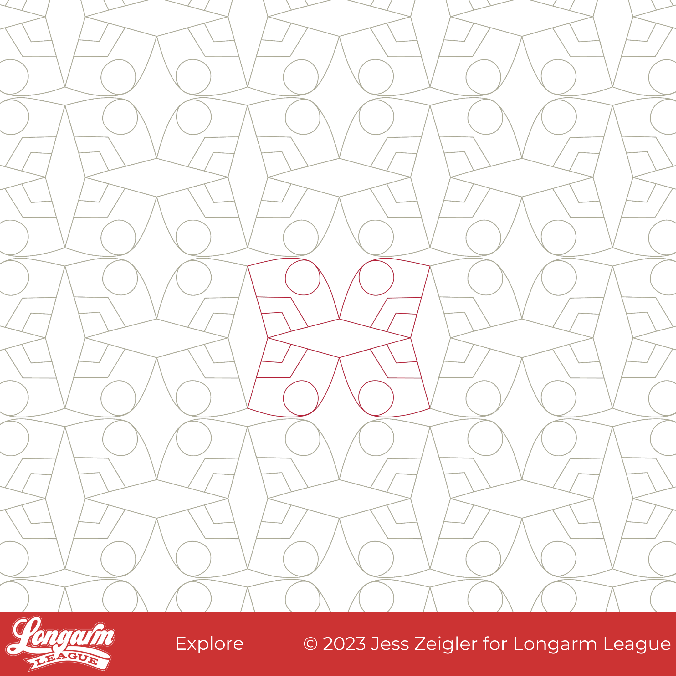
What started as a baseball diamond shape morphed into something that looked reminiscent of a graphic for America's National Parks. From there, I repeated the shapes at odd angles so that some secondary and tertiary diamonds emerged, but the "explore" feeling from an imagined poster never left.
What I like about this design is the graphic boldness of straight lines, angles, curves, and circles all playing together.
I found it funny that because I used such low volume AND extremely low contrast fabrics in this quilt, the quilting design pretty much swallowed up the whole quilt pattern! I was shocked by how little I could see the quilt pattern after quilting. Oops!


The Quilt
Believe it or not, this quilt is the Star Pop II quilt by Emily Dennis of Quilty Love. Here it is on my design wall before quilting as proof there were stars involved. Ha!
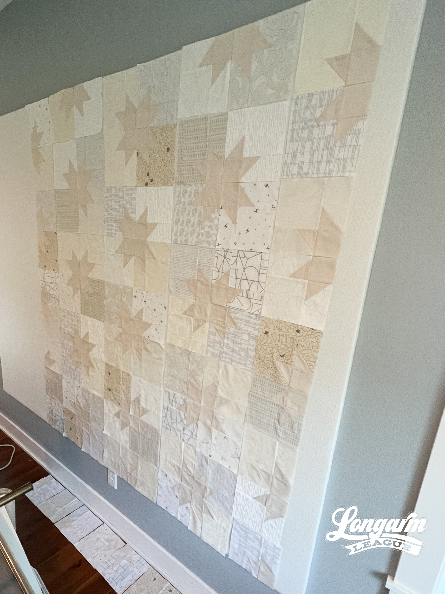
And then, after quilting: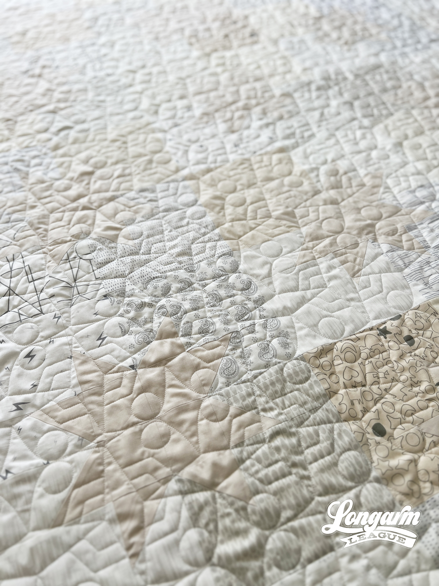
To be sure, I knew that the patchwork would be subtle. It was intentional. This was a wedding quilt for a...
Ledger Edge-to-Edge Modern Quilting Design
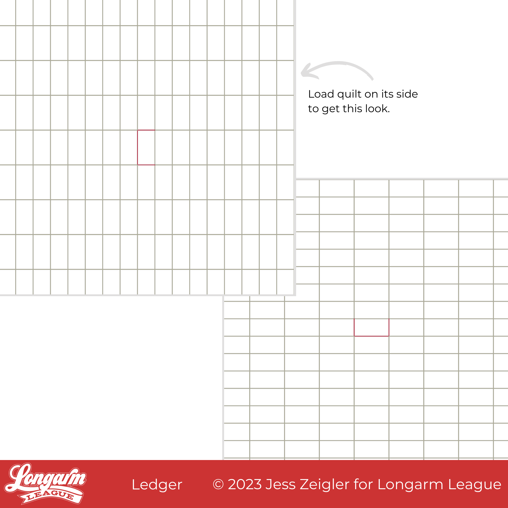
Ledger is a tricky design to execute and not for those who stress about perfection. How is this for a sales pitch?! But also? OMG, I'm in love with the modern-looking result!
I like to be upfront about the degree of difficulty of a design because I'd hate for a beginner to get frustrated.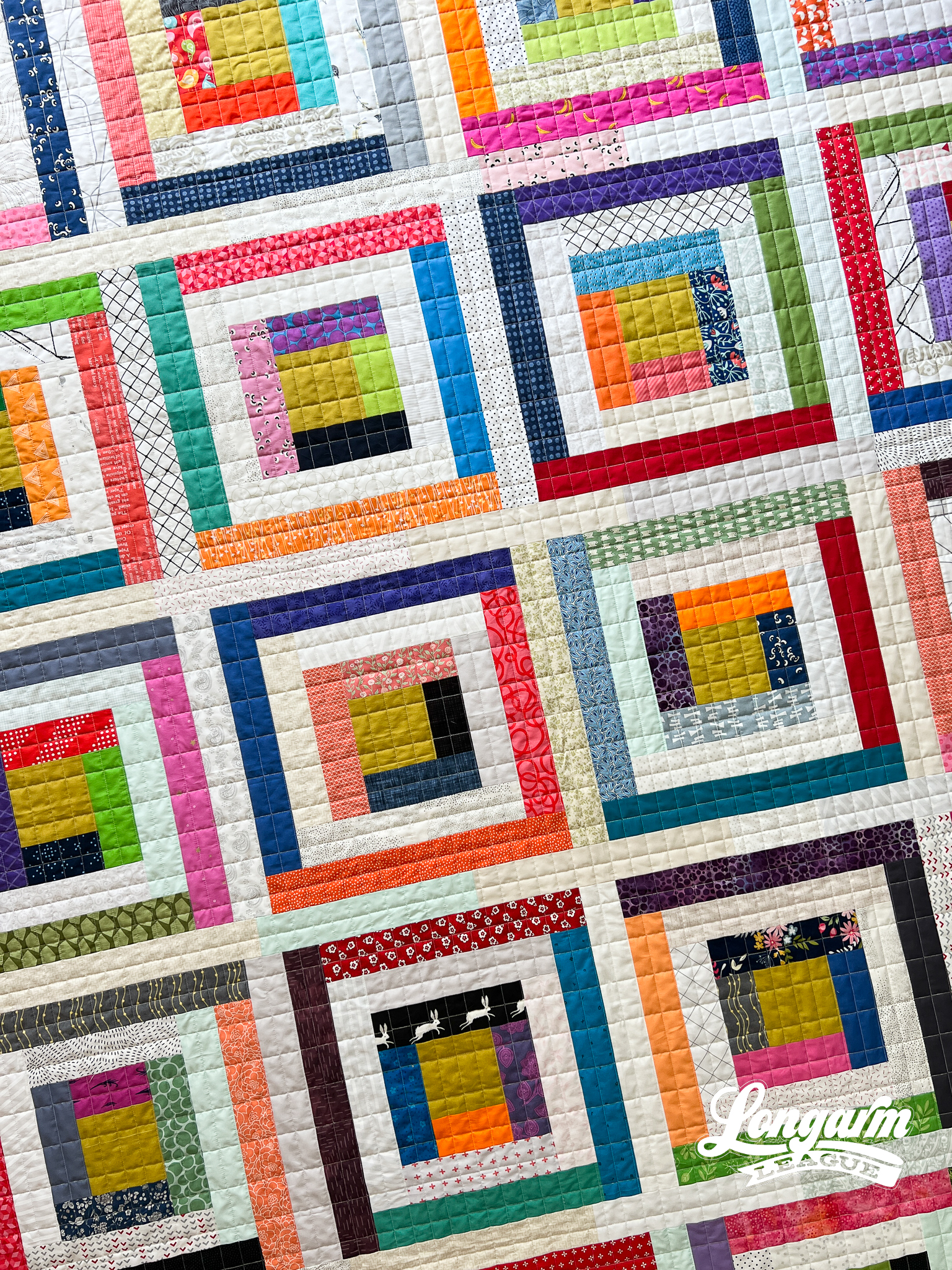
Ledger has a look you might only expect to see from careful walking-foot quilting on a domestic machine. But luckily—no basting, quilt wrangling, or taking it off the frame and re-mounting it halfway—is involved with this method.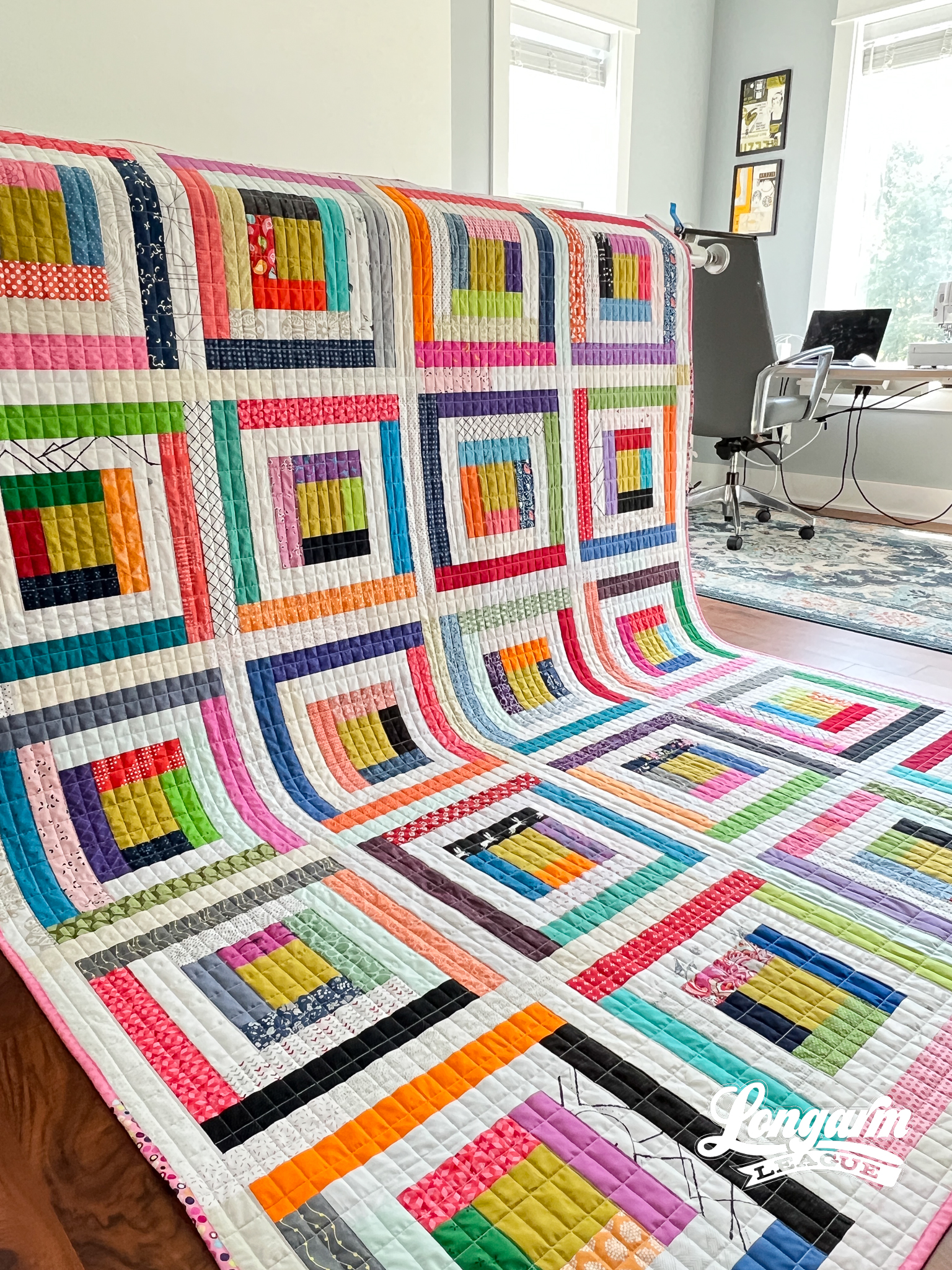
I was feeling very ho-hum about this quilt top when I finished it at a retreat earlier this year, but after I quilted it, my excitement meter went up.
WAY UP! 📈 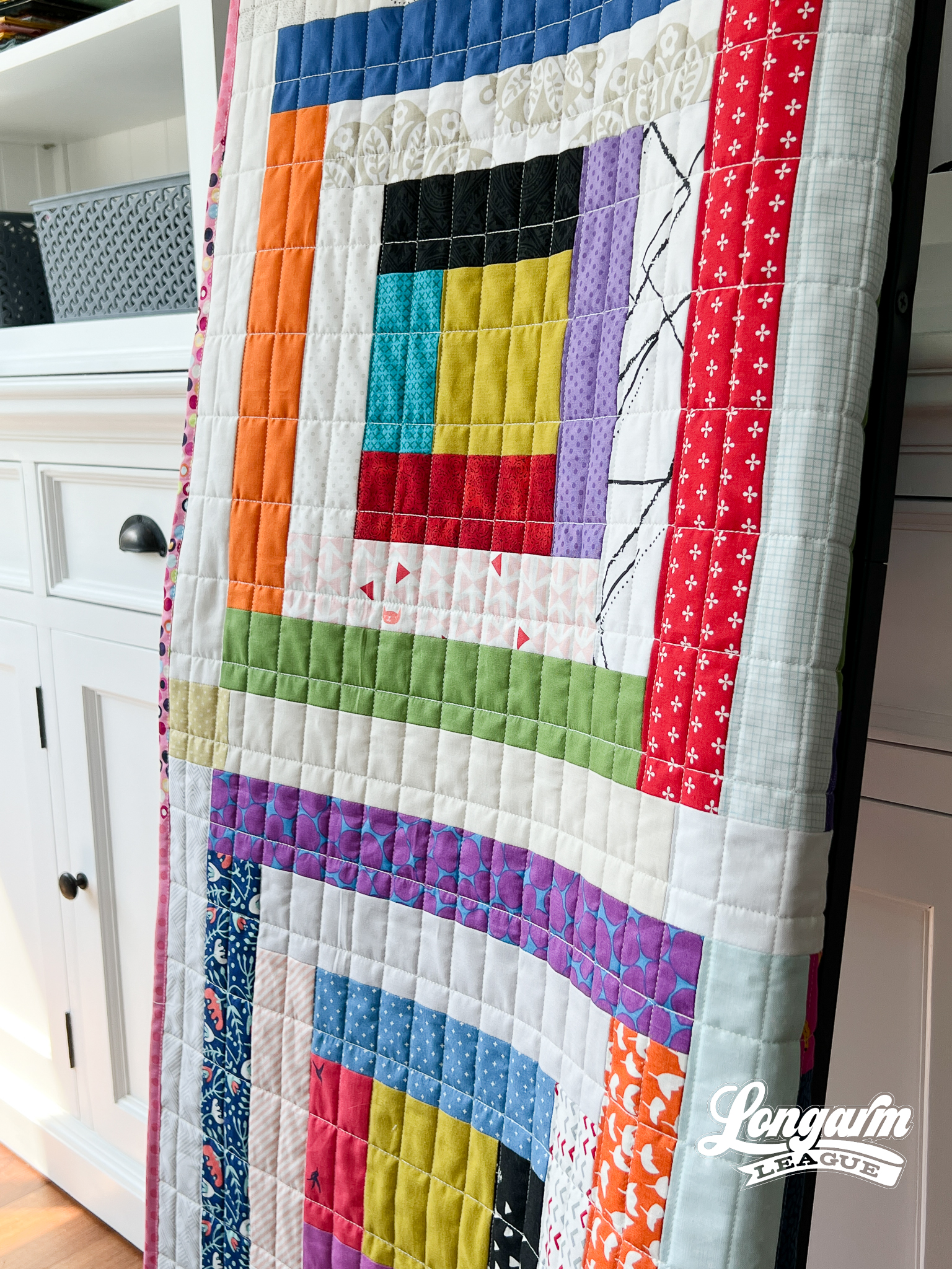
I decided to experiment with grid quilting as an edge-to-edge design, building the grid "brick-by-brick". You can watch the video of the stitch-out at the top of the blog post to see what that looks like.
I wanted to keep the longer lines of the rectangle free from backtracking, but doing it this way m...
Clamour Bundle - Four E2E Clamshell Quilting Designs with Many Options
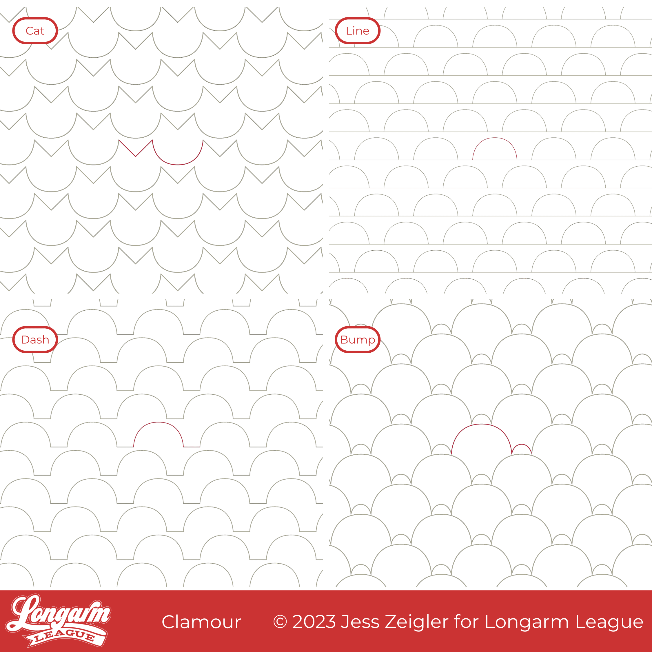
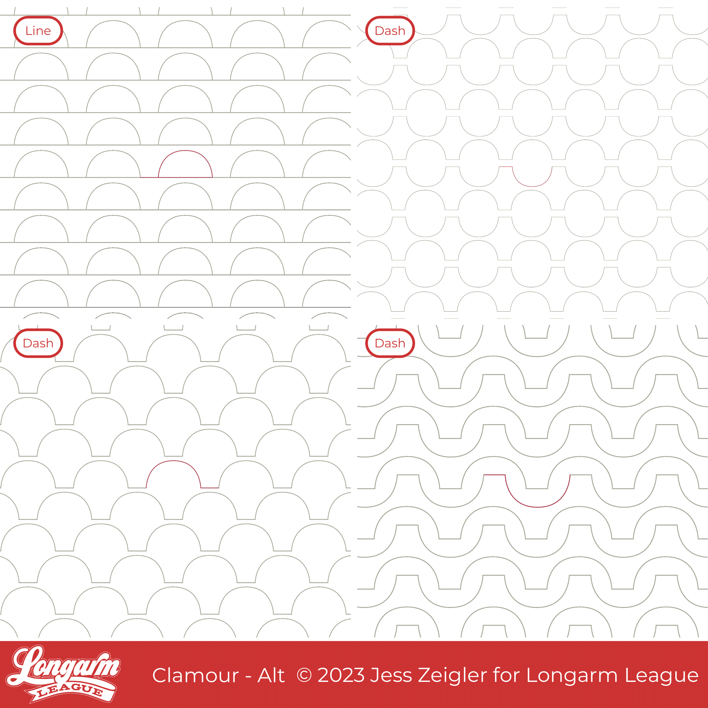
Hello friends! I'm showcasing a bundle for you today. Instead of narrowing a variety of clamshell designs down to one, I've bundled them together so that you can have many options!
There are FOUR edge-to-edge designs included in the Clamour bundle:
Cat
Line
Dash
Bump
All of this started because the Des Moines flag inspired me. I live in the Des Moines metro area, and the flag below represents bridges in the city. I created a few simple clamshell shapes designed to have some spacing between the clamshells, one with a line traveling under the clamshells (or on top if you'd like to flip it vertically like bunting) and one with a short line between. In the bundle, these are represented by Line and Dash.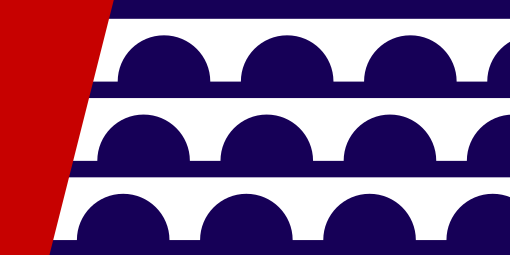
From there, I stumbled upon a variation that looked like cute cat heads in a simple and easy stitch path, so I knew I needed to include it too. We have a cat-friendly (cat-laden?) household, if you haven't met me yet. 👋

Let's talk about the Cat option now, because that's what I ...
Migrate Digital Quilting Design on Spring in Paris Quilt
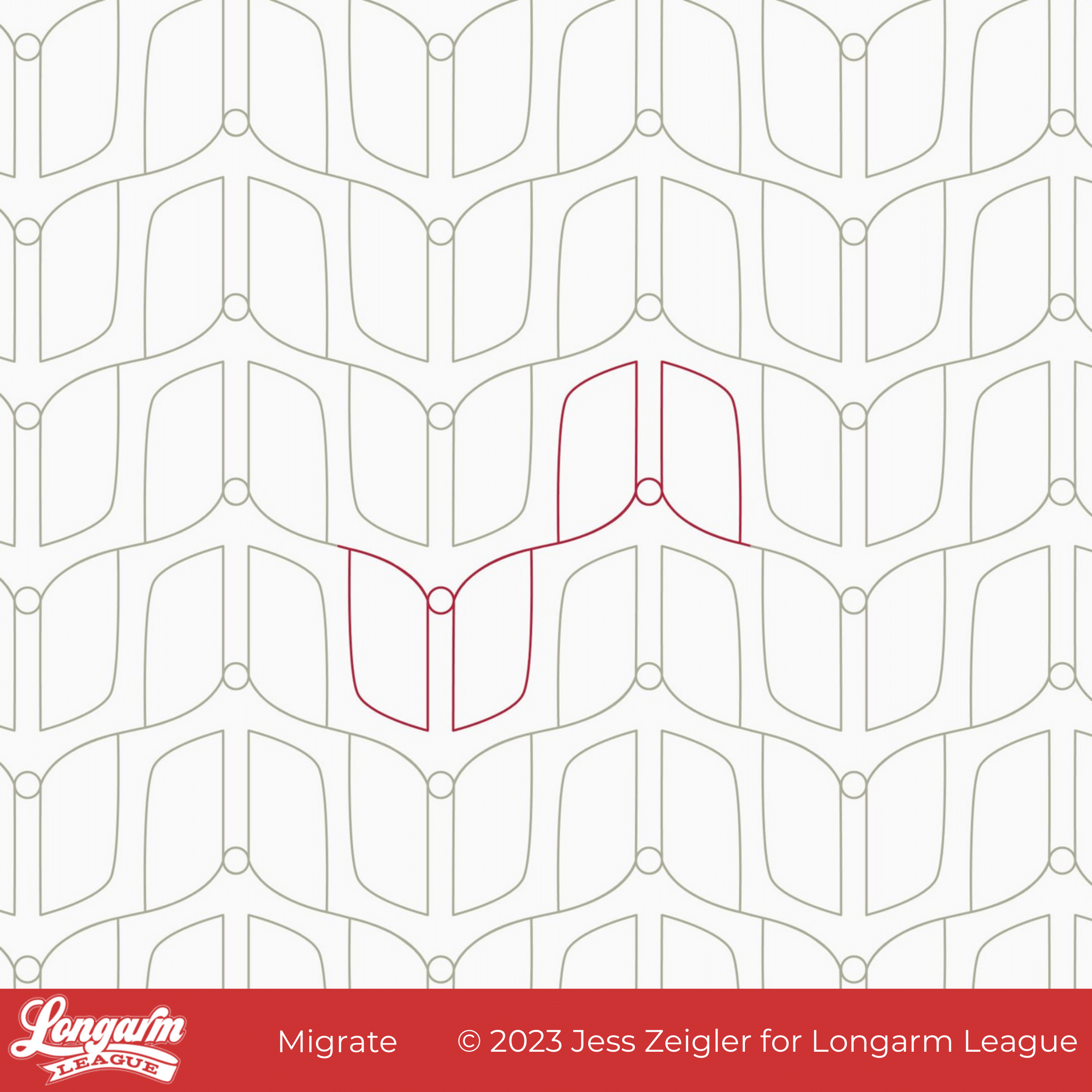
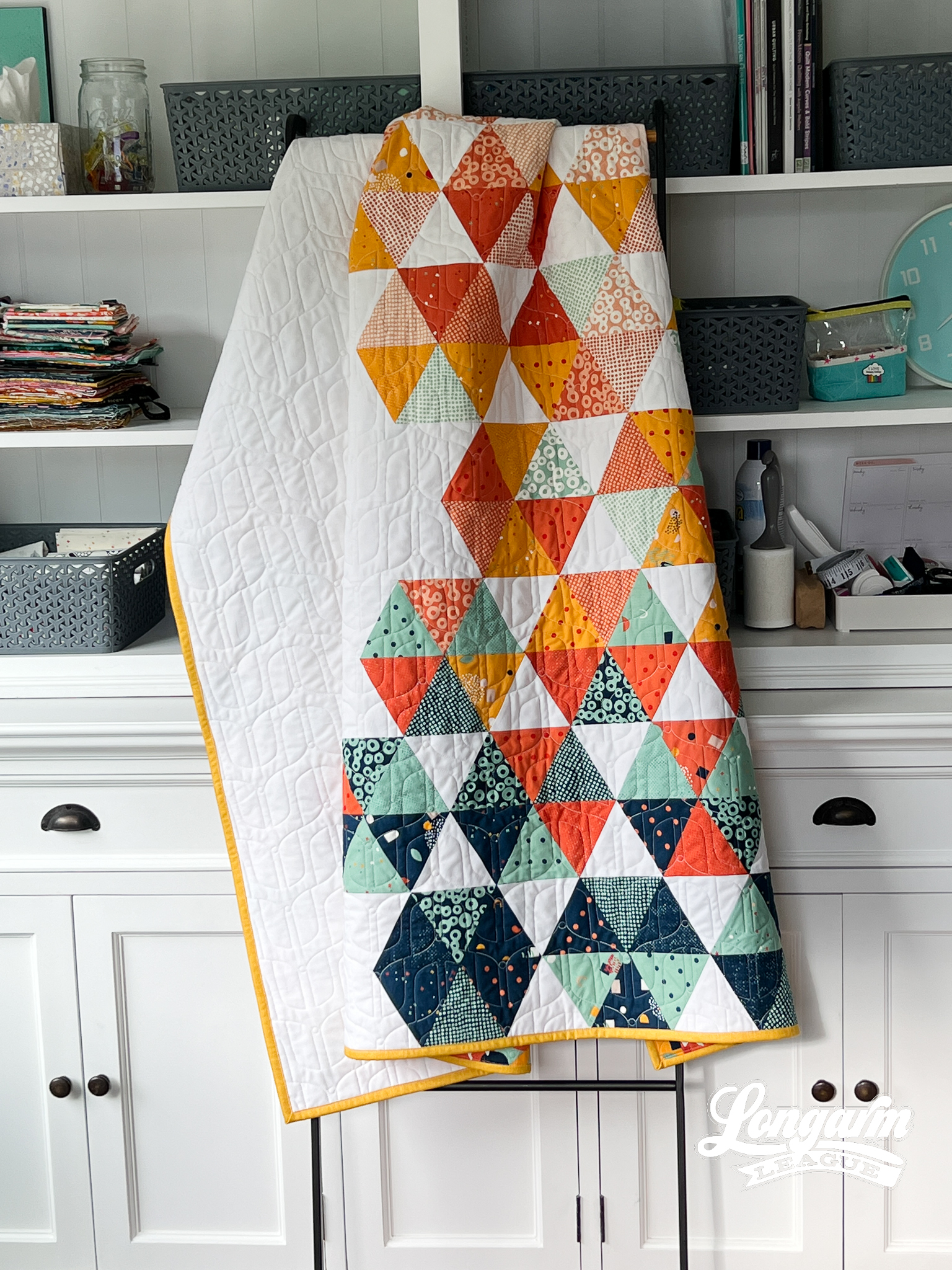
Migrate is a digital pantograph design that came about as I played with the elongated, mirrored "wing" shapes you see here. Only after looking at it for a while did it remind me of a minimalist butterfly shape and that's where the name came from.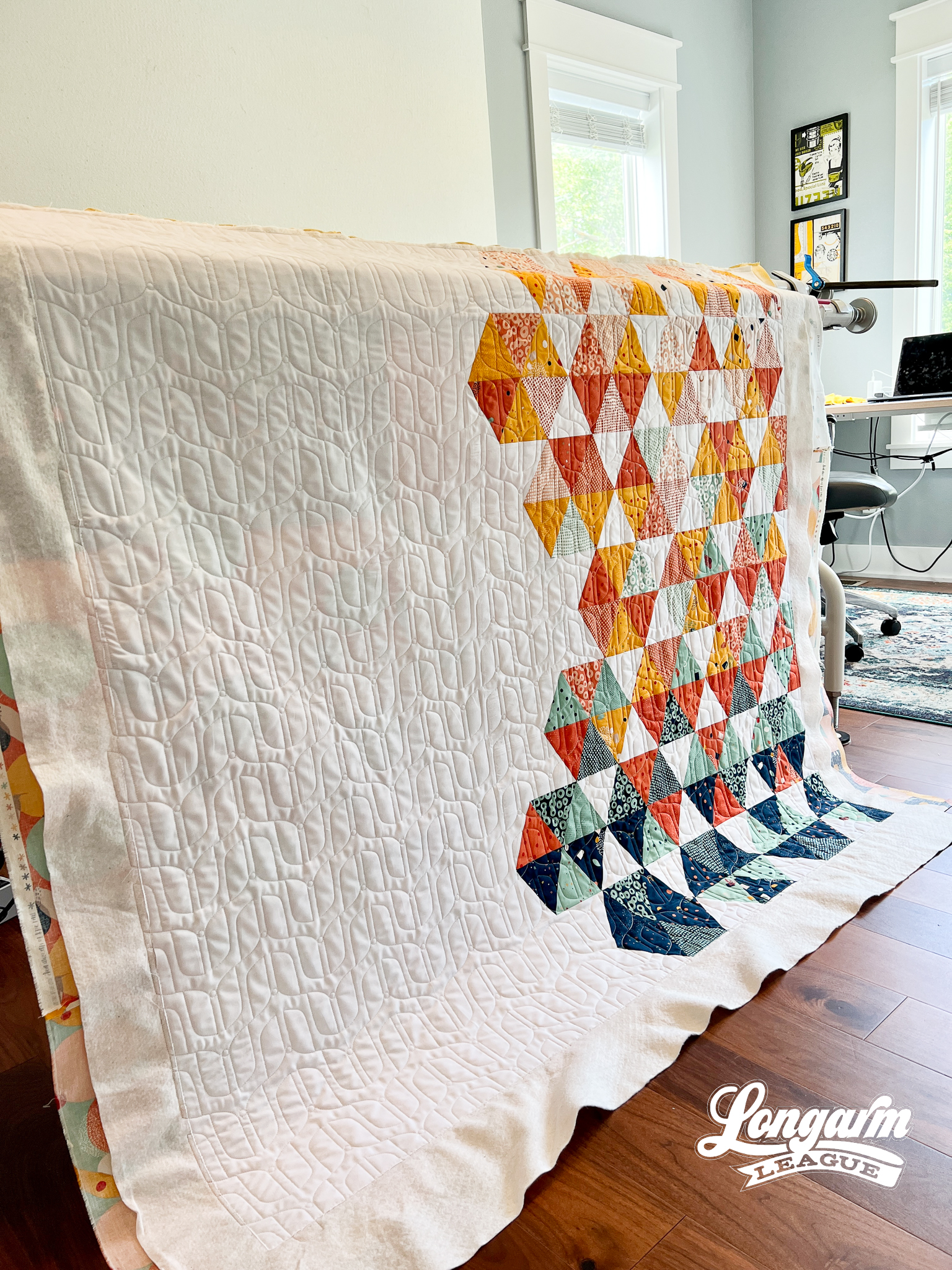
But you don't have to like butterflies to use this design on a quilt top! It's abstract enough to work on a lot of different styles. It would even work for a mid-century modern look.
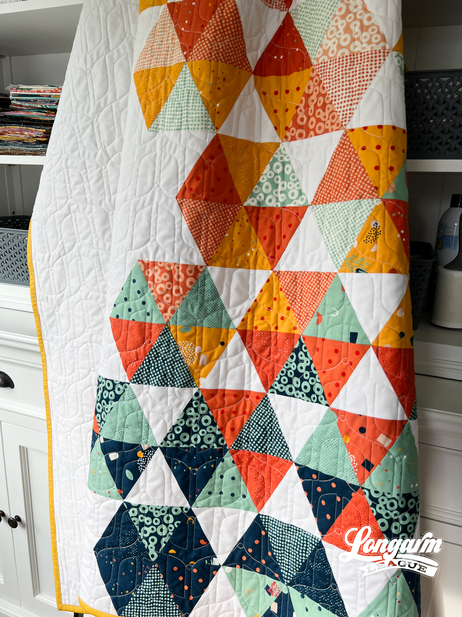
There is some backtracking involved in this design, so if you're curious about that, watch the video of the stitch-out at the top of this blog post.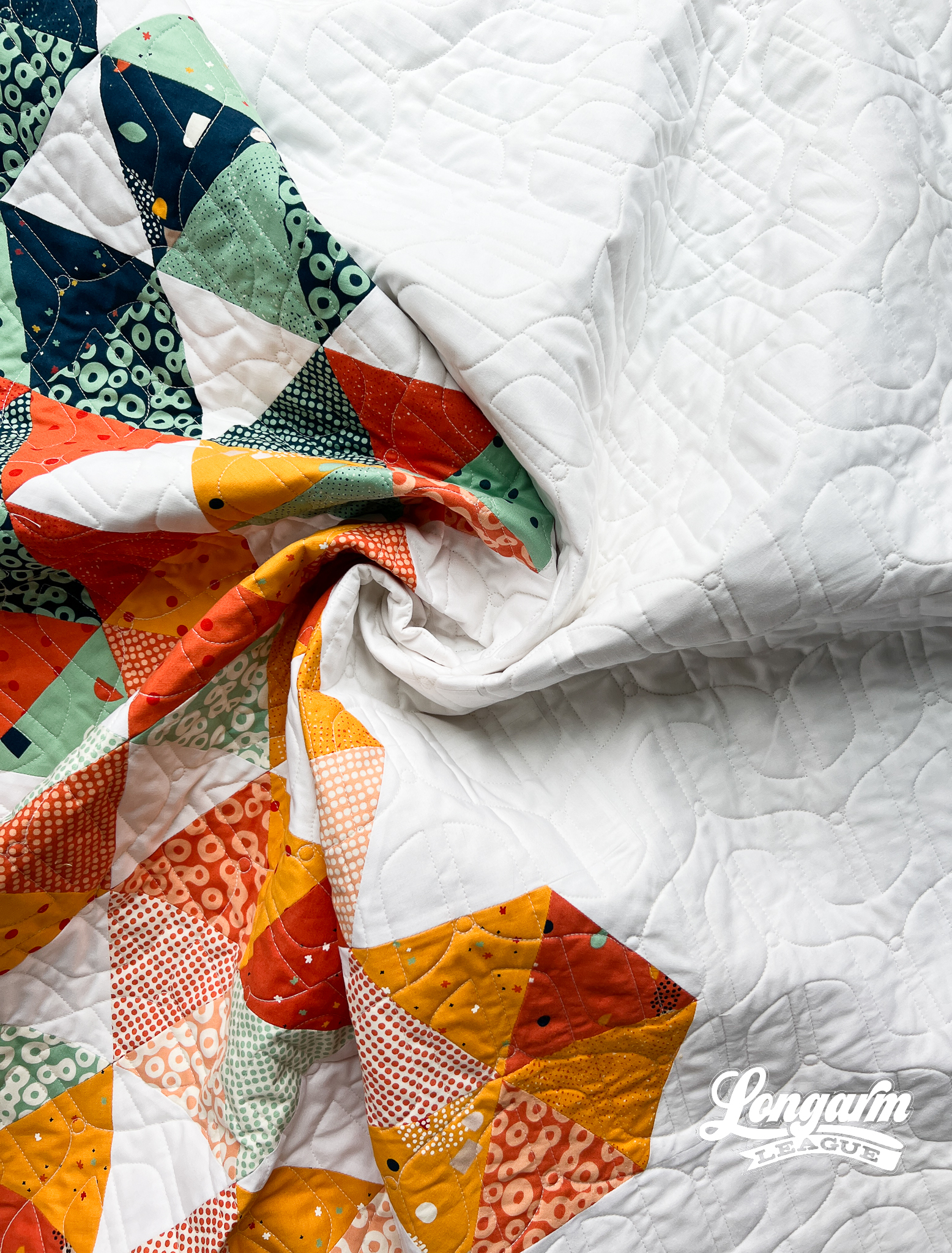
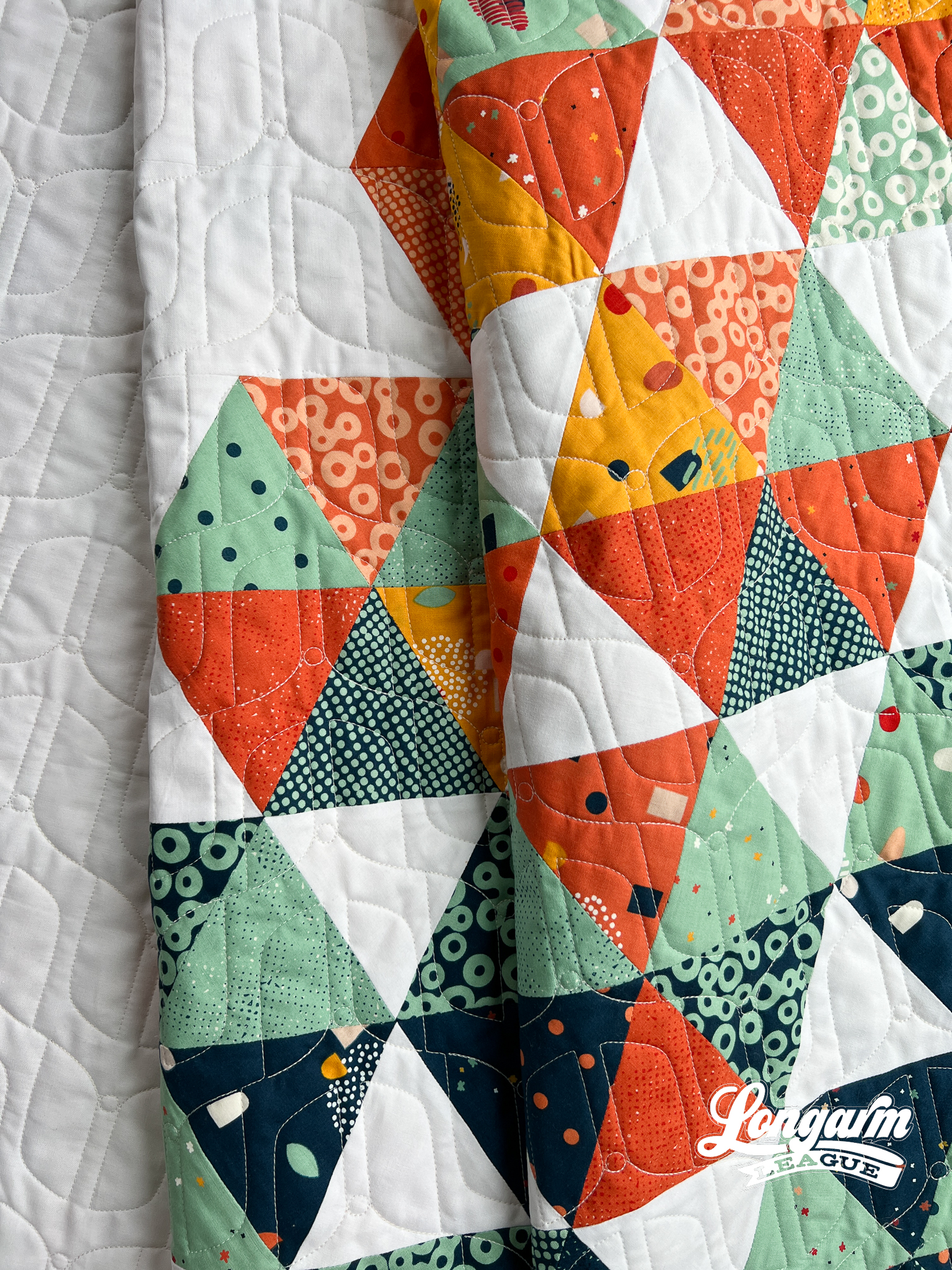
The Quilt
I have to admit, I pieced this quilt top specifically to test a different pantograph design. I loaded it up and quilted three rows of the intended design until I was sure it was a no-go. Sometimes my ideas on the computer don't quite translate well to real-life applications. It's a bummer, but that's life. That means more tweaking is needed until I'm happy with the design or it'll get scra...

Jess Zeigler
Longarm League Commish & Owner of Threaded Quilting Studio, LLC.


